Dancing in Chains#
The five sequences—Nihilism through Integration, Lens, Fragmented to United, Hate to Trust, and Cacophony to Symphony—illuminate the role of data standardization techniques in overcoming integration challenges within the clinical research ecosystem, as seen through a web app for living donor nephrectomy decisions. This ecosystem, connecting students, professors, care providers, patients, analysts, academic departments, administrators, and federal employees with NHANES access, depends on merging diverse datasets—donor registries, NHANES controls, Cox regression outputs—into Kaplan-Meier curves for outcomes like perioperative mortality or ESRD risk. Each sequence highlights how standardization techniques can transform fragmented, discordant data into a cohesive foundation for the app, addressing the ecosystem’s integration hurdles.

Fig. 32 Given our deep dive into “nonself” and “self” through biological systems, signal detection, and the metaphor of Uganda’s and Africa’s identity, I’d love to ask you: How do you see the interplay of cultural “noise” and “signal” shaping your own perception of Ugandan identity today—particularly in balancing traditional tribal heritage with the modern, global influences that have woven into its fabric? It ties into our exploration of ambiguity and convergence, and I’m curious about your personal lens on this dynamic.#
The first sequence, Nihilism to Integration, traces standardization as a path from chaos to unity. Nihilism, a failure to integrate, thrives when data lacks uniformity: donor records use varied time units, NHANES employs different coding schemes, and analysts’ .csv files diverge in structure. Deconstruction exposes these inconsistencies—techniques like data profiling reveal mismatches (e.g., age categories misaligned). Perspective emerges as stakeholders adopt mapping tools, aligning NHANES population data with donor-specific metrics. Awareness drives the use of common schemas—say, adopting FHIR standards for health data—while Reconstruction applies normalization, scaling perioperative risks to a shared baseline. Integration completes the process, with the app’s back end on GitHub Pages leveraging a standardized .csv of beta coefficients, ensuring inputs like patient demographics from drop-down menus yield consistent 95% CIs. Standardization here is the antidote to disintegration, knitting siloed data into a usable whole.
“Lens,” the second sequence, is the web app—a platform where standardization techniques crystallize. Built with JavaScript and HTML, it fuses NHANES cumulative incidence functions, donor registry stats, and analyst outputs into two curves. Techniques like ontology mapping align terms—converting “mortality” across datasets into a unified definition—while data transformation standardizes units (e.g., years vs. months). For an 85-year-old donor, sparse data widens CIs, but imputation methods (borrowing from NHANES norms) stabilize estimates. Administrators enforce metadata standards via IRB protocols, ensuring consistency, while analysts use version control on GitHub to sync updates. The Lens shows standardization as a dynamic glue: without it, patient inputs and model outputs clash, but with it, the app delivers coherent, interactive insights.
Fragmented to United, the third sequence, underscores standardization’s role in bridging divides. Fragmentation persists when NHANES controls use broad demographics and donor data drills into specifics—unstandardized, they’re apples and oranges. Techniques like data harmonization reconcile this: a common data model (e.g., OMOP) maps variables, aligning age, sex, or risk factors across sources. The app’s binary curves demand this unity; without it, baseline and nephrectomy risks misalign, confusing care providers and patients. Standardization via controlled vocabularies (e.g., SNOMED) ensures terms like “ESRD” match, uniting stakeholders around a shared truth. This sequence proves standardization’s power to turn fragmented inputs into a singular narrative, though incomplete efforts leave gaps—evident in shaky CIs for rare cases.
The fourth sequence, Hate to Trust, reveals standardization as a trust-building mechanism. “Hate” festers when unstandardized data breeds doubt—patients question curves from mismatched sources, analysts distrust professors’ ad-hoc adjustments, and federal employees guard NHANES over format disputes. “Negotiate” employs techniques like schema crosswalks, where stakeholders agree to map donor fields to NHANES standards, or data cleaning to scrub outliers. “Trust” emerges as standardization delivers reliability—the app’s outputs hold when perioperative mortality aligns across datasets, validated by a shared scale. This process highlights a relational challenge: standardization requires consensus on protocols (e.g., ICD-10 coding), easing tensions and fostering confidence in integrated results like the app’s curves.
Cacophony to Symphony, the fifth sequence, showcases standardization taming data’s chaos into harmony. “Cacophony” arises from discordant inputs—donor registries with free-text notes, NHANES with statistical aggregates, analysts’ bespoke regression tweaks. “Outside” standardization techniques, like ETL (extract, transform, load) pipelines, pull external NHANES data into a uniform format. “Emotion” reflects the strain—students wrestle with syntax errors, patients face uncertain 30-year risks—but “Inside” sees the app apply normalization (e.g., z-scores for risk factors), smoothing disparities. “Symphony” arrives as standardized data sings: curves reflect a unified base-case function, stakeholders align on outputs. This arc shows standardization as a conductor, orchestrating noisy sources into a clear, actionable melody.
These techniques—profiling, mapping, harmonization, normalization—rescue the ecosystem from integration’s pitfalls. For the nephrectomy app, they align NHANES to donor data, ensuring the Lens reflects reality despite sparse inputs (e.g., elderly donors). Beyond medicine, they scale to any ecosystem—tech firms syncing APIs, governments merging surveys—where standardization turns raw data into shared power. The app, fueled by a GitHub-hosted .csv, proves that without these methods, integration crumbles; with them, it soars, uniting stakeholders in a symphony of informed choice.
Show code cell source
import numpy as np
import matplotlib.pyplot as plt
import networkx as nx

# Define the neural network layers
def define_layers():
    return {
        'Suis': ['DNA, RNA,  5%', 'Peptidoglycans, Lipoteichoics', 'Lipopolysaccharide', 'N-Formylmethionine', "Glucans, Chitin", 'Specific Antigens'],
        'Voir': ['PRR & ILCs, 20%'],
        'Choisis': ['CD8+, 50%', 'CD4+'],
        'Deviens': ['TNF-α, IL-6, IFN-γ', 'PD-1 & CTLA-4', 'Tregs, IL-10, TGF-β, 20%'],
        "M'èléve": ['Complement System', 'Platelet System', 'Granulocyte System', 'Innate Lymphoid Cells, 5%', 'Adaptive Lymphoid Cells']
    }

# Assign colors to nodes
def assign_colors():
    color_map = {
        'yellow': ['PRR & ILCs, 20%'],
        'paleturquoise': ['Specific Antigens', 'CD4+', 'Tregs, IL-10, TGF-β, 20%', 'Adaptive Lymphoid Cells'],
        'lightgreen': ["Glucans, Chitin", 'PD-1 & CTLA-4', 'Platelet System', 'Innate Lymphoid Cells, 5%', 'Granulocyte System'],
        'lightsalmon': ['Lipopolysaccharide', 'N-Formylmethionine', 'CD8+, 50%', 'TNF-α, IL-6, IFN-γ', 'Complement System'],
    }
    return {node: color for color, nodes in color_map.items() for node in nodes}

# Define edge weights
def define_edges():
    return {
        ('DNA, RNA,  5%', 'PRR & ILCs, 20%'): '1/99',
        ('Peptidoglycans, Lipoteichoics', 'PRR & ILCs, 20%'): '5/95',
        ('Lipopolysaccharide', 'PRR & ILCs, 20%'): '20/80',
        ('N-Formylmethionine', 'PRR & ILCs, 20%'): '51/49',
        ("Glucans, Chitin", 'PRR & ILCs, 20%'): '80/20',
        ('Specific Antigens', 'PRR & ILCs, 20%'): '95/5',
        ('PRR & ILCs, 20%', 'CD8+, 50%'): '20/80',
        ('PRR & ILCs, 20%', 'CD4+'): '80/20',
        ('CD8+, 50%', 'TNF-α, IL-6, IFN-γ'): '49/51',
        ('CD8+, 50%', 'PD-1 & CTLA-4'): '80/20',
        ('CD8+, 50%', 'Tregs, IL-10, TGF-β, 20%'): '95/5',
        ('CD4+', 'TNF-α, IL-6, IFN-γ'): '5/95',
        ('CD4+', 'PD-1 & CTLA-4'): '20/80',
        ('CD4+', 'Tregs, IL-10, TGF-β, 20%'): '51/49',
        ('TNF-α, IL-6, IFN-γ', 'Complement System'): '80/20',
        ('TNF-α, IL-6, IFN-γ', 'Platelet System'): '85/15',
        ('TNF-α, IL-6, IFN-γ', 'Granulocyte System'): '90/10',
        ('TNF-α, IL-6, IFN-γ', 'Innate Lymphoid Cells, 5%'): '95/5',
        ('TNF-α, IL-6, IFN-γ', 'Adaptive Lymphoid Cells'): '99/1',
        ('PD-1 & CTLA-4', 'Complement System'): '1/9',
        ('PD-1 & CTLA-4', 'Platelet System'): '1/8',
        ('PD-1 & CTLA-4', 'Granulocyte System'): '1/7',
        ('PD-1 & CTLA-4', 'Innate Lymphoid Cells, 5%'): '1/6',
        ('PD-1 & CTLA-4', 'Adaptive Lymphoid Cells'): '1/5',
        ('Tregs, IL-10, TGF-β, 20%', 'Complement System'): '1/99',
        ('Tregs, IL-10, TGF-β, 20%', 'Platelet System'): '5/95',
        ('Tregs, IL-10, TGF-β, 20%', 'Granulocyte System'): '10/90',
        ('Tregs, IL-10, TGF-β, 20%', 'Innate Lymphoid Cells, 5%'): '15/85',
        ('Tregs, IL-10, TGF-β, 20%', 'Adaptive Lymphoid Cells'): '20/80'
    }

# Define edges to be highlighted in black
def define_black_edges():
    return {
        ('PRR & ILCs, 20%', 'CD4+'): '80/20',
        ('CD4+', 'TNF-α, IL-6, IFN-γ'): '5/95',
        ('CD4+', 'PD-1 & CTLA-4'): '20/80',
        ('CD4+', 'Tregs, IL-10, TGF-β, 20%'): '51/49',
    }

# Calculate node positions
def calculate_positions(layer, x_offset):
    y_positions = np.linspace(-len(layer) / 2, len(layer) / 2, len(layer))
    return [(x_offset, y) for y in y_positions]

# Create and visualize the neural network graph
def visualize_nn():
    layers = define_layers()
    colors = assign_colors()
    edges = define_edges()
    black_edges = define_black_edges()

    G = nx.DiGraph()
    pos = {}
    node_colors = []

    # Create mapping from original node names to numbered labels
    mapping = {}
    counter = 1
    for layer in layers.values():
        for node in layer:
            mapping[node] = f"{counter}. {node}"
            counter += 1

    # Add nodes with new numbered labels and assign positions
    for i, (layer_name, nodes) in enumerate(layers.items()):
        positions = calculate_positions(nodes, x_offset=i * 2)
        for node, position in zip(nodes, positions):
            new_node = mapping[node]
            G.add_node(new_node, layer=layer_name)
            pos[new_node] = position
            node_colors.append(colors.get(node, 'lightgray'))

    # Add edges with updated node labels
    edge_colors = []
    for (source, target), weight in edges.items():
        if source in mapping and target in mapping:
            new_source = mapping[source]
            new_target = mapping[target]
            G.add_edge(new_source, new_target, weight=weight)
            edge_colors.append('black' if (source, target) in black_edges else 'lightgrey')

    # Draw the graph
    plt.figure(figsize=(12, 8))
    edges_labels = {(u, v): d["weight"] for u, v, d in G.edges(data=True)}

    nx.draw(
        G, pos, with_labels=True, node_color=node_colors, edge_color=edge_colors,
        node_size=3000, font_size=9, connectionstyle="arc3,rad=0.2"
    )
    nx.draw_networkx_edge_labels(G, pos, edge_labels=edges_labels, font_size=8)
    plt.title("OPRAH™: Nonself & the Salient Network", fontsize=18)
    plt.show()

# Run the visualization
visualize_nn()
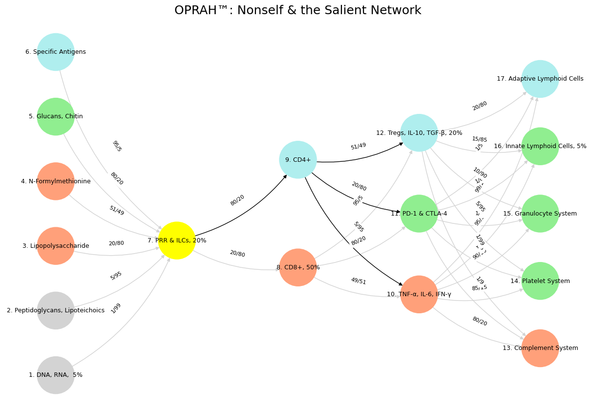
Fig. 33 G1-G3: Ganglia & N1-N5 Nuclei. These are cranial nerve, dorsal-root (G1 & G2); basal ganglia, thalamus, hypothalamus (N1, N2, N3); and brain stem and cerebelum (N4 & N5).#