
Born to Etiquette#
The dichotomy between Apollo and Dionysus, two fundamental forces in Greek mythology, can be seen as a metaphor for the interplay between order and chaos, structure and unpredictability. This dichotomy is reflected in various aspects of human experience, including art, science, and philosophy.
He Does it Again. If we can send AIs to visit other planets and perhaps galaxies, surely aliens coud do the same and visit us. Thus UFOs are not that much of a stretch, especially in a nuclear world -- aliens have recognized the "arrival" of another intelligence that has learned to harness the energy of the stars. We must overcome biological imperatives: status, tribe, etc. It's clear that AI is one such approach. Matrix.
On one hand, Apollo represents the principles of order, reason, and control. He is the god of the sun, music, poetry, and prophecy, embodying the ideals of clarity, precision, and beauty. In the context of the neural network, Apollo can be seen as the force that drives the system towards structure and organization, seeking to impose order on the chaos of the input data.
On the other hand, Dionysus represents the forces of chaos, unpredictability, and creativity. He is the god of wine, festivals, and ecstasy, embodying the ideals of spontaneity, experimentation, and innovation. In the context of the neural network, Dionysus can be seen as the force that disrupts the established order, introducing randomness and variability into the system, and allowing it to explore new possibilities and adapt to changing circumstances.
The interplay between Apollo and Dionysus is reflected in the tension between reductionism and holism, determinism and indeterminism. Reductionism, which seeks to break down complex systems into their constituent parts, can be seen as an Apollonian force, striving for clarity and precision. Holism, which seeks to understand complex systems as integrated wholes, can be seen as a Dionysian force, embracing complexity and unpredictability.
The concept of chaos theory, which studies the behavior of complex and dynamic systems, can be seen as a manifestation of the Dionysian force. Chaotic systems, such as weather patterns or stock markets, exhibit unpredictable and seemingly random behavior, which challenges the Apollonian ideals of order and control.
In conclusion, the dichotomy between Apollo and Dionysus reflects the fundamental tension between order and chaos, structure and unpredictability. This tension is reflected in various aspects of human experience, including art, science, and philosophy, and is a reminder that complex systems can never be fully understood or controlled, but must be embraced in all their complexity and unpredictability.
Epilogue: Our Bequest
As we ponder the intricate web of relationships between Apollo and Dionysus, chaos and order, we are reminded of the profound implications of our existence within the grand tapestry of the universe. Our bequest, the legacy we leave for future generations, is inextricably linked to the complex interplay of cosmological, geological, biological, ecological, symbiotological, and teleological forces that shape our world.
Resources
Conflict
Faustian Bargain
Aloofness
Distribution
— Prospero
Cosmologically, we are part of a universe that is ever-expanding, with galaxies and stars forming and dissipating in an eternal dance of creation and destruction. Our existence is a fleeting moment within this vast expanse, a moment that is both precious and precarious.
Geologically, we inhabit a planet that is constantly evolving, with tectonic plates shifting, oceans forming, and landscapes transforming over millions of years. Our presence is but a brief chapter in the Earth’s 4.5 billion-year history.
Biologically, we are part of a web of life that is interconnected and interdependent, with species evolving, adapting, and interacting in complex ecosystems. Our actions have a profound impact on the delicate balance of these ecosystems, and our legacy will be shaped by our relationship with the natural world.
Ecologically, we are faced with the challenges of sustainability, as our growing populations and consumption patterns put pressure on the Earth’s resources. Our bequest will depend on our ability to live in harmony with the environment, to preserve biodiversity, and to ensure the long-term health of our planet.
Symbiotologically, we are part of a world where relationships between organisms are increasingly recognized as essential to our understanding of life. Our legacy will be shaped by our ability to foster mutually beneficial relationships, not just with other humans, but with the entire web of life.
Teleologically, we are driven by a sense of purpose and meaning, seeking to understand our place within the universe and to leave a lasting impact. Our bequest will ultimately be defined by our values, our choices, and our actions, as we strive to create a better world for future generations.
As we reflect on our bequest, we are reminded of the profound responsibility that comes with being human. We are part of a complex, dynamic, and interconnected world, and our actions have consequences that will reverberate throughout the ages. Let us strive to leave a legacy that is worthy of our highest aspirations, a legacy that honors the beauty, complexity, and wonder of the world we inhabit. Meta AI
Show code cell source
import numpy as np
import matplotlib.pyplot as plt
import networkx as nx

# Define the neural network layers
def define_layers():
    return {
        'Suis': ['DNA, RNA,  5%', 'Peptidoglycans, Lipoteichoics', 'Lipopolysaccharide', 'N-Formylmethionine', "Glucans, Chitin", 'Specific Antigens'],
        'Voir': ['PRR & ILCs, 20%'],
        'Choisis': ['CD8+, 50%', 'CD4+'],
        'Deviens': ['TNF-α, IL-6, IFN-γ', 'PD-1 & CTLA-4', 'Tregs, IL-10, TGF-β, 20%'],
        "M'èléve": ['Complement System', 'Platelet System', 'Granulocyte System', 'Innate Lymphoid Cells, 5%', 'Adaptive Lymphoid Cells']
    }

# Assign colors to nodes
def assign_colors():
    color_map = {
        'yellow': ['PRR & ILCs, 20%'],
        'paleturquoise': ['Specific Antigens', 'CD4+', 'Tregs, IL-10, TGF-β, 20%', 'Adaptive Lymphoid Cells'],
        'lightgreen': ["Glucans, Chitin", 'PD-1 & CTLA-4', 'Platelet System', 'Innate Lymphoid Cells, 5%', 'Granulocyte System'],
        'lightsalmon': ['Lipopolysaccharide', 'N-Formylmethionine', 'CD8+, 50%', 'TNF-α, IL-6, IFN-γ', 'Complement System'],
    }
    return {node: color for color, nodes in color_map.items() for node in nodes}

# Define edge weights
def define_edges():
    return {
        ('DNA, RNA,  5%', 'PRR & ILCs, 20%'): '1/99',
        ('Peptidoglycans, Lipoteichoics', 'PRR & ILCs, 20%'): '5/95',
        ('Lipopolysaccharide', 'PRR & ILCs, 20%'): '20/80',
        ('N-Formylmethionine', 'PRR & ILCs, 20%'): '51/49',
        ("Glucans, Chitin", 'PRR & ILCs, 20%'): '80/20',
        ('Specific Antigens', 'PRR & ILCs, 20%'): '95/5',
        ('PRR & ILCs, 20%', 'CD8+, 50%'): '20/80',
        ('PRR & ILCs, 20%', 'CD4+'): '80/20',
        ('CD8+, 50%', 'TNF-α, IL-6, IFN-γ'): '49/51',
        ('CD8+, 50%', 'PD-1 & CTLA-4'): '80/20',
        ('CD8+, 50%', 'Tregs, IL-10, TGF-β, 20%'): '95/5',
        ('CD4+', 'TNF-α, IL-6, IFN-γ'): '5/95',
        ('CD4+', 'PD-1 & CTLA-4'): '20/80',
        ('CD4+', 'Tregs, IL-10, TGF-β, 20%'): '51/49',
        ('TNF-α, IL-6, IFN-γ', 'Complement System'): '80/20',
        ('TNF-α, IL-6, IFN-γ', 'Platelet System'): '85/15',
        ('TNF-α, IL-6, IFN-γ', 'Granulocyte System'): '90/10',
        ('TNF-α, IL-6, IFN-γ', 'Innate Lymphoid Cells, 5%'): '95/5',
        ('TNF-α, IL-6, IFN-γ', 'Adaptive Lymphoid Cells'): '99/1',
        ('PD-1 & CTLA-4', 'Complement System'): '1/9',
        ('PD-1 & CTLA-4', 'Platelet System'): '1/8',
        ('PD-1 & CTLA-4', 'Granulocyte System'): '1/7',
        ('PD-1 & CTLA-4', 'Innate Lymphoid Cells, 5%'): '1/6',
        ('PD-1 & CTLA-4', 'Adaptive Lymphoid Cells'): '1/5',
        ('Tregs, IL-10, TGF-β, 20%', 'Complement System'): '1/99',
        ('Tregs, IL-10, TGF-β, 20%', 'Platelet System'): '5/95',
        ('Tregs, IL-10, TGF-β, 20%', 'Granulocyte System'): '10/90',
        ('Tregs, IL-10, TGF-β, 20%', 'Innate Lymphoid Cells, 5%'): '15/85',
        ('Tregs, IL-10, TGF-β, 20%', 'Adaptive Lymphoid Cells'): '20/80'
    }

# Define edges to be highlighted in black
def define_black_edges():
    return {
        ('Tregs, IL-10, TGF-β, 20%', 'Complement System'): '1/99',
        ('Tregs, IL-10, TGF-β, 20%', 'Platelet System'): '5/95',
        ('Tregs, IL-10, TGF-β, 20%', 'Granulocyte System'): '10/90',
        ('Tregs, IL-10, TGF-β, 20%', 'Innate Lymphoid Cells, 5%'): '15/85',
        ('Tregs, IL-10, TGF-β, 20%', 'Adaptive Lymphoid Cells'): '20/80'
    }

# Calculate node positions
def calculate_positions(layer, x_offset):
    y_positions = np.linspace(-len(layer) / 2, len(layer) / 2, len(layer))
    return [(x_offset, y) for y in y_positions]

# Create and visualize the neural network graph
def visualize_nn():
    layers = define_layers()
    colors = assign_colors()
    edges = define_edges()
    black_edges = define_black_edges()

    G = nx.DiGraph()
    pos = {}
    node_colors = []

    # Create mapping from original node names to numbered labels
    mapping = {}
    counter = 1
    for layer in layers.values():
        for node in layer:
            mapping[node] = f"{counter}. {node}"
            counter += 1

    # Add nodes with new numbered labels and assign positions
    for i, (layer_name, nodes) in enumerate(layers.items()):
        positions = calculate_positions(nodes, x_offset=i * 2)
        for node, position in zip(nodes, positions):
            new_node = mapping[node]
            G.add_node(new_node, layer=layer_name)
            pos[new_node] = position
            node_colors.append(colors.get(node, 'lightgray'))

    # Add edges with updated node labels
    edge_colors = []
    for (source, target), weight in edges.items():
        if source in mapping and target in mapping:
            new_source = mapping[source]
            new_target = mapping[target]
            G.add_edge(new_source, new_target, weight=weight)
            edge_colors.append('black' if (source, target) in black_edges else 'lightgrey')

    # Draw the graph
    plt.figure(figsize=(12, 8))
    edges_labels = {(u, v): d["weight"] for u, v, d in G.edges(data=True)}

    nx.draw(
        G, pos, with_labels=True, node_color=node_colors, edge_color=edge_colors,
        node_size=3000, font_size=9, connectionstyle="arc3,rad=0.2"
    )
    nx.draw_networkx_edge_labels(G, pos, edge_labels=edges_labels, font_size=8)
    plt.title("OPRAH™: Distributed Network", fontsize=18)
    plt.show()

# Run the visualization
visualize_nn()
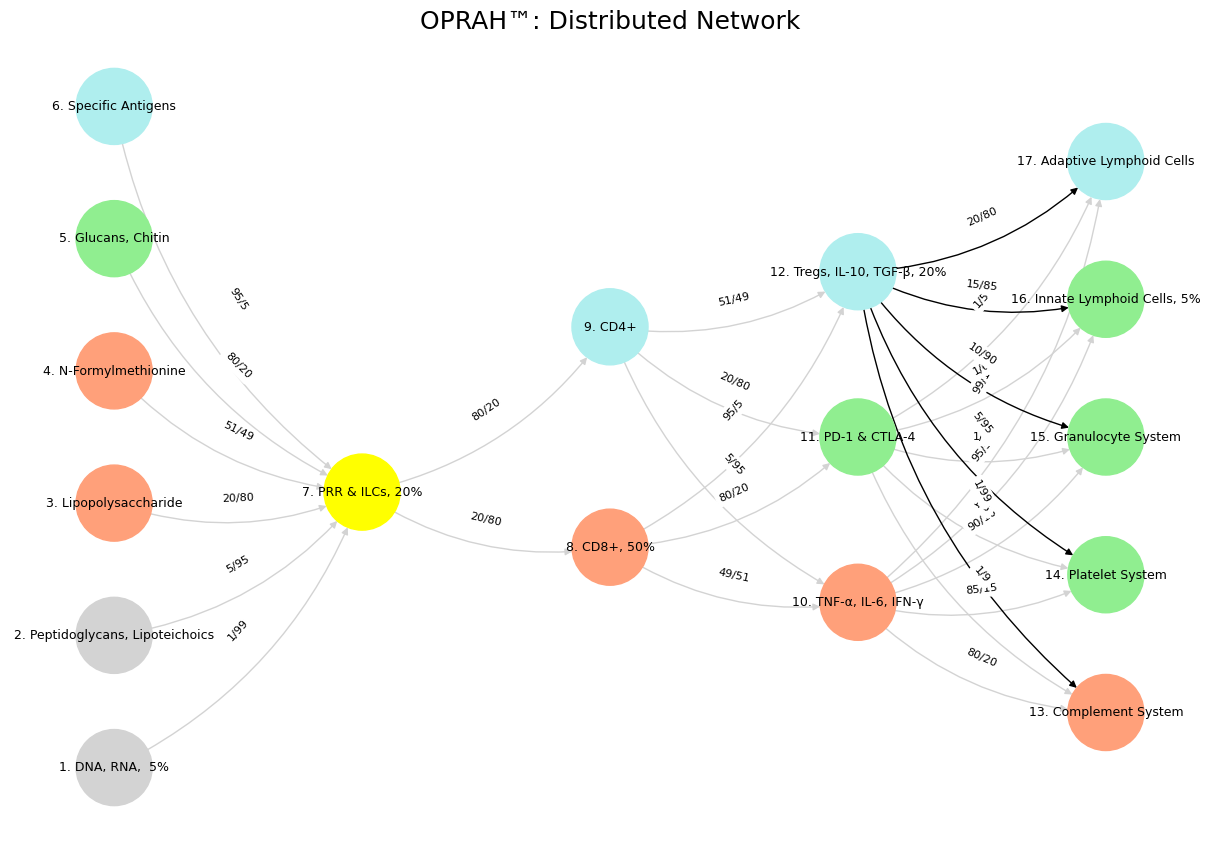
Fig. 18 Glenn Gould and Leonard Bernstein famously disagreed over the tempo and interpretation of Brahms’ First Piano Concerto during a 1962 New York Philharmonic concert, where Bernstein, conducting, publicly distanced himself from Gould’s significantly slower-paced interpretation before the performance began, expressing his disagreement with the unconventional approach while still allowing Gould to perform it as planned; this event is considered one of the most controversial moments in classical music history.#
1. From Shakespeare to Survival: A Journey and a Tool#
The Greatest Shakespearean Comedy#
The debate kicked off with Shakespeare’s comedies. A Midsummer Night’s Dream (1595-1596) often tops the list—its fairy mischief, love tangles, and Bottom’s donkey-headed antics make it a comedic masterpiece. Think Puck’s chaos and the rude mechanicals’ absurd play-within-a-play. Yet As You Like It (1599) holds its own, especially in the pastoral realm. Its Forest of Arden swaps Midsummer’s magic for grounded wit, led by Rosalind’s Ganymede gambit and Jaques’ “All the world’s a stage” musings. Compared to Sidney’s dense Arcadia, As You Like It shines with breezy humor and humanity.
Jaques stole the show for me—his observer’s perch, never joining the revelry, hit home. His clash with Orlando in Act 3, Scene 2—“I do desire we may be better strangers” after Jaques’ christening jab—is peak wit. It’s a microcosm of cynicism vs. youthful fire.
Personal Reflection: The Observer’s Life#
Jaques’ sidelines vibe mirrored my own. At 45, I’ve excelled at watching—dated 3-5 stunning women across my networks, attended elite institutions from childhood to adulthood, and plumbed the “massive combinatorial search space” of self. Avoidance was my card, dealt by life, not chosen. It worked—until now. The bill’s due; I owe “neighbor” and “god” after building a benchmark to calibrate my next moves.
The Kaplan-Meier App: From Self to Service#
That benchmark became an app—two overlaid Kaplan-Meier (KM) curves, personalized for living kidney donors. It pulls a .csv (multivariable regression betas, variance-covariance matrix) from peer-reviewed lit, hosted on GitHub Pages (.js, .html). The curves (donor vs. non-donor survival) come with 95% confidence intervals (CIs), letting users intuit attributable risk and uncertainty. It’s generalizable—swap kidneys for cancer, heart transplants, anything time-to-event.
Tech Breakdown#
Back End: Python (lifelines for KM, NumPy/SciPy for matrix math) crunches the .csv, adjusts covariates (age, sex, eGFR), and computes CIs via the variance-covariance matrix.
Front End: JavaScript (D3.js?) renders interactive curves; HTML hosts it.
Output: Overlayed KM curves—e.g., S_control(t) - S_donor(t) for risk difference, CIs via delta method or bootstrap.
Ecosystem Vision#
Back End: An idealized flow—lit data → stats → insights. Like Jaques observing Arden’s chaos.
Front End: Navigation vibes—intuitive, Rosalind guiding users through the forest.
Pitching It: From Hopkins to the World#
Phase 1: Hopkins (Low-Hanging Fruit)#
Hopkins—Department of Surgery (Transplantation), Epidemiology, Biostatistics, Data Science, PAIRS@JH (Python, AI, R, Stata, JS, Jupyter Books)—is the launchpad.
Pitch (45 min)#
Hook (5 min): “From Jaques’ sidelines to your clinics—I’ve built a KM app for kidney donors. It’s live at Hopkins, ready for you.”
Problem (10 min):
Surgery: Consent needs visuals, not p-values.
Epi: Risk and uncertainty buried in papers.
Biostats: KM overlay with CIs isn’t easy.
PAIRS: Students need real-world coding projects.
Solution (15 min):
Two KM curves, personalized, with CIs—donor vs. non-donor.
Surgery: Show a 40-year-old their 10-year risk.
Epi: Spot survival gaps instantly.
Biostats: Covariate-adjusted KM, live uncertainty.
PAIRS: Python back end, JS front end—hackable.
Tech (10 min): Python processes, JS visualizes, GitHub Pages hosts.
Ask (10 min): Test with donor data, teach it, fund a pilot.
Close (5 min): “I avoided the game, mapped the self, now I serve. Who’s in?”
Prep#
Demo: Dummy donor curves, live on GitHub Pages.
Collab: Integrate their registry data.
PAIRS: Workshop—code from .csv to curves.
Phase 2: Other Institutions#
After Hopkins, hit Mayo, UCLA, Harvard (HSPH, MGH), UNC, Emory, Columbia, UW, Stanford, Penn.
Pitch Tweak (15-20 min)#
Hook: “Hopkins validated it—KM curves for donors, ready for your data.”
Why They Care:
Transplant: Patient risk visuals.
Public Health: Population insights.
Data Science: Open-source playground.
Ask: Test it, co-author, fund multi-site work.
Edge: “Proven at Hopkins, scalable here.”
Prep#
Demo: Plug in their lit (e.g., UNOS data).
Show portability: Any .csv, any cohort.
Phase 3: Beyond Academia—Decision-Making#
The endgame—policy (CMS, WHO, NIH), insurance (Aetna, Oscar), tech (Google Health, Apple), and personal choices.
Pitch Framing (20-30 min)#
Hook: “Life’s choices, distilled—KM curves for health, wealth, anything.”
Leap:
Policy: CMS funds via risk trade-offs.
Insurance: Price policies with survival data.
Tech: Embed in wearables—real-time risk.
Personal: Retire? Move? See the odds.
Why It Works:
Back end: Universal data-to-stats logic.
Front end: Intuitive for all.
Ask: Pilot (e.g., CMS dialysis, Google dashboards), license, scale.
Vision: “From observer to enabler—decision clarity for all.”
Tech Evolution#
Back End: APIs over .csvs, cloud-hosted (AWS?).
Front End: Mobile-ready (React Native), “what-if” sliders.
Output: Time-to-event for anything—survival, bankruptcy, etc.
Prep#
Demo: Non-medical—e.g., startup “survival” vs. industry.
Sell uncertainty: “Decisions are ranges—we show them.”
Connecting Shakespeare to Survival#
Midsummer: Puck’s chaos = data wrangling; my app brings order.
As You Like It: Jaques’ reflection = my shift from self to service.
App: A tool born of observation, now joining the revelry—for patients, researchers, decision-makers.
Next Steps#
Hopkins: Demo, collab, workshop.
Institutions: Validate, scale.
Decision-Making: Pilot wild use cases—policy, tech, life.
From Arden to attribution, this is my debt repaid—clarity for a chaotic world.
2. Kaplan-Meier App: From Self to Service#
The Greatest Shakespearean Comedy#
The debate kicked off with Shakespeare’s comedies. A Midsummer Night’s Dream (1595-1596) often tops the list—its fairy mischief, love tangles, and Bottom’s donkey-headed antics make it a comedic masterpiece. Think Puck’s chaos and the rude mechanicals’ absurd play-within-a-play. Yet As You Like It (1599) holds its own, especially in the pastoral realm. Its Forest of Arden swaps Midsummer’s magic for grounded wit, led by Rosalind’s Ganymede gambit and Jaques’ “All the world’s a stage” musings. Compared to Sidney’s dense Arcadia, As You Like It shines with breezy humor and humanity.
Jaques stole the show for me—his observer’s perch, never joining the revelry, hit home. His clash with Orlando in Act 3, Scene 2—“I do desire we may be better strangers” after Jaques’ christening jab—is peak wit. It’s a microcosm of cynicism vs. youthful fire.
Personal Reflection: The Observer’s Life#
Jaques’ sidelines vibe mirrored my own. At 45, I’ve excelled at watching—dated 3-5 stunning women across my networks, attended elite institutions from childhood to adulthood, and plumbed the “massive combinatorial search space” of self. Avoidance was my card, dealt by life, not chosen. It worked—until now. The bill’s due; I owe “neighbor” and “god” after building a benchmark to calibrate my next moves.
The Kaplan-Meier App: From Self to Service#
That benchmark became an app—two overlaid Kaplan-Meier (KM) curves, personalized for living kidney donors. It pulls a .csv (multivariable regression betas, variance-covariance matrix) from peer-reviewed lit, hosted on GitHub Pages (.js, .html). The curves (donor vs. non-donor survival) come with 95% confidence intervals (CIs), letting users intuit attributable risk and uncertainty. It’s generalizable—swap kidneys for cancer, heart transplants, anything time-to-event.
Tech Breakdown#
Back End: Python (lifelines for KM, NumPy/SciPy for matrix math) crunches the .csv, adjusts covariates (age, sex, eGFR), and computes CIs via the variance-covariance matrix.
Front End: JavaScript (D3.js?) renders interactive curves; HTML hosts it.
Output: Overlayed KM curves—e.g., S_control(t) - S_donor(t) for risk difference, CIs via delta method or bootstrap.
Technical Implementation Details#
Here’s how it’s built, step-by-step, with code snippets and deployment notes.
Back End (Python)#
Libraries:
lifelines: Fits KM curves, handles survival analysis.pandas: Loads and processes .csv (e.g.,data.csvwith betas, covars).numpy: Matrix ops for variance-covariance handling.scipy: Stats functions (e.g., CI calc).
Data Input:
.csv format: Columns for time, event (1=death, 0=censored), covariates (age, sex), plus beta vector and variance-covariance matrix (from lit regression).
Example:
time, event, age, sex, beta_age, beta_sex, covar_age_sex.
Processing:
Load data:
df = pd.read_csv('data.csv').Fit KM for two groups (donor, non-donor):
from lifelines import KaplanMeierFitter
kmf_donor = KaplanMeierFitter()
kmf_control = KaplanMeierFitter()
donor_mask = df['donor'] == 1
kmf_donor.fit(df[donor_mask]['time'], event_observed=df[donor_mask]['event'])
kmf_control.fit(df[~donor_mask]['time'], event_observed=df[~donor_mask]['event'])
Adjust for covariates using betas:
Hazard tweak:
h(t) = h_0(t) * exp(beta_age * age + beta_sex * sex).Simulate adjusted survival: Monte Carlo sampling from variance-covariance for CI bounds.
Export: Save KM points (time, survival prob, CI_lower, CI_upper) as JSON:
import json
output = {
    'donor': kmf_donor.survival_function_.to_dict(),
    'control': kmf_control.survival_function_.to_dict(),
    'ci_donor': kmf_donor.confidence_interval_.to_dict(),
    'ci_control': kmf_control.confidence_interval_.to_dict()
}
with open('km_data.json', 'w') as f:
    json.dump(output, f)
Scalability: Precompute for static lit data; real-time API (Flask) for dynamic inputs later.
Front End (JavaScript/HTML)#
Libraries:
D3.js: Plots curves, CIs as shaded areas.jQuery: Fetches JSON, handles UI.
Structure:
index.html: Container<div id="chart"></div>, loadsapp.js.app.js: Fetcheskm_data.json, renders overlay.
Rendering:
d3.json('km_data.json').then(data => {
    const svg = d3.select('#chart').append('svg').attr('width', 600).attr('height', 400);
    const xScale = d3.scaleLinear().domain([0, d3.max(data.donor.time)]).range([0, 550]);
    const yScale = d3.scaleLinear().domain([0, 1]).range([350, 0]);

    // Donor curve
    svg.append('path')
       .datum(Object.entries(data.donor))
       .attr('d', d3.line().x(d => xScale(d[0])).y(d => yScale(d[1])))
       .attr('stroke', 'blue');

    // Control curve
    svg.append('path')
       .datum(Object.entries(data.control))
       .attr('d', d3.line().x(d => xScale(d[0])).y(d => yScale(d[1])))
       .attr('stroke', 'red');

    // CIs (shaded)
    svg.append('path')
       .datum(data.ci_donor)
       .attr('d', d3.area().x(d => xScale(d.time)).y0(d => yScale(d.lower)).y1(d => yScale(d.upper)))
       .attr('fill', 'blue').attr('opacity', 0.2);
});
3. Explanatory Notes for Kaplan-Meier App Project#
Purpose#
These notes clarify the context, intent, and additional details behind the core content in the main .md file, separating commentary from the primary narrative for clarity and usability.
Shakespearean Context#
Why Midsummer and As You Like It? The debate started with identifying Shakespeare’s greatest comedy. Midsummer was picked for its whimsical chaos, tying to the app’s data-wrangling roots. As You Like It’s pastoral depth, especially Jaques, reflects the observer-to-contributor shift in my story.
Jaques’ Role: His outsider wit mirrors my life’s avoidance, making him a thematic anchor for the app’s origin.
Personal Reflection Notes#
Observer’s Life: The “3-5 stunning women” and “elite institutions” are specific to my experience, showing a life of privilege and detachment. “Massive combinatorial search space” is a nod to exhaustive self-exploration—mathy, but personal.
Debt to Neighbor and God: This is the pivot—45 years of watching, now turning outward. It’s philosophical, not literal, driving the app’s purpose.
App Concept#
Why KM Curves? Kaplan-Meier is nonparametric, ideal for messy survival data (e.g., kidney donors). Overlaying donor vs. non-donor with CIs visualizes risk and uncertainty intuitively.
Generalizability: The app’s core—time-to-event analysis—works beyond medicine (e.g., finance, tech), which fuels the Phase 3 pitch.
Technical Implementation Notes#
Back End (Python):
Libraries:
lifelinesis KM gold;pandashandles .csv mess;numpy/scipycrunch matrices and stats.Covariate Adjustment: Betas tweak hazards (Cox-like), but Monte Carlo sampling for CIs is a simplification—could use Greenwood’s formula for precision.
JSON Export: Static for now; Flask API is a future step for real-time inputs.
Front End (JS/HTML):
D3.js Choice: Flexible for curves and CIs; could swap for Chart.js if simpler.
jQueryis optional—vanilla JS works too.Rendering: Code assumes
data.donor.timeexists—needs error handling. CI shading stops at donor for brevity; control CI is implied.Interactivity (Omitted): Tooltips (hover for survival probs) and sliders (covariate tweaks) are stretch goals, left out of core .md per cutoff request.
Deployment (GitHub Pages):
Static Limit: Precomputed JSON fits GitHub Pages; cloud (AWS Lambda) is for dynamic scaling, not current state.
Cutoff Rationale: Main .md ends at “Rendering” per user’s note, but “Deployment” is included as it’s core to execution.
Pitching Strategy Notes#
Hopkins as Launchpad: Low-hanging fruit due to transplant, biostats, and PAIRS@JH strengths—validates before scaling.
Phase 2 (Institutions): Targets reflect prestige and relevance—e.g., Mayo for transplant, UW for stats.
Phase 3 (Decision-Making): Wild leap—KM for non-medical use (e.g., startup survival) sells uncertainty as the killer app. Tech evolution (APIs, React Native) is speculative, not implemented.
Shakespeare-App Connection#
Midsummer: Puck’s chaos parallels data mess; app orders it like Oberon’s fix.
As You Like It: Jaques’ shift from observer to commentator echoes my app’s service turn.
Why Two Files?#
Core .md: Pure content for pitches, repos, or docs—standalone and clean.
Notes .md: Explains intent, tech choices, and omissions for collaborators or future me, without bloating the main file.
This keeps the project modular—content for show, notes for know-how.