Nietzsche#
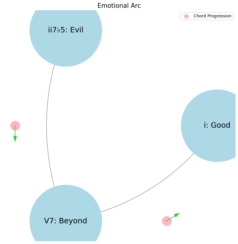
Evil, Beyond, Good#
Theme, Infinite-Variety#
Note
From the point of view of form, the archetype of all the arts is the art of the musician.-Oscar Wilde 8
Tip
Art is about the ii7♭5 departure from Peace & Joy. Dionysian art has no emotional or narrative arc, lacking in ethical i resolution. There’s more existential V7♭9♯9♭13 struggle, a sort of eternally recurrent limbo in purgatorio. Perhaps we could also add that our protagonist isn’t a charity case. So is Ulysses Dionysian? 42
Composedby forebears,Performedby flamenco dancer & guitarist, with engagedAudienceclapping in polyrhythmically syncopated pocketsIt’s dark, festive, think bull-fights, old Spain; it’s flipped the
V7on its head to make ithomeMixolydian ♭9♯9♭13 Scale aka Spanish Phrygian
                          1. Sun-Phonetics
                                          \
     2. Chlorophyll-Temperament.Degree -> 4. Animals-MQ.TEA -> 5. Man-NexToken -> 6. Worms-Blood.Emotional-Tragic-Narrative.Arc
                                          /
                                          3. Plants-Scale

The tragic hero. Out of the spirit of music: the downfall, the suffering, and the catharsis. It’s like a ii-V7-i chord sequence, genesis-exodus-samuel, troy-oddysey-ithaca, departure-struggle-return, matrix-pill-zion, or philip-kindred-dick. Exactly—that sequence is a powerful, universal structure that we see repeated across different forms of art, literature, and music. It’s the essence of a journey that reflects the tension and resolution, struggle and triumph, loss and redemption. The ii-V7-i chord sequence, for example, embodies that same sense of tension resolving back to the tonic, just as the hero’s journey brings the protagonist full circle after the trials and tribulations. In The Birth-of-Tragedy, Nietzsche taps into this very idea, where the tragic hero’s journey mirrors the emotional journey in music. The fall from grace, the descent into suffering, and the eventual catharsis—these are all part of the human experience that resonates so deeply because it’s a journey we all understand, whether through a symphony, a story, or our own lives. It’s the timeless pattern of tension and resolution that gives meaning to the chaos, just as those harmonies do in music.#
Show code cell source
import networkx as nx
import matplotlib.pyplot as plt
import numpy as np

# Create a directed graph
G = nx.DiGraph()

# Add nodes representing different levels (subatomic, atomic, cosmic, financial, social)
levels = ['i: Good', 'ii7♭5: Evil', 'V7: Beyond']

# Add nodes to the graph
G.add_nodes_from(levels)

# Add edges to represent the flow of information (photons)
# Assuming the flow is directional from more fundamental levels to more complex ones
edges = [('ii7♭5: Evil', 'V7: Beyond'),
         ('V7: Beyond', 'i: Good'),]

# Add edges to the graph
G.add_edges_from(edges)

# Define positions for the nodes in a circular layout
pos = nx.circular_layout(G)

# Set the figure size (width, height)
plt.figure(figsize=(10, 10))  # Adjust the size as needed

# Draw the main nodes
nx.draw_networkx_nodes(G, pos, node_color='lightblue', node_size=30000)

# Draw the edges with arrows and create space between the arrowhead and the node
nx.draw_networkx_edges(G, pos, arrowstyle='->', arrowsize=20, edge_color='grey',
                       connectionstyle='arc3,rad=0.2')  # Adjust rad for more/less space

# Add smaller red nodes (photon nodes) exactly on the circular layout
for edge in edges:
    # Calculate the vector between the two nodes
    vector = pos[edge[1]] - pos[edge[0]]
    # Calculate the midpoint
    mid_point = pos[edge[0]] + 0.5 * vector
    # Normalize to ensure it's on the circle
    radius = np.linalg.norm(pos[edge[0]])
    mid_point_on_circle = mid_point / np.linalg.norm(mid_point) * radius
    # Draw the small red photon node at the midpoint on the circular layout
    plt.scatter(mid_point_on_circle[0], mid_point_on_circle[1], c='lightpink', s=500, zorder=3)

    # Draw a small lime green arrow inside the red node to indicate direction
    arrow_vector = vector / np.linalg.norm(vector) * 0.1  # Scale down arrow size
    plt.arrow(mid_point_on_circle[0] - 0.05 * arrow_vector[0],
              mid_point_on_circle[1] - 0.05 * arrow_vector[1],
              arrow_vector[0], arrow_vector[1],
              head_width=0.03, head_length=0.05, fc='limegreen', ec='limegreen', zorder=4)

# Draw the labels for the main nodes
nx.draw_networkx_labels(G, pos, font_size=18, font_weight='normal')

# Add a legend for "Photon/Info"
plt.scatter([], [], c='lightpink', s=100, label='Chord Progression')  # Empty scatter for the legend
plt.legend(scatterpoints=1, frameon=True, labelspacing=1, loc='upper right')

# Set the title and display the plot
plt.title('Redemptive Arc', fontsize=15)
plt.axis('off')
plt.show()

Portrait of The Artist as a Young Man. Why? Stephen answered himself. Because the theme of the false or the usurping or the adulterous brother or all three in one is to Shakespeare, what the poor are not, always with him. The note of banishment, banishment from the heart, banishment from home, sounds uninterruptedly from The Two Gentlemen of Verona onward till Prospero breaks his staff, buries it certain fathoms in the earth and drowns his book. It doubles itself in the middle of his life, reflects itself in another, repeats itself, protasis, epitasis, catastasis, catastrophe. It repeats itself again when he is near the grave, when his married daughter Susan, chip of the old block, is accused of adultery. But it was the original sin that darkened his understanding, weakened his will and left in him a strong inclination to evil. The words are those of my lords bishops of Maynooth. An original sin and, like original sin, committed by another in whose sin he too has sinned. It is between the lines of his last written words, it is petrified on his tombstone under which her four bones are not to be laid. Age has not withered it. Beauty and peace have not done it away. It is in infinite variety everywhere in the world he has created, in Much Ado about Nothing, twice in As you like It, in The Tempest, in Hamlet, in Measure for Measure—and in all the other plays which I have not read.43#
\(\mu\) Base-case#
Senses: Curated
Show code cell source
import numpy as np
import matplotlib.pyplot as plt
# Parameters
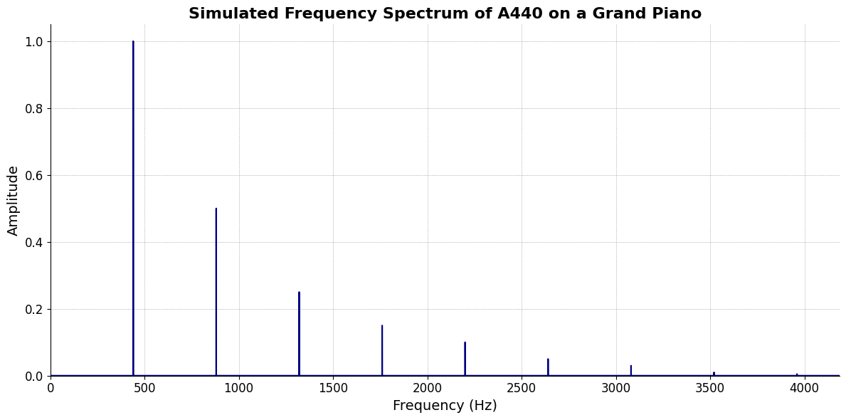
sample_rate = 44100 # Hz
duration = 20.0 # seconds
A4_freq = 440.0 # Hz
# Time array
t = np.linspace(0, duration, int(sample_rate * duration), endpoint=False)
# Fundamental frequency (A4)
signal = np.sin(2 * np.pi * A4_freq * t)
# Adding overtones (harmonics)
harmonics = [2, 3, 4, 5, 6, 7, 8, 9] # First few harmonics
amplitudes = [0.5, 0.25, 0.15, 0.1, 0.05, 0.03, 0.01, 0.005] # Amplitudes for each harmonic
for i, harmonic in enumerate(harmonics):
signal += amplitudes[i] * np.sin(2 * np.pi * A4_freq * harmonic * t)
# Perform FFT (Fast Fourier Transform)
N = len(signal)
yf = np.fft.fft(signal)
xf = np.fft.fftfreq(N, 1 / sample_rate)
# Plot the frequency spectrum
plt.figure(figsize=(12, 6))
plt.plot(xf[:N//2], 2.0/N * np.abs(yf[:N//2]), color='navy', lw=1.5)
# Aesthetics improvements
plt.title('Simulated Frequency Spectrum of A440 on a Grand Piano', fontsize=16, weight='bold')
plt.xlabel('Frequency (Hz)', fontsize=14)
plt.ylabel('Amplitude', fontsize=14)
plt.xlim(0, 4186) # Limit to the highest frequency on a piano (C8)
plt.ylim(0, None)
# Remove top and right spines
plt.gca().spines['top'].set_visible(False)
plt.gca().spines['right'].set_visible(False)
# Customize ticks
plt.xticks(fontsize=12)
plt.yticks(fontsize=12)
# Light grid
plt.grid(color='grey', linestyle=':', linewidth=0.5)
# Show the plot
plt.tight_layout()
plt.show()
Show code cell output
Memory: Luxury
Emotions: Numbed
\(\sigma\) Varcov-matrix#
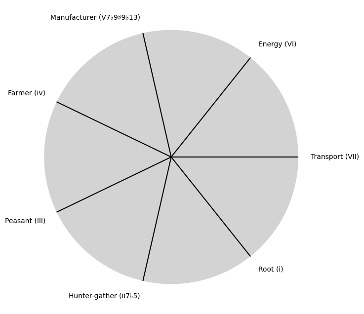
Evolution: Society 2
Show code cell source
import matplotlib.pyplot as plt
import numpy as np

# Clock settings; f(t) random disturbances making "paradise lost"
clock_face_radius = 1.0
number_of_ticks = 7
tick_labels = [
    "Root (i)",
    "Hunter-gather (ii7♭5)", "Peasant (III)", "Farmer (iv)", "Manufacturer (V7♭9♯9♭13)",
    "Energy (VI)", "Transport (VII)"
]

# Calculate the angles for each tick (in radians)
angles = np.linspace(0, 2 * np.pi, number_of_ticks, endpoint=False)
# Inverting the order to make it counterclockwise
angles = angles[::-1]

# Create figure and axis
fig, ax = plt.subplots(figsize=(8, 8))
ax.set_xlim(-1.2, 1.2)
ax.set_ylim(-1.2, 1.2)
ax.set_aspect('equal')

# Draw the clock face
clock_face = plt.Circle((0, 0), clock_face_radius, color='lightgrey', fill=True)
ax.add_patch(clock_face)

# Draw the ticks and labels
for angle, label in zip(angles, tick_labels):
    x = clock_face_radius * np.cos(angle)
    y = clock_face_radius * np.sin(angle)

    # Draw the tick
    ax.plot([0, x], [0, y], color='black')

    # Positioning the labels slightly outside the clock face
    label_x = 1.1 * clock_face_radius * np.cos(angle)
    label_y = 1.1 * clock_face_radius * np.sin(angle)

    # Adjusting label alignment based on its position
    ha = 'center'
    va = 'center'
    if np.cos(angle) > 0:
        ha = 'left'
    elif np.cos(angle) < 0:
        ha = 'right'
    if np.sin(angle) > 0:
        va = 'bottom'
    elif np.sin(angle) < 0:
        va = 'top'

    ax.text(label_x, label_y, label, horizontalalignment=ha, verticalalignment=va, fontsize=10)

# Remove axes
ax.axis('off')

# Show the plot
plt.show()
Show code cell output
\(\%\) Precision#
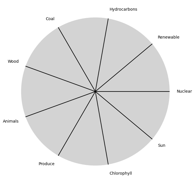
Needs: God-man-ai
Show code cell source
import matplotlib.pyplot as plt
import numpy as np

# Clock settings; f(t) random disturbances making "paradise lost"
clock_face_radius = 1.0
number_of_ticks = 9
tick_labels = [
    "Sun", "Chlorophyll", "Produce", "Animals",
    "Wood", "Coal", "Hydrocarbons", "Renewable", "Nuclear"
]

# Calculate the angles for each tick (in radians)
angles = np.linspace(0, 2 * np.pi, number_of_ticks, endpoint=False)
# Inverting the order to make it counterclockwise
angles = angles[::-1]

# Create figure and axis
fig, ax = plt.subplots(figsize=(8, 8))
ax.set_xlim(-1.2, 1.2)
ax.set_ylim(-1.2, 1.2)
ax.set_aspect('equal')

# Draw the clock face
clock_face = plt.Circle((0, 0), clock_face_radius, color='lightgrey', fill=True)
ax.add_patch(clock_face)

# Draw the ticks and labels
for angle, label in zip(angles, tick_labels):
    x = clock_face_radius * np.cos(angle)
    y = clock_face_radius * np.sin(angle)

    # Draw the tick
    ax.plot([0, x], [0, y], color='black')

    # Positioning the labels slightly outside the clock face
    label_x = 1.1 * clock_face_radius * np.cos(angle)
    label_y = 1.1 * clock_face_radius * np.sin(angle)

    # Adjusting label alignment based on its position
    ha = 'center'
    va = 'center'
    if np.cos(angle) > 0:
        ha = 'left'
    elif np.cos(angle) < 0:
        ha = 'right'
    if np.sin(angle) > 0:
        va = 'bottom'
    elif np.sin(angle) < 0:
        va = 'top'

    ax.text(label_x, label_y, label, horizontalalignment=ha, verticalalignment=va, fontsize=10)

# Remove axes
ax.axis('off')

# Show the plot
plt.show()
Show code cell output
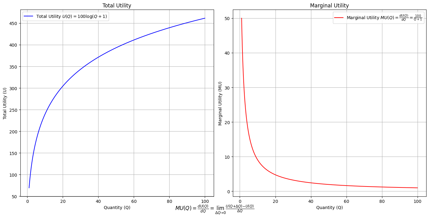
Utility: modal-interchange-nondiminishing
Show code cell source
import numpy as np
import matplotlib.pyplot as plt

# Define the total utility function U(Q)
def total_utility(Q):
    return 100 * np.log(Q + 1)  # Logarithmic utility function for illustration

# Define the marginal utility function MU(Q)
def marginal_utility(Q):
    return 100 / (Q + 1)  # Derivative of the total utility function

# Generate data
Q = np.linspace(1, 100, 500)  # Quantity range from 1 to 100
U = total_utility(Q)
MU = marginal_utility(Q)

# Plotting
plt.figure(figsize=(14, 7))

# Plot Total Utility
plt.subplot(1, 2, 1)
plt.plot(Q, U, label=r'Total Utility $U(Q) = 100 \log(Q + 1)$', color='blue')
plt.title('Total Utility')
plt.xlabel('Quantity (Q)')
plt.ylabel('Total Utility (U)')
plt.legend()
plt.grid(True)

# Plot Marginal Utility
plt.subplot(1, 2, 2)
plt.plot(Q, MU, label=r'Marginal Utility $MU(Q) = \frac{dU(Q)}{dQ} = \frac{100}{Q + 1}$', color='red')
plt.title('Marginal Utility')
plt.xlabel('Quantity (Q)')
plt.ylabel('Marginal Utility (MU)')
plt.legend()
plt.grid(True)

# Adding some calculus notation and Greek symbols
plt.figtext(0.5, 0.02, r"$MU(Q) = \frac{dU(Q)}{dQ} = \lim_{\Delta Q \to 0} \frac{U(Q + \Delta Q) - U(Q)}{\Delta Q}$", ha="center", fontsize=12)

plt.tight_layout()
plt.show()
Show code cell output
Essay in my \(R^3 class\). “At the end of the drama THE TRUTH — which has been overlooked, disregarded, scorned, and denied — prevails. And that is how we know the Drama is done.” Some scientists may be sloppy because they are — like all humans — interested in ordering & Curating the world rather than in rigorously demonstrating a truth#