Muse#
Everybody has got blood 🩸 on their hands - Bourdain
                    1. f(hz) Pretext
                                    \
                    2. S(t) Text -> 4. y:h'(t)=0;t(X'X).X'Y Context -> 5.b Hypertext -> 6. SV' Metatext
                                    /
                                    3. h(t) Subtext

What does it take to hit the spot?. Let’s investigate this from molecules to gastronomy, flavors, cuisines, tribes, experience. One should observe that “preparation” of the ingredients is ommitted (i.e., pretext). But its here precisely where we quite literally “draw blood” 🩸. Modern societies are mostly removed from this business, but a few engaged activists may find it disturbing and turn vegetarean. This is a misunderstanding of human history, society, and its underbelly. But lets have modal interchange: musicke.#
That dark child’s got a sharp ear. Teddy Riley’s genius lies in how he fused R&B with hip-hop, creating that infectious New Jack Swing groove that defined the late '80s and '90s. It’s rhythm-forward, a bass-heavy sound where every beat and syncopation drives the music, making people move. Groove is all about that tight rhythm section, and Teddy made it his playground.
On the other hand, Babyface’s mastery is in songwriting. He’s like a narrative architect, shaping emotions into melodies that hit the heart. His songs are more lyrical, intimate, and structured around storytelling and harmony. While Teddy makes you feel the beat, Babyface makes you feel the message.
That contrast makes them both essential, but in different dimensions of R&B. Perfect call by the dark child.
                        1. Phonetics
                                    \
                  2. Temperament -> 4. Chords -> 5. Groove -> 6. Arc
                                    /
                                    3. Modes
\(\mu\), Timing#
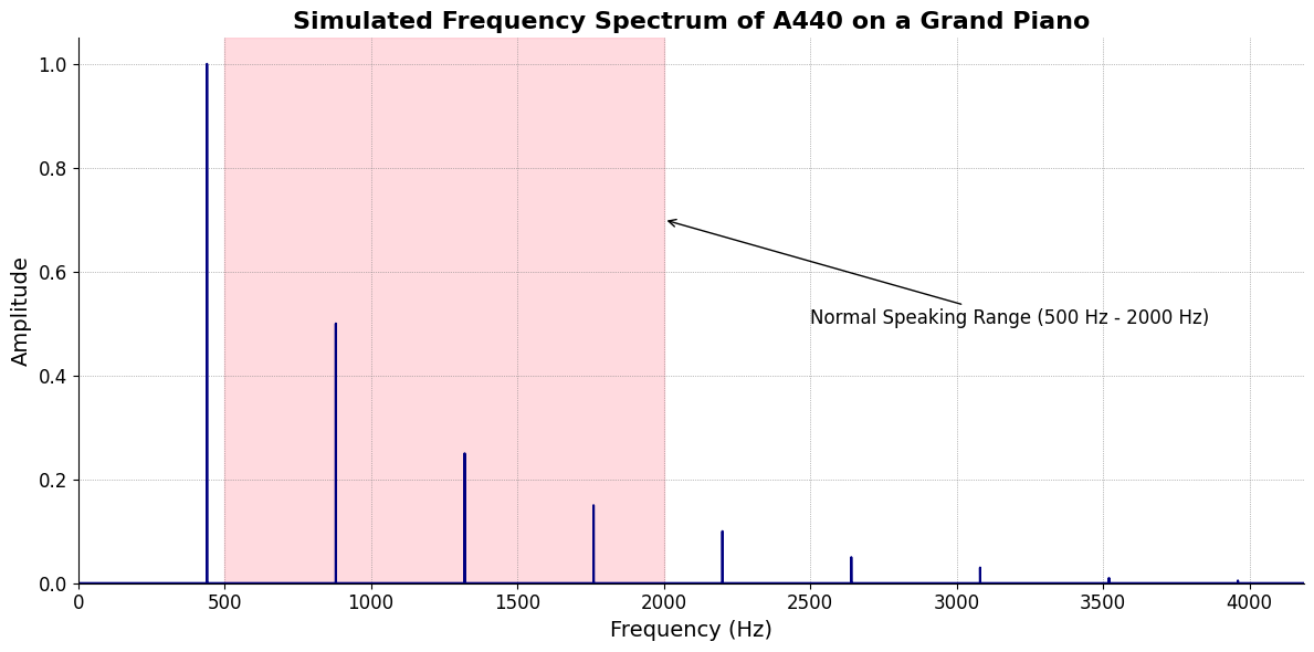
\(f(Hz)\) Phonetics
Show code cell source
import numpy as np
import matplotlib.pyplot as plt

# Parameters
sample_rate = 44100  # Hz
duration = 20.0       # seconds
A4_freq = 440.0      # Hz

# Time array
t = np.linspace(0, duration, int(sample_rate * duration), endpoint=False)

# Fundamental frequency (A4)
signal = np.sin(2 * np.pi * A4_freq * t)

# Adding overtones (harmonics)
harmonics = [2, 3, 4, 5, 6, 7, 8, 9]  # First few harmonics
amplitudes = [0.5, 0.25, 0.15, 0.1, 0.05, 0.03, 0.01, 0.005]  # Amplitudes for each harmonic

for i, harmonic in enumerate(harmonics):
    signal += amplitudes[i] * np.sin(2 * np.pi * A4_freq * harmonic * t)

# Perform FFT (Fast Fourier Transform)
N = len(signal)
yf = np.fft.fft(signal)
xf = np.fft.fftfreq(N, 1 / sample_rate)

# Plot the frequency spectrum
plt.figure(figsize=(12, 6))
plt.plot(xf[:N//2], 2.0/N * np.abs(yf[:N//2]), color='navy', lw=1.5)

# Aesthetics improvements
plt.title('Simulated Frequency Spectrum of A440 on a Grand Piano', fontsize=16, weight='bold')
plt.xlabel('Frequency (Hz)', fontsize=14)
plt.ylabel('Amplitude', fontsize=14)
plt.xlim(0, 4186)  # Limit to the highest frequency on a piano (C8)
plt.ylim(0, None)

# Shading the region for normal speaking range (approximately 85 Hz to 255 Hz)
plt.axvspan(500, 2000, color='lightpink', alpha=0.5)

# Annotate the shaded region
plt.annotate('Normal Speaking Range (500 Hz - 2000 Hz)',
             xy=(2000, 0.7), xycoords='data',
             xytext=(2500, 0.5), textcoords='data',
             arrowprops=dict(facecolor='black', arrowstyle="->"),
             fontsize=12, color='black')

# Remove top and right spines
plt.gca().spines['top'].set_visible(False)
plt.gca().spines['right'].set_visible(False)

# Customize ticks
plt.xticks(fontsize=12)
plt.yticks(fontsize=12)

# Light grid
plt.grid(color='grey', linestyle=':', linewidth=0.5)

# Show the plot
plt.tight_layout()
plt.show()
Show code cell output
\(\sigma\), Qualities#
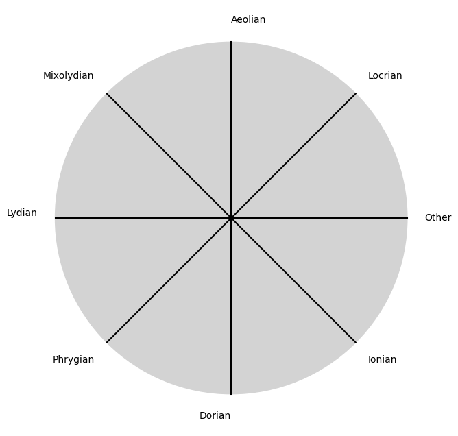
\((X'X)^T \cdot X'Y\) Modes
Show code cell source
import matplotlib.pyplot as plt
import numpy as np

# Clock settings; f(t) random disturbances making "paradise lost"
clock_face_radius = 1.0
number_of_ticks = 8
tick_labels = [
    "Ionian", "Dorian", "Phrygian", "Lydian",
    "Mixolydian", "Aeolian", "Locrian", "Other"
]

# Calculate the angles for each tick (in radians)
angles = np.linspace(0, 2 * np.pi, number_of_ticks, endpoint=False)
# Inverting the order to make it counterclockwise
angles = angles[::-1]

# Create figure and axis
fig, ax = plt.subplots(figsize=(8, 8))
ax.set_xlim(-1.2, 1.2)
ax.set_ylim(-1.2, 1.2)
ax.set_aspect('equal')

# Draw the clock face
clock_face = plt.Circle((0, 0), clock_face_radius, color='lightgrey', fill=True)
ax.add_patch(clock_face)

# Draw the ticks and labels
for angle, label in zip(angles, tick_labels):
    x = clock_face_radius * np.cos(angle)
    y = clock_face_radius * np.sin(angle)

    # Draw the tick
    ax.plot([0, x], [0, y], color='black')

    # Positioning the labels slightly outside the clock face
    label_x = 1.1 * clock_face_radius * np.cos(angle)
    label_y = 1.1 * clock_face_radius * np.sin(angle)

    # Adjusting label alignment based on its position
    ha = 'center'
    va = 'center'
    if np.cos(angle) > 0:
        ha = 'left'
    elif np.cos(angle) < 0:
        ha = 'right'
    if np.sin(angle) > 0:
        va = 'bottom'
    elif np.sin(angle) < 0:
        va = 'top'

    ax.text(label_x, label_y, label, horizontalalignment=ha, verticalalignment=va, fontsize=10)

# Remove axes
ax.axis('off')

# Show the plot
plt.show()
Show code cell output
\(\%\), Delivery#
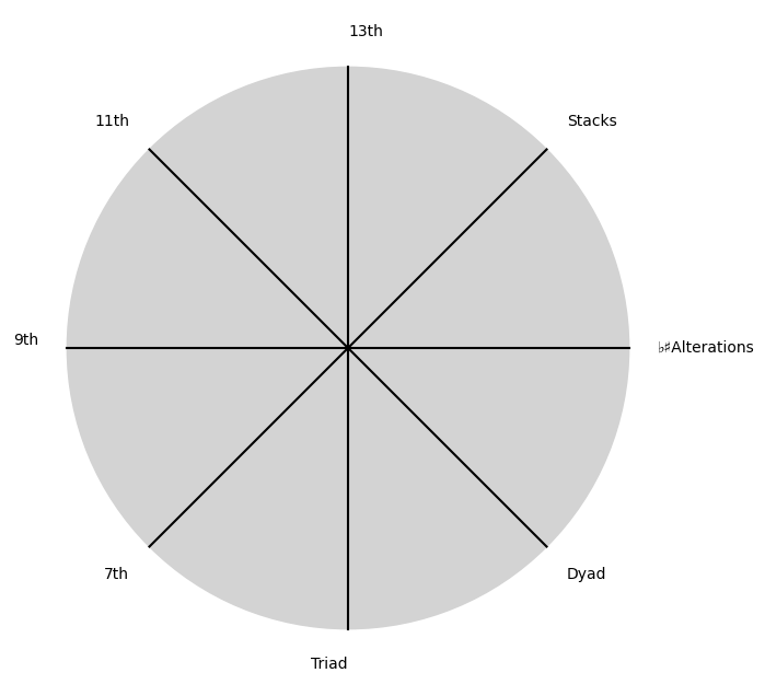
\(\beta\) NexToken
Show code cell source
import matplotlib.pyplot as plt
import numpy as np

# Clock settings; f(t) random disturbances making "paradise lost"
clock_face_radius = 1.0
number_of_ticks = 8
tick_labels = [
    "Dyad", "Triad", "7th", "9th",
    "11th", "13th", "Stacks", "♭♯Alterations"
]

# Calculate the angles for each tick (in radians)
angles = np.linspace(0, 2 * np.pi, number_of_ticks, endpoint=False)
# Inverting the order to make it counterclockwise
angles = angles[::-1]

# Create figure and axis
fig, ax = plt.subplots(figsize=(8, 8))
ax.set_xlim(-1.2, 1.2)
ax.set_ylim(-1.2, 1.2)
ax.set_aspect('equal')

# Draw the clock face
clock_face = plt.Circle((0, 0), clock_face_radius, color='lightgrey', fill=True)
ax.add_patch(clock_face)

# Draw the ticks and labels
for angle, label in zip(angles, tick_labels):
    x = clock_face_radius * np.cos(angle)
    y = clock_face_radius * np.sin(angle)

    # Draw the tick
    ax.plot([0, x], [0, y], color='black')

    # Positioning the labels slightly outside the clock face
    label_x = 1.1 * clock_face_radius * np.cos(angle)
    label_y = 1.1 * clock_face_radius * np.sin(angle)

    # Adjusting label alignment based on its position
    ha = 'center'
    va = 'center'
    if np.cos(angle) > 0:
        ha = 'left'
    elif np.cos(angle) < 0:
        ha = 'right'
    if np.sin(angle) > 0:
        va = 'bottom'
    elif np.sin(angle) < 0:
        va = 'top'

    ax.text(label_x, label_y, label, horizontalalignment=ha, verticalalignment=va, fontsize=10)

# Remove axes
ax.axis('off')

# Show the plot
plt.show()
Show code cell output
\(SV_t'\) Emotion 🩸