Superficiality#
Russians speaking French#
Note
When returning home with the children before luncheon, I met a cavalcade of our party riding to view some ruins. Two splendid carriages, magnificently horsed, with Mlle. Blanche, Maria Philipovna, and Polina Alexandrovna in one of them, and the Frenchman, the Englishman, and the General in attendance on horseback! The passers-by stopped to stare at them, for the effect was splendid—the General could not have improved upon it. I calculated that, with the 4000 francs which I had brought with me, added to what my patrons seemed already to have acquired, the party must be in possession of at least 7000 or 8000 francs—though that would be none too much for Mlle. Blanche, who, with her mother and the Frenchman, was also lodging in our hotel. The latter gentleman was called by the lacqueys “Monsieur le Comte,” and Mlle. Blanche’s mother was dubbed “Madame la Comtesse.” Perhaps in very truth they were “Comte et Comtesse.” - The Gambler
                     1. Phonetics
                                 \
                2. Temperament -> 4. Modes -> 5. NexToken -> 6. Emotion
                                 /
                                 3. Scales
Experience that is grounded in reality vs. Abstractions that are sort of in the cloud. Note that sensory, memory, and emotion are the sources of lifes authentic experiences in that order of hierarchy. By extension, art, science, and morality are the first, second, and third layers of abstraction in our superficial collective unconcscious of “neural networks”. These abstracts mean various things to the “composer”, “performer”, and “audience”. The composer might be unknown and the phrase clichéd. The performer is invariably an imposter of sorts. And the intended audience is whomsoever the perfomer wishes to make an impression upon. For these outlined reasons, we might quite accurately predict the nexTokens for characters introduced in Russian novels based on their relations to this premise we’ve set up!#
Russian novelists often include French characters and references to French culture in their works because of the significant cultural influence France exerted on Russia during the 18th and 19th centuries. This phenomenon can be traced back to several key historical and social factors:
Cultural Prestige and Emulation: For a long period, especially under the rule of Catherine the Great and her successors, French culture was seen as the pinnacle of sophistication and refinement in Europe. The Russian aristocracy, eager to align themselves with European ideals and fashions, heavily adopted French language, customs, and etiquette. French became the language of the Russian court and aristocracy; nobles often spoke French more fluently than Russian, and it was used for high society conversations, literature, and correspondence.
Napoleonic Wars and Romanticism: The Napoleonic Wars (1803–1815) brought both conflict and fascination. While Russia fought against Napoleon’s France, there was a paradoxical admiration for French culture. This duality—of seeing France as both a cultural model and a military adversary—created a rich narrative ground for Russian writers. Novels like Tolstoy’s War and Peace vividly depict this tension, showcasing Russian nobility’s conflicted feelings towards French culture amidst the realities of war and national identity.
Symbolism of Decadence and Contradiction: In Russian literature, French characters often symbolize a form of cultural or moral decadence. They can be portrayed as cosmopolitan, detached from local Russian realities, embodying a
superficialityor foreign influence that contrasts with the perceived depth andauthenticityof Russian character. This is particularly evident in works by Tolstoy, Dostoevsky, and Pushkin, where Frenchmen are sometimes used to represent the conflict between Russian values and Western European decadence.Language as a Social Marker: Using French in Russian novels also serves as a literary device to delineate social hierarchies and character depth. Characters who speak French fluently or prefer French culture often reflect the upper echelons of society or, conversely, a sense of disconnection from their Russian roots. In Anna Karenina, for example, Tolstoy frequently uses French to convey intimacy, politeness, or to mock social pretensions.
Historical Interactions and Marriages: There were many real historical interactions between Russians and French, including intermarriages among nobility. After the Russian defeat of Napoleon, many French soldiers stayed in Russia, contributing to cultural exchange and embedding French influence deeper into Russian society.
So, the prevalence of French and Frenchmen in Russian novels reflects a complex interplay of admiration, emulation, resistance, and critique, making it a rich theme for exploring identity, culture, and the tensions between tradition and modernity in Russian literature.
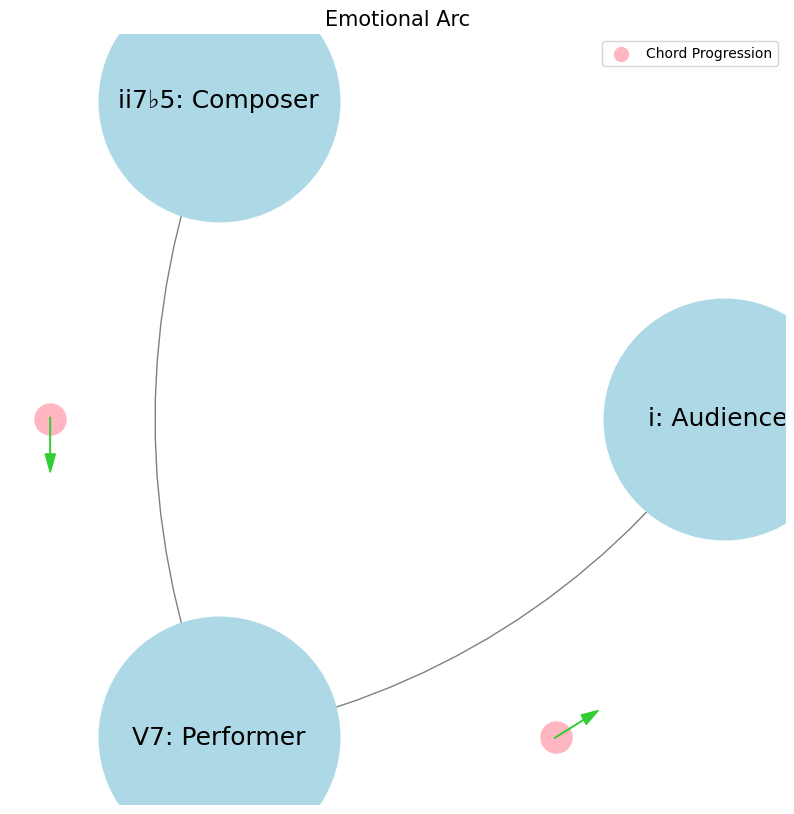
Show code cell source
import networkx as nx
import matplotlib.pyplot as plt
import numpy as np

# Create a directed graph
G = nx.DiGraph()

# Add nodes representing different levels (subatomic, atomic, cosmic, financial, social)
levels = ['i: Audiencex', 'ii7♭5: Composer', 'V7: Performer']

# Add nodes to the graph
G.add_nodes_from(levels)

# Add edges to represent the flow of information (photons)
# Assuming the flow is directional from more fundamental levels to more complex ones
edges = [('ii7♭5: Composer', 'V7: Performer'),
         ('V7: Performer', 'i: Audiencex'),]

# Add edges to the graph
G.add_edges_from(edges)

# Define positions for the nodes in a circular layout
pos = nx.circular_layout(G)

# Set the figure size (width, height)
plt.figure(figsize=(10, 10))  # Adjust the size as needed

# Draw the main nodes
nx.draw_networkx_nodes(G, pos, node_color='lightblue', node_size=30000)

# Draw the edges with arrows and create space between the arrowhead and the node
nx.draw_networkx_edges(G, pos, arrowstyle='->', arrowsize=20, edge_color='grey',
                       connectionstyle='arc3,rad=0.2')  # Adjust rad for more/less space

# Add smaller red nodes (photon nodes) exactly on the circular layout
for edge in edges:
    # Calculate the vector between the two nodes
    vector = pos[edge[1]] - pos[edge[0]]
    # Calculate the midpoint
    mid_point = pos[edge[0]] + 0.5 * vector
    # Normalize to ensure it's on the circle
    radius = np.linalg.norm(pos[edge[0]])
    mid_point_on_circle = mid_point / np.linalg.norm(mid_point) * radius
    # Draw the small red photon node at the midpoint on the circular layout
    plt.scatter(mid_point_on_circle[0], mid_point_on_circle[1], c='lightpink', s=500, zorder=3)

    # Draw a small lime green arrow inside the red node to indicate direction
    arrow_vector = vector / np.linalg.norm(vector) * 0.1  # Scale down arrow size
    plt.arrow(mid_point_on_circle[0] - 0.05 * arrow_vector[0],
              mid_point_on_circle[1] - 0.05 * arrow_vector[1],
              arrow_vector[0], arrow_vector[1],
              head_width=0.03, head_length=0.05, fc='limegreen', ec='limegreen', zorder=4)

# Draw the labels for the main nodes
nx.draw_networkx_labels(G, pos, font_size=18, font_weight='normal')

# Add a legend for "Photon/Info"
plt.scatter([], [], c='lightpink', s=100, label='Chord Progression')  # Empty scatter for the legend
plt.legend(scatterpoints=1, frameon=True, labelspacing=1, loc='upper right')

# Set the title and display the plot
plt.title('Emotional Arc', fontsize=15)
plt.axis('off')
plt.show()

These six topics cover all aspects of music. Challenge GPT-4o or any other ChatBot to find a issue that isn’t seamlessly subsumed by one of these headlines. Meanwhile, What could stop the Nvidia frenzy? Let’s test the resilience of this framework against an orthogonal topic! Lento (57 BPM) but “pocket” is Grave iambic meter (28.5 BPM) with a da-DUM “churchy” stamp, key scales are on B & E with G♯ minor/B Major modal interchange: VI-V7-i/v-I. One “must” see that these are transmutted ii-V7-i triadic progressions in two modes, with VI substitution in G♯ minor & ii deletion in E Major. Call-answer Gospel tokens are remeniscent of the cantor-audience in synagogue & these pockets are firmly rooted in the iambic meter. Given that the composer (R Kelly), performer (Marvin Sapp), and the audience (Black christians) are steeped in Gospel tradition, ministers of the word, and active recipients, this song is a tempest in a delicious teapot of soul & worship. Traditions are honored, craftsmanship is gifted, and Marvin Sapp is commended for reaching out to a “sinner”, through whom God has clearly worked a supreme miracle. (How did the framework perform?)#
                    1. Nodes
                            \
                2. Edges -> 4. Nodes -> 5. Edges -> 6. Scale
                            /
                            3. Scale
ii \(\mu\) Single Note#
ii\(f(t)\) Phonetics: 27 28Fractals\(440Hz \times 2^{\frac{N}{12}}\), \(S_0(t) \times e^{logHR}\), \(\frac{S N(d_1)}{K N(d_2)} \times e^{rT}\)
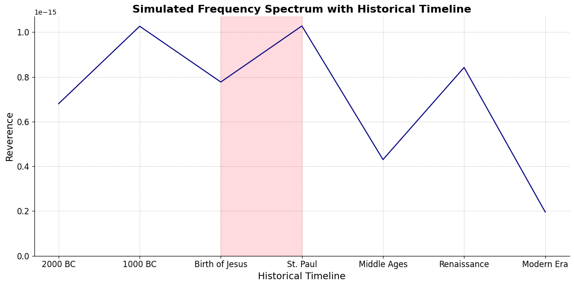
Show code cell source
import numpy as np
import matplotlib.pyplot as plt

# Parameters
sample_rate = 44100  # Hz
duration = 20.0       # seconds
A4_freq = 440.0      # Hz

# Time array
t = np.linspace(0, duration, int(sample_rate * duration), endpoint=False)

# Fundamental frequency (A4)
signal = np.sin(2 * np.pi * A4_freq * t)

# Adding overtones (harmonics)
harmonics = [2, 3, 4, 5, 6, 7, 8, 9]  # First few harmonics
amplitudes = [0.5, 0.25, 0.15, 0.1, 0.05, 0.03, 0.01, 0.005]  # Amplitudes for each harmonic

for i, harmonic in enumerate(harmonics):
    signal += amplitudes[i] * np.sin(2 * np.pi * A4_freq * harmonic * t)

# Perform FFT (Fast Fourier Transform)
N = len(signal)
yf = np.fft.fft(signal)
xf = np.fft.fftfreq(N, 1 / sample_rate)

# Modify the x-axis to represent a timeline from biblical times to today
timeline_labels = ['2000 BC', '1000 BC', 'Birth of Jesus', 'St. Paul', 'Middle Ages', 'Renaissance', 'Modern Era']
timeline_positions = np.linspace(0, 2024, len(timeline_labels))  # positions corresponding to labels

# Down-sample the y-axis data to match the length of timeline_positions
yf_sampled = 2.0 / N * np.abs(yf[:N // 2])
yf_downsampled = np.interp(timeline_positions, np.linspace(0, 2024, len(yf_sampled)), yf_sampled)

# Plot the frequency spectrum with modified x-axis
plt.figure(figsize=(12, 6))
plt.plot(timeline_positions, yf_downsampled, color='navy', lw=1.5)

# Aesthetics improvements
plt.title('Simulated Frequency Spectrum with Historical Timeline', fontsize=16, weight='bold')
plt.xlabel('Historical Timeline', fontsize=14)
plt.ylabel('Reverence', fontsize=14)
plt.xticks(timeline_positions, labels=timeline_labels, fontsize=12)
plt.ylim(0, None)

# Shading the period from Birth of Jesus to St. Paul
plt.axvspan(timeline_positions[2], timeline_positions[3], color='lightpink', alpha=0.5)

# Annotate the shaded region
plt.annotate('Birth of Jesus to St. Paul',
             xy=(timeline_positions[2], 0.7), xycoords='data',
             xytext=(timeline_positions[3] + 200, 0.5), textcoords='data',
             arrowprops=dict(facecolor='black', arrowstyle="->"),
             fontsize=12, color='black')

# Remove top and right spines
plt.gca().spines['top'].set_visible(False)
plt.gca().spines['right'].set_visible(False)

# Customize ticks
plt.xticks(timeline_positions, labels=timeline_labels, fontsize=12)
plt.yticks(fontsize=12)

# Light grid
plt.grid(color='grey', linestyle=':', linewidth=0.5)

# Show the plot
plt.tight_layout()


plt.show()
Show code cell output
V7\(S(t)\) Temperament: \(440Hz \times 2^{\frac{N}{12}}\)i\(h(t)\) Scales: 12 unique notes x 7 modes (Bach covers only x 2 modes in WTK)Soulja Boy has an incomplete Phrygian in PBS
Flamenco Phyrgian scale is equivalent to a Mixolydian
V9♭♯9♭13
V7 \(\sigma\) Chord Stacks#
\((X'X)^T \cdot X'Y\): Mode: \( \mathcal{F}(t) = \alpha \cdot \left( \prod_{i=1}^{n} \frac{\partial \psi_i(t)}{\partial t} \right) + \beta \cdot \int_{0}^{t} \left( \sum_{j=1}^{m} \frac{\partial \phi_j(\tau)}{\partial \tau} \right) d\tau\)
Show code cell source
import matplotlib.pyplot as plt
import numpy as np
# Clock settings; f(t) random disturbances making "paradise lost"
clock_face_radius = 1.0
number_of_ticks = 7
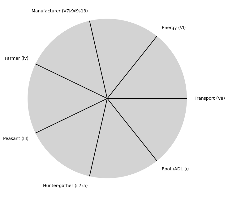
tick_labels = [
"Root-iADL (i)",
"Hunter-gather (ii7♭5)", "Peasant (III)", "Farmer (iv)", "Manufacturer (V7♭9♯9♭13)",
"Energy (VI)", "Transport (VII)"
]
# Calculate the angles for each tick (in radians)
angles = np.linspace(0, 2 * np.pi, number_of_ticks, endpoint=False)
# Inverting the order to make it counterclockwise
angles = angles[::-1]
# Create figure and axis
fig, ax = plt.subplots(figsize=(8, 8))
ax.set_xlim(-1.2, 1.2)
ax.set_ylim(-1.2, 1.2)
ax.set_aspect('equal')
# Draw the clock face
clock_face = plt.Circle((0, 0), clock_face_radius, color='lightgrey', fill=True)
ax.add_patch(clock_face)
# Draw the ticks and labels
for angle, label in zip(angles, tick_labels):
x = clock_face_radius * np.cos(angle)
y = clock_face_radius * np.sin(angle)
# Draw the tick
ax.plot([0, x], [0, y], color='black')
# Positioning the labels slightly outside the clock face
label_x = 1.1 * clock_face_radius * np.cos(angle)
label_y = 1.1 * clock_face_radius * np.sin(angle)
# Adjusting label alignment based on its position
ha = 'center'
va = 'center'
if np.cos(angle) > 0:
ha = 'left'
elif np.cos(angle) < 0:
ha = 'right'
if np.sin(angle) > 0:
va = 'bottom'
elif np.sin(angle) < 0:
va = 'top'
ax.text(label_x, label_y, label, horizontalalignment=ha, verticalalignment=va, fontsize=10)
# Remove axes
ax.axis('off')
# Show the plot
plt.show()
Show code cell output
i \(\%\) Predict NexToken#
\(\alpha, \beta, t\) NexToken: Attention, to the minor, major, dom7, and half-dim7 groupings, is all you need 29
Show code cell source
import matplotlib.pyplot as plt
import numpy as np
# Clock settings; f(t) random disturbances making "paradise lost"
clock_face_radius = 1.0
number_of_ticks = 9
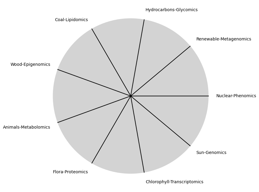
tick_labels = [
"Sun-Genomics", "Chlorophyll-Transcriptomics", "Flora-Proteomics", "Animals-Metabolomics",
"Wood-Epigenomics", "Coal-Lipidomics", "Hydrocarbons-Glycomics", "Renewable-Metagenomics", "Nuclear-Phenomics"
]
# Calculate the angles for each tick (in radians)
angles = np.linspace(0, 2 * np.pi, number_of_ticks, endpoint=False)
# Inverting the order to make it counterclockwise
angles = angles[::-1]
# Create figure and axis
fig, ax = plt.subplots(figsize=(8, 8))
ax.set_xlim(-1.2, 1.2)
ax.set_ylim(-1.2, 1.2)
ax.set_aspect('equal')
# Draw the clock face
clock_face = plt.Circle((0, 0), clock_face_radius, color='lightgrey', fill=True)
ax.add_patch(clock_face)
# Draw the ticks and labels
for angle, label in zip(angles, tick_labels):
x = clock_face_radius * np.cos(angle)
y = clock_face_radius * np.sin(angle)
# Draw the tick
ax.plot([0, x], [0, y], color='black')
# Positioning the labels slightly outside the clock face
label_x = 1.1 * clock_face_radius * np.cos(angle)
label_y = 1.1 * clock_face_radius * np.sin(angle)
# Adjusting label alignment based on its position
ha = 'center'
va = 'center'
if np.cos(angle) > 0:
ha = 'left'
elif np.cos(angle) < 0:
ha = 'right'
if np.sin(angle) > 0:
va = 'bottom'
elif np.sin(angle) < 0:
va = 'top'
ax.text(label_x, label_y, label, horizontalalignment=ha, verticalalignment=va, fontsize=10)
# Remove axes
ax.axis('off')
# Show the plot
plt.show()
Show code cell output
\(SV_t'\) Emotion: How many degrees of freedom does a composer, performer, or audience member have within a genre? We’ve roped in the audience as a reminder that music has no passive participants
Show code cell source
import numpy as np
import matplotlib.pyplot as plt
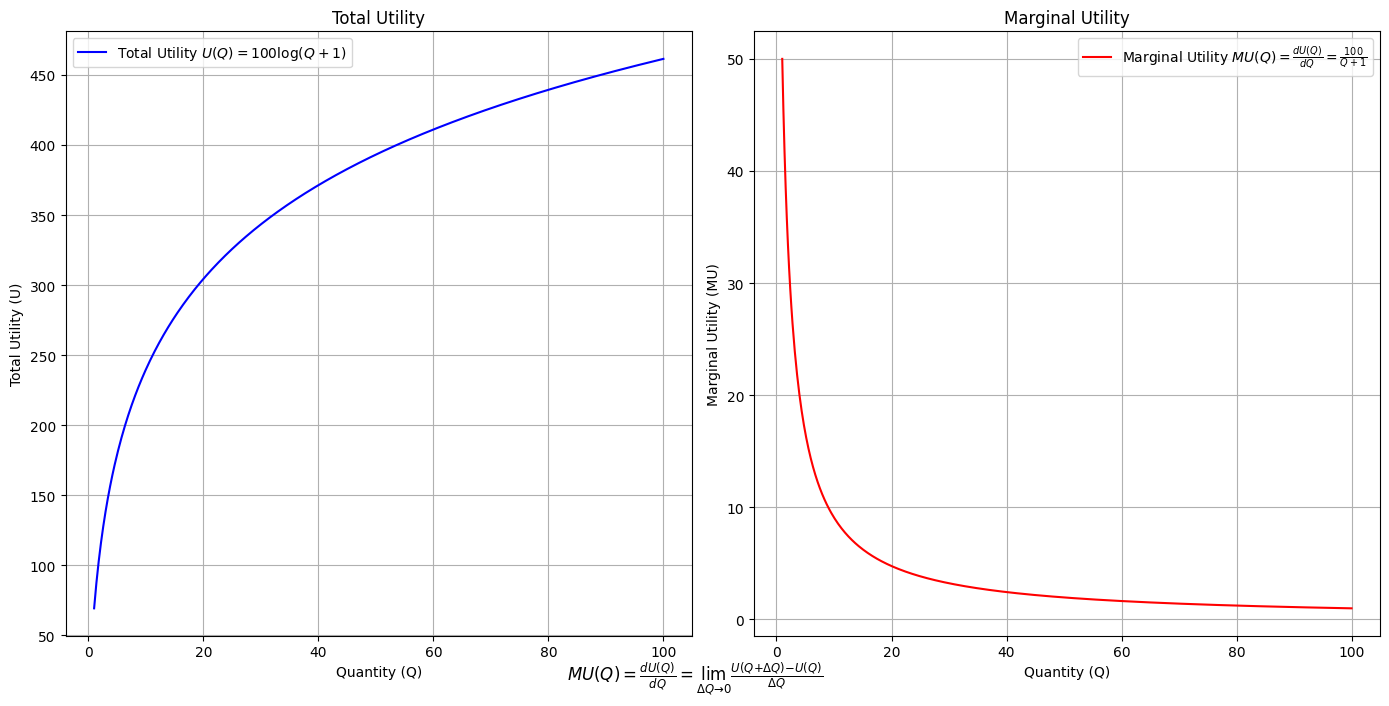
# Define the total utility function U(Q)
def total_utility(Q):
return 100 * np.log(Q + 1) # Logarithmic utility function for illustration
# Define the marginal utility function MU(Q)
def marginal_utility(Q):
return 100 / (Q + 1) # Derivative of the total utility function
# Generate data
Q = np.linspace(1, 100, 500) # Quantity range from 1 to 100
U = total_utility(Q)
MU = marginal_utility(Q)
# Plotting
plt.figure(figsize=(14, 7))
# Plot Total Utility
plt.subplot(1, 2, 1)
plt.plot(Q, U, label=r'Total Utility $U(Q) = 100 \log(Q + 1)$', color='blue')
plt.title('Total Utility')
plt.xlabel('Quantity (Q)')
plt.ylabel('Total Utility (U)')
plt.legend()
plt.grid(True)
# Plot Marginal Utility
plt.subplot(1, 2, 2)
plt.plot(Q, MU, label=r'Marginal Utility $MU(Q) = \frac{dU(Q)}{dQ} = \frac{100}{Q + 1}$', color='red')
plt.title('Marginal Utility')
plt.xlabel('Quantity (Q)')
plt.ylabel('Marginal Utility (MU)')
plt.legend()
plt.grid(True)
# Adding some calculus notation and Greek symbols
plt.figtext(0.5, 0.02, r"$MU(Q) = \frac{dU(Q)}{dQ} = \lim_{\Delta Q \to 0} \frac{U(Q + \Delta Q) - U(Q)}{\Delta Q}$", ha="center", fontsize=12)
plt.tight_layout()
plt.show()
Show code cell output
Show code cell source
import matplotlib.pyplot as plt
import numpy as np
from matplotlib.cm import ScalarMappable
from matplotlib.colors import LinearSegmentedColormap, PowerNorm

def gaussian(x, mean, std_dev, amplitude=1):
    return amplitude * np.exp(-0.9 * ((x - mean) / std_dev) ** 2)

def overlay_gaussian_on_line(ax, start, end, std_dev):
    x_line = np.linspace(start[0], end[0], 100)
    y_line = np.linspace(start[1], end[1], 100)
    mean = np.mean(x_line)
    y = gaussian(x_line, mean, std_dev, amplitude=std_dev)
    ax.plot(x_line + y / np.sqrt(2), y_line + y / np.sqrt(2), color='red', linewidth=2.5)

fig, ax = plt.subplots(figsize=(10, 10))

intervals = np.linspace(0, 100, 11)
custom_means = np.linspace(1, 23, 10)
custom_stds = np.linspace(.5, 10, 10)

# Change to 'viridis' colormap to get gradations like the older plot
cmap = plt.get_cmap('viridis')
norm = plt.Normalize(custom_stds.min(), custom_stds.max())
sm = ScalarMappable(cmap=cmap, norm=norm)
sm.set_array([])

median_points = []

for i in range(10):
    xi, xf = intervals[i], intervals[i+1]
    x_center, y_center = (xi + xf) / 2 - 20, 100 - (xi + xf) / 2 - 20
    x_curve = np.linspace(custom_means[i] - 3 * custom_stds[i], custom_means[i] + 3 * custom_stds[i], 200)
    y_curve = gaussian(x_curve, custom_means[i], custom_stds[i], amplitude=15)

    x_gauss = x_center + x_curve / np.sqrt(2)
    y_gauss = y_center + y_curve / np.sqrt(2) + x_curve / np.sqrt(2)

    ax.plot(x_gauss, y_gauss, color=cmap(norm(custom_stds[i])), linewidth=2.5)
    median_points.append((x_center + custom_means[i] / np.sqrt(2), y_center + custom_means[i] / np.sqrt(2)))

median_points = np.array(median_points)
ax.plot(median_points[:, 0], median_points[:, 1], '--', color='grey')
start_point = median_points[0, :]
end_point = median_points[-1, :]
overlay_gaussian_on_line(ax, start_point, end_point, 24)

ax.grid(True, linestyle='--', linewidth=0.5, color='grey')
ax.set_xlim(-30, 111)
ax.set_ylim(-20, 87)

# Create a new ScalarMappable with a reversed colormap just for the colorbar
cmap_reversed = plt.get_cmap('viridis').reversed()
sm_reversed = ScalarMappable(cmap=cmap_reversed, norm=norm)
sm_reversed.set_array([])

# Existing code for creating the colorbar
cbar = fig.colorbar(sm_reversed, ax=ax, shrink=1, aspect=90)

# Specify the tick positions you want to set
custom_tick_positions = [0.5, 5, 8, 10]  # example positions, you can change these
cbar.set_ticks(custom_tick_positions)

# Specify custom labels for those tick positions
custom_tick_labels = ['5', '3', '1', '0']  # example labels, you can change these
cbar.set_ticklabels(custom_tick_labels)

# Label for the colorbar
cbar.set_label(r'♭', rotation=0, labelpad=15, fontstyle='italic', fontsize=24)


# Label for the colorbar
cbar.set_label(r'♭', rotation=0, labelpad=15, fontstyle='italic', fontsize=24)


cbar.set_label(r'♭', rotation=0, labelpad=15, fontstyle='italic', fontsize=24)

# Add X and Y axis labels with custom font styles
ax.set_xlabel(r'Principal Component', fontstyle='italic')
ax.set_ylabel(r'Emotional State', rotation=0, fontstyle='italic', labelpad=15)

# Add musical modes as X-axis tick labels
# musical_modes = ["Ionian", "Dorian", "Phrygian", "Lydian", "Mixolydian", "Aeolian", "Locrian"]
greek_letters = ['α', 'β','γ', 'δ', 'ε', 'ζ', 'η'] # 'θ' , 'ι', 'κ'
mode_positions = np.linspace(ax.get_xlim()[0], ax.get_xlim()[1], len(greek_letters))
ax.set_xticks(mode_positions)
ax.set_xticklabels(greek_letters, rotation=0)

# Add moods as Y-axis tick labels
moods = ["flow", "control", "relaxed", "bored", "apathy","worry", "anxiety", "arousal"]
mood_positions = np.linspace(ax.get_ylim()[0], ax.get_ylim()[1], len(moods))
ax.set_yticks(mood_positions)
ax.set_yticklabels(moods)

# ... (rest of the code unchanged)


plt.tight_layout()
plt.show()
Show code cell output
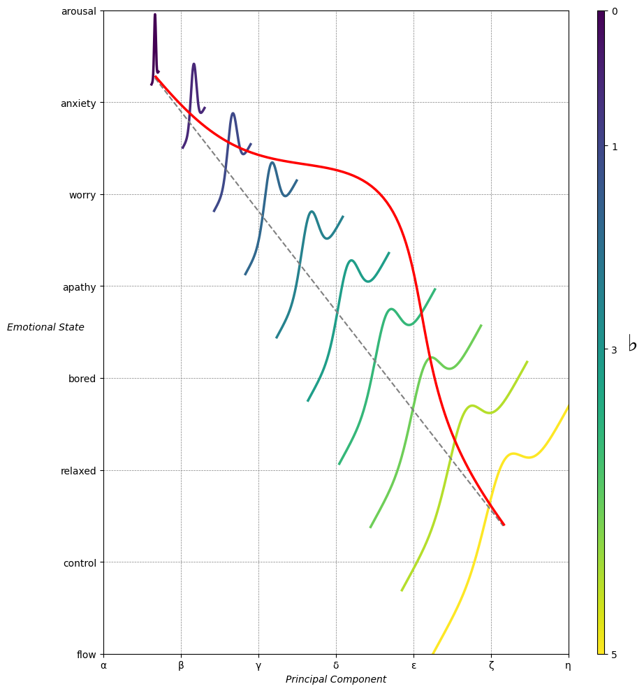
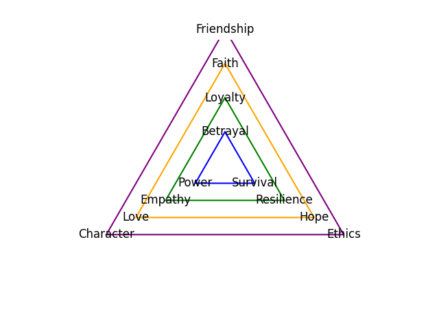
Emotion & Affect as Outcomes & Freewill. And the predictors \(\beta\) are MQ-TEA: Modes (ionian, dorian, phrygian, lydian, mixolydian, locrian), Qualities (major, minor, dominant, suspended, diminished, half-dimished, augmented), Tensions (7th), Extensions (9th, 11th, 13th), and Alterations (♯, ♭) 30#
                    1. f(t)
                           \
               2. S(t) ->  4. Nxb:t(X'X).X'Y -> 5. b -> 6. df
                           /
                           3. h(t)
Show code cell source
import pandas as pd

# Data for the table
data = {
    "Thinker": [
        "Heraclitus", "Plato", "Aristotle", "Augustine", "Thomas Aquinas",
        "Machiavelli", "Descartes", "Spinoza", "Leibniz", "Hume",
        "Kant", "Hegel", "Nietzsche", "Marx", "Freud",
        "Jung", "Schumpeter", "Foucault", "Derrida", "Deleuze"
    ],
    "Epoch": [
        "Ancient", "Ancient", "Ancient", "Late Antiquity", "Medieval",
        "Renaissance", "Early Modern", "Early Modern", "Early Modern", "Enlightenment",
        "Enlightenment", "19th Century", "19th Century", "19th Century", "Late 19th Century",
        "Early 20th Century", "Early 20th Century", "Late 20th Century", "Late 20th Century", "Late 20th Century"
    ],
    "Lineage": [
        "Implicit", "Socratic lineage", "Builds on Plato",
        "Christian synthesis", "Christianizes Aristotle",
        "Acknowledges predecessors", "Breaks tradition", "Synthesis of traditions", "Cartesian", "Empiricist roots",
        "Hume influence", "Dialectic evolution", "Heraclitus influence",
        "Hegelian critique", "Original psychoanalysis",
        "Freudian divergence", "Marxist roots", "Nietzsche, Marx",
        "Deconstruction", "Nietzsche, Spinoza"
    ]
}

# Create DataFrame
df = pd.DataFrame(data)

# Display DataFrame
print(df)
Show code cell output
           Thinker               Epoch                    Lineage
0       Heraclitus             Ancient                   Implicit
1            Plato             Ancient           Socratic lineage
2        Aristotle             Ancient            Builds on Plato
3        Augustine      Late Antiquity        Christian synthesis
4   Thomas Aquinas            Medieval    Christianizes Aristotle
5      Machiavelli         Renaissance  Acknowledges predecessors
6        Descartes        Early Modern           Breaks tradition
7          Spinoza        Early Modern    Synthesis of traditions
8          Leibniz        Early Modern                  Cartesian
9             Hume       Enlightenment           Empiricist roots
10            Kant       Enlightenment             Hume influence
11           Hegel        19th Century        Dialectic evolution
12       Nietzsche        19th Century       Heraclitus influence
13            Marx        19th Century          Hegelian critique
14           Freud   Late 19th Century    Original psychoanalysis
15            Jung  Early 20th Century        Freudian divergence
16      Schumpeter  Early 20th Century              Marxist roots
17        Foucault   Late 20th Century            Nietzsche, Marx
18         Derrida   Late 20th Century             Deconstruction
19         Deleuze   Late 20th Century         Nietzsche, Spinoza
Show code cell source
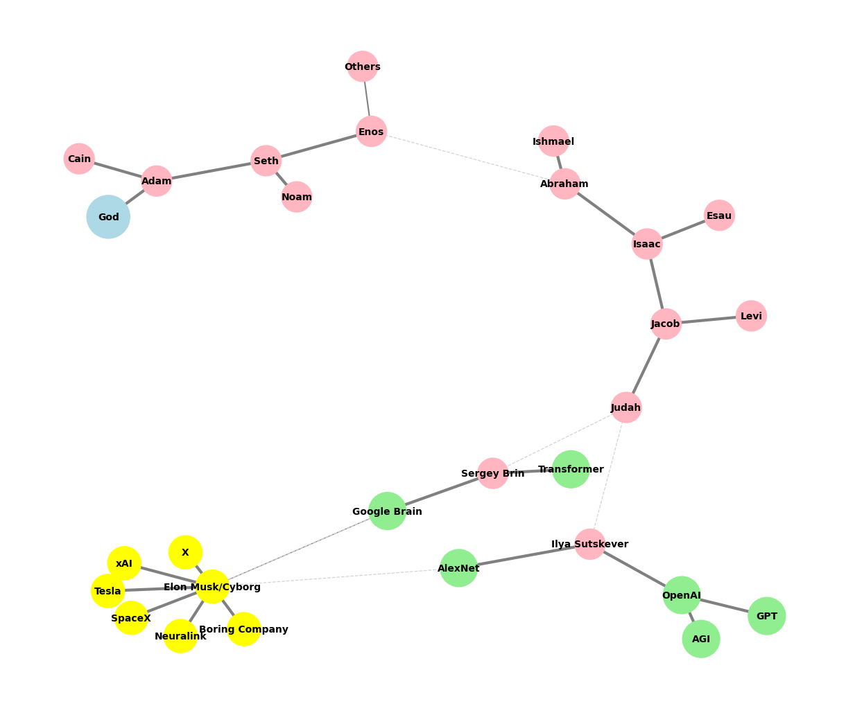
# Edited by X.AI

import networkx as nx
import matplotlib.pyplot as plt

def add_family_edges(G, parent, depth, names, scale=1, weight=1):
    if depth == 0 or not names:
        return parent

    children = names.pop(0)
    for child in children:
        # Assign weight based on significance or relationship strength
        edge_weight = weight if child not in ["Others"] else 0.5  # Example: 'Others' has less weight
        G.add_edge(parent, child, weight=edge_weight)

        if child not in ["GPT", "AGI", "Transformer", "Google Brain"]:
            add_family_edges(G, child, depth - 1, names, scale * 0.9, weight)

def create_extended_fractal_tree():
    G = nx.Graph()

    root = "God"
    G.add_node(root)

    adam = "Adam"
    G.add_edge(root, adam, weight=1)  # Default weight

    descendants = [
        ["Seth", "Cain"],
        ["Enos", "Noam"],
        ["Abraham", "Others"],
        ["Isaac", "Ishmael"],
        ["Jacob", "Esau"],
        ["Judah", "Levi"],
        ["Ilya Sutskever", "Sergey Brin"],
        ["OpenAI", "AlexNet"],
        ["GPT", "AGI"],
        ["Elon Musk/Cyborg"],
        ["Tesla", "SpaceX", "Boring Company", "Neuralink", "X", "xAI"]
    ]

    add_family_edges(G, adam, len(descendants), descendants)

    # Manually add edges for "Transformer" and "Google Brain" as children of Sergey Brin
    G.add_edge("Sergey Brin", "Transformer", weight=1)
    G.add_edge("Sergey Brin", "Google Brain", weight=1)

    # Manually add dashed edges to indicate "missing links"
    missing_link_edges = [
        ("Enos", "Abraham"),
        ("Judah", "Ilya Sutskever"),
        ("Judah", "Sergey Brin"),
        ("AlexNet", "Elon Musk/Cyborg"),
        ("Google Brain", "Elon Musk/Cyborg")
    ]

    # Add missing link edges with a lower weight
    for edge in missing_link_edges:
        G.add_edge(edge[0], edge[1], weight=0.3, style="dashed")

    return G, missing_link_edges

def visualize_tree(G, missing_link_edges, seed=42):
    plt.figure(figsize=(12, 10))
    pos = nx.spring_layout(G, seed=seed)

    # Define color maps for nodes
    color_map = []
    size_map = []
    for node in G.nodes():
        if node == "God":
            color_map.append("lightblue")
            size_map.append(2000)
        elif node in ["OpenAI", "AlexNet", "GPT", "AGI", "Google Brain", "Transformer"]:
            color_map.append("lightgreen")
            size_map.append(1500)
        elif node == "Elon Musk/Cyborg" or node in ["Tesla", "SpaceX", "Boring Company", "Neuralink", "X", "xAI"]:
            color_map.append("yellow")
            size_map.append(1200)
        else:
            color_map.append("lightpink")
            size_map.append(1000)

    # Draw all solid edges with varying thickness based on weight
    edge_widths = [G[u][v]['weight'] * 3 for (u, v) in G.edges() if (u, v) not in missing_link_edges]
    nx.draw(G, pos, edgelist=[(u, v) for (u, v) in G.edges() if (u, v) not in missing_link_edges],
            with_labels=True, node_size=size_map, node_color=color_map,
            font_size=10, font_weight="bold", edge_color="grey", width=edge_widths)

    # Draw the missing link edges as dashed lines with lower weight
    nx.draw_networkx_edges(
        G,
        pos,
        edgelist=missing_link_edges,
        style="dashed",
        edge_color="lightgray",
        width=[G[u][v]['weight'] * 3 for (u, v) in missing_link_edges]
    )

    plt.axis('off')

    # Save the plot as a PNG file in the specified directory
    plt.savefig("../figures/ultimate.png", format="png", dpi=300)

    plt.show()

# Generate and visualize the tree
G, missing_edges = create_extended_fractal_tree()
visualize_tree(G, missing_edges, seed=2)
Show code cell output