Sontata#
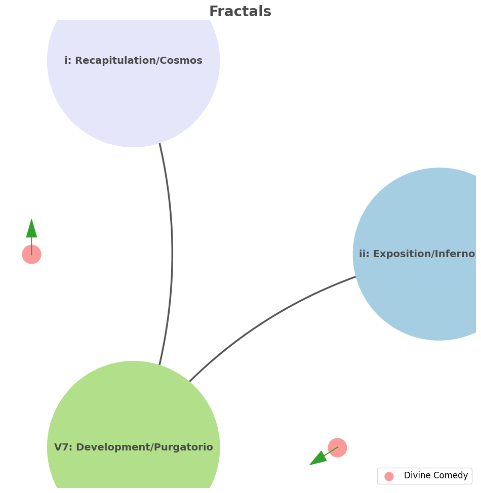
Fractals: Within & Between Movements#
                   1. Antiquarian
                                 \
                2. Monumental -> 4. History-Antiquarian -> 5. NexToken-Monumental -> 6. Emotion-Critical
                                 /
                                 3. Critical
Show code cell source
import networkx as nx
import matplotlib.pyplot as plt
import numpy as np

# Create a directed graph
G = nx.DiGraph()

# Add nodes representing different levels (subatomic, atomic, cosmic, financial, social)
levels = ['ii: Exposition/Infernoxxxxxxx', 'i: Recapitulation/Cosmos', 'V7: Development/Purgatorio']

# Add nodes to the graph
G.add_nodes_from(levels)

# Add edges to represent the flow of information (photons)
edges = [('ii: Exposition/Infernoxxxxxxx', 'V7: Development/Purgatorio'),
         ('V7: Development/Purgatorio', 'i: Recapitulation/Cosmos'),]

# Add edges to the graph
G.add_edges_from(edges)

# Define positions for the nodes in a circular layout
pos = nx.circular_layout(G)

# Set the figure size (width, height)
plt.figure(figsize=(12, 12))  # Slightly larger figure for better spacing

# Draw the main nodes with gradient color for a more dynamic look
node_colors = ['#A6CEE3', '#E6E6FA', '#B2DF8A'] ##E6E6FA, '#A6CEE3', '#1F78B4', '#B2DF8A'
nx.draw_networkx_nodes(G, pos, node_color=node_colors, node_size=60000)

# Draw the edges with arrows and space between the arrowhead and the node
nx.draw_networkx_edges(G, pos, arrowstyle='-|>', arrowsize=25, edge_color='#555555',
                       connectionstyle='arc3,rad=0.2', width=2.5)  # Thicker edges for emphasis

# Add smaller nodes (photon nodes) exactly on the circular layout
for edge in edges:
    # Calculate the vector between the two nodes
    vector = pos[edge[1]] - pos[edge[0]]
    # Calculate the midpoint
    mid_point = pos[edge[0]] + 0.5 * vector
    # Normalize to ensure it's on the circle
    radius = np.linalg.norm(pos[edge[0]])
    mid_point_on_circle = mid_point / np.linalg.norm(mid_point) * radius
    # Draw the small node at the midpoint on the circular layout
    plt.scatter(mid_point_on_circle[0], mid_point_on_circle[1], c='#FB9A99', s=700, zorder=3)

    # Draw a small arrow inside the node to indicate direction
    arrow_vector = vector / np.linalg.norm(vector) * 0.08  # Scale down arrow size
    plt.arrow(mid_point_on_circle[0] - 0.05 * arrow_vector[0],
              mid_point_on_circle[1] - 0.05 * arrow_vector[1],
              arrow_vector[0], arrow_vector[1],
              head_width=0.05, head_length=0.08, fc='#33A02C', ec='#33A02C', zorder=4)

# Draw the labels for the main nodes with enhanced font settings
nx.draw_networkx_labels(G, pos, font_size=14, font_weight='bold', font_color='#4A4A4A')

# Add a legend for "Photon/Info"
plt.scatter([], [], c='#FB9A99', s=150, label='Divine Comedy')  # Empty scatter for the legend
plt.legend(scatterpoints=1, frameon=True, labelspacing=1.2, loc='lower right', fontsize=12)

# Set the title with enhanced font settings and display the plot
plt.title('Fractals', fontsize=20, fontweight='bold', color='#4A4A4A')
plt.axis('off')
plt.show()

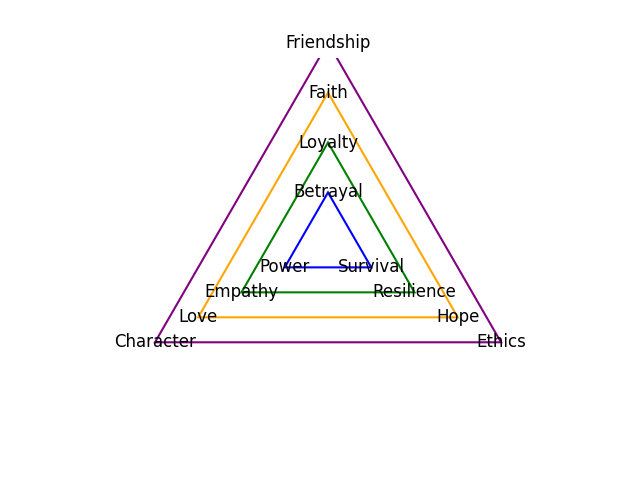
The Dudes Redemptive Arc: Loss of Rug, Struggle in Web, Return to Bowling. Life throws chaos at him—his rug is ruined, he’s pulled into a bizarre conspiracy—but The Dude simply abides. This acceptance without bitterness or despair might have earned Nietzsche’s admiration, as it reflects a life lived in harmony with fate. ii: God/Loss. Random, meaningless events; Such as mistaken identity; Departure from the mundane into chaos. V7: Man/Struggle. Aburd, Bizarre, Convoluted. i: Self/Return, Unchanged (no spiritual awakening in the “development” section “V7”); Back to old habits; Bowling, white russians, friends (we bet he got a new rug although Maude had recovered the second one)#
ii \(\mu\) Reverence/Amor Fati#
ii\(f(t)\) Paradiso/Bowl/Amor: 27 28Fractals\(440Hz \times 2^{\frac{N}{12}}\), \(S_0(t) \times e^{logHR}\), \(\frac{S N(d_1)}{K N(d_2)} \times e^{rT}\). The analogy you’ve drawn between “The Dude” from The Big Lebowski and the narrative arc of the nation of Israel is intriguing, particularly in how it aligns with the musical progression of ii-V7-i. The idea that both stories, despite their vastly different contexts, follow a similar structure is a testament to the universality of certain narrative forms.
Show code cell source
import numpy as np
import matplotlib.pyplot as plt

# Parameters
sample_rate = 44100  # Hz
duration = 20.0       # seconds
A4_freq = 440.0      # Hz

# Time array
t = np.linspace(0, duration, int(sample_rate * duration), endpoint=False)

# Fundamental frequency (A4)
signal = np.sin(2 * np.pi * A4_freq * t)

# Adding overtones (harmonics)
harmonics = [2, 3, 4, 5, 6, 7, 8, 9]  # First few harmonics
amplitudes = [0.5, 0.25, 0.15, 0.1, 0.05, 0.03, 0.01, 0.005]  # Amplitudes for each harmonic

for i, harmonic in enumerate(harmonics):
    signal += amplitudes[i] * np.sin(2 * np.pi * A4_freq * harmonic * t)

# Perform FFT (Fast Fourier Transform)
N = len(signal)
yf = np.fft.fft(signal)
xf = np.fft.fftfreq(N, 1 / sample_rate)

# Modify the x-axis to represent a timeline from biblical times to today
timeline_labels = ['2000 BC', '1000 BC', 'Birth of Jesus', 'St. Paul', 'Middle Ages', 'Renaissance', 'Modern Era']
timeline_positions = np.linspace(0, 2024, len(timeline_labels))  # positions corresponding to labels

# Down-sample the y-axis data to match the length of timeline_positions
yf_sampled = 2.0 / N * np.abs(yf[:N // 2])
yf_downsampled = np.interp(timeline_positions, np.linspace(0, 2024, len(yf_sampled)), yf_sampled)

# Plot the frequency spectrum with modified x-axis
plt.figure(figsize=(12, 6))
plt.plot(timeline_positions, yf_downsampled, color='navy', lw=1.5)

# Aesthetics improvements
plt.title('Simulated Frequency Spectrum with Historical Timeline', fontsize=16, weight='bold')
plt.xlabel('Historical Timeline', fontsize=14)
plt.ylabel('Reverence', fontsize=14)
plt.xticks(timeline_positions, labels=timeline_labels, fontsize=12)
plt.ylim(0, None)

# Shading the period from Birth of Jesus to St. Paul
plt.axvspan(timeline_positions[2], timeline_positions[3], color='lightpink', alpha=0.5)

# Annotate the shaded region
plt.annotate('Birth of Jesus to St. Paul',
             xy=(timeline_positions[2], 0.7), xycoords='data',
             xytext=(timeline_positions[3] + 200, 0.5), textcoords='data',
             arrowprops=dict(facecolor='black', arrowstyle="->"),
             fontsize=12, color='black')

# Remove top and right spines
plt.gca().spines['top'].set_visible(False)
plt.gca().spines['right'].set_visible(False)

# Customize ticks
plt.xticks(timeline_positions, labels=timeline_labels, fontsize=12)
plt.yticks(fontsize=12)

# Light grid
plt.grid(color='grey', linestyle=':', linewidth=0.5)

# Show the plot
plt.tight_layout()


plt.show()
Show code cell output
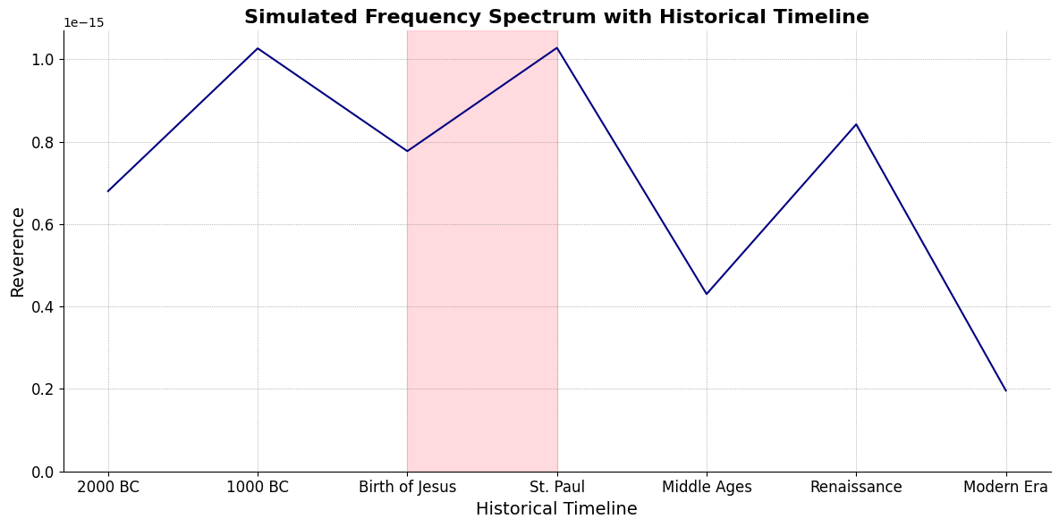
Inferno/Rug(Renaissance -> Modern Era)Purgatorio/Toe(St. Paul <- Middle Ages)
V7\(S(t)\) Struggle/Eternal:ChainsEqual temperament, Proportional hazards, Homoskedastic volatility. In The Big Lebowski, the loss of the rug (ii) triggers the departure from the mundane into chaos—a kind of desert where nothing makes sense (V7). The Dude navigates this chaos with his laid-back attitude, and after a series of bizarre and often absurd encounters, he returns to his life, seemingly unchanged but somehow richer in experience (i). This return isn’t just to the literal life of bowling and White Russians but to a deeper acceptance of the absurdity of life, which is, in itself, a kind of resolution.

i\(h(t)\) Deliverance/Übermench:Equations26 Inherited (Antiquary), Added (Challenges), Overcome (Gracefully). Similarly, the biblical narrative of Israel follows a journey from the bondage of Egypt (ii), through the trials of the desert (V7), and finally to the promised land of Canaan (i). This arc is not just a physical journey but a spiritual one, reflecting the struggles and eventual reconciliation with divine purpose.

V7 \(\sigma\) Struggle/Eternal#
\((X'X)^T \cdot X'Y\): Mode: \( \mathcal{F}(t) = \alpha \cdot \left( \prod_{i=1}^{n} \frac{\partial \psi_i(t)}{\partial t} \right) + \beta \cdot \int_{0}^{t} \left( \sum_{j=1}^{m} \frac{\partial \phi_j(\tau)}{\partial \tau} \right) d\tau\) .
Accidentsmezcal, mezclar, mezcaline. Just a reminder that accidents can mislead one to perceive patterns where there’re none. That said, \(\alpha\) & \(\beta\) are emerging as parameters representing the highest hierarchy in this multilevel dataset. They stand for determined (chains) & freewill (wiggle-room), which, with iteration, becomes substantive regardless of the degrees-of-freedom. The fractal nature of these narratives—the idea that they repeat on different scales and in different contexts—speaks to the deep resonance of the ii-V7-i progression in storytelling. Great art, as you rightly point out, often eschews heavy exposition, plunging us directly into the middle of things (“in medias res”). It trusts the audience to catch up, to fill in the gaps, and to experience the challenges (V7) before arriving at a form of resolution (i).
Show code cell source
import matplotlib.pyplot as plt
import numpy as np
# Clock settings; f(t) random disturbances making "paradise lost"
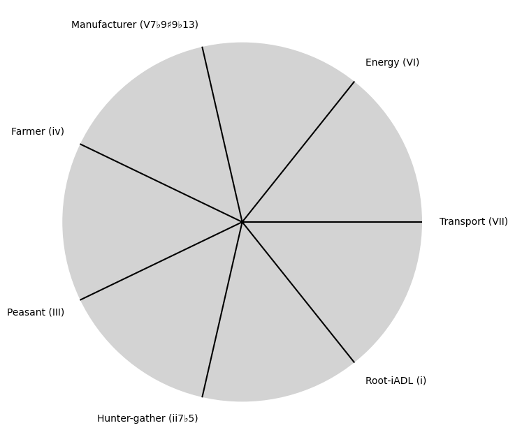
clock_face_radius = 1.0
number_of_ticks = 7
tick_labels = [
"Root-iADL (i)",
"Hunter-gather (ii7♭5)", "Peasant (III)", "Farmer (iv)", "Manufacturer (V7♭9♯9♭13)",
"Energy (VI)", "Transport (VII)"
]
# Calculate the angles for each tick (in radians)
angles = np.linspace(0, 2 * np.pi, number_of_ticks, endpoint=False)
# Inverting the order to make it counterclockwise
angles = angles[::-1]
# Create figure and axis
fig, ax = plt.subplots(figsize=(8, 8))
ax.set_xlim(-1.2, 1.2)
ax.set_ylim(-1.2, 1.2)
ax.set_aspect('equal')
# Draw the clock face
clock_face = plt.Circle((0, 0), clock_face_radius, color='lightgrey', fill=True)
ax.add_patch(clock_face)
# Draw the ticks and labels
for angle, label in zip(angles, tick_labels):
x = clock_face_radius * np.cos(angle)
y = clock_face_radius * np.sin(angle)
# Draw the tick
ax.plot([0, x], [0, y], color='black')
# Positioning the labels slightly outside the clock face
label_x = 1.1 * clock_face_radius * np.cos(angle)
label_y = 1.1 * clock_face_radius * np.sin(angle)
# Adjusting label alignment based on its position
ha = 'center'
va = 'center'
if np.cos(angle) > 0:
ha = 'left'
elif np.cos(angle) < 0:
ha = 'right'
if np.sin(angle) > 0:
va = 'bottom'
elif np.sin(angle) < 0:
va = 'top'
ax.text(label_x, label_y, label, horizontalalignment=ha, verticalalignment=va, fontsize=10)
# Remove axes
ax.axis('off')
# Show the plot
plt.show()
Show code cell output
i \(\%\) Deliverance/Übermench#
\(\alpha, \beta, t\) NexToken:
Parametrizedthe processes that are responsible for human behavior as a moiety of “chains” with some “wiggle-room”. In contrast, popular entertainment often feels the need to spoon-feed the audience, rushing through exposition to get to the action. This approach can sometimes dilute the narrative impact, reducing the story to mere spectacle rather than allowing the audience to experience the full emotional and intellectual journey that more nuanced art offers.
Show code cell source
import matplotlib.pyplot as plt
import numpy as np
# Clock settings; f(t) random disturbances making "paradise lost"
clock_face_radius = 1.0
number_of_ticks = 9
tick_labels = [
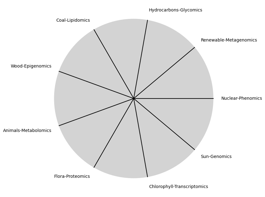
"Sun-Genomics", "Chlorophyll-Transcriptomics", "Flora-Proteomics", "Animals-Metabolomics",
"Wood-Epigenomics", "Coal-Lipidomics", "Hydrocarbons-Glycomics", "Renewable-Metagenomics", "Nuclear-Phenomics"
]
# Calculate the angles for each tick (in radians)
angles = np.linspace(0, 2 * np.pi, number_of_ticks, endpoint=False)
# Inverting the order to make it counterclockwise
angles = angles[::-1]
# Create figure and axis
fig, ax = plt.subplots(figsize=(8, 8))
ax.set_xlim(-1.2, 1.2)
ax.set_ylim(-1.2, 1.2)
ax.set_aspect('equal')
# Draw the clock face
clock_face = plt.Circle((0, 0), clock_face_radius, color='lightgrey', fill=True)
ax.add_patch(clock_face)
# Draw the ticks and labels
for angle, label in zip(angles, tick_labels):
x = clock_face_radius * np.cos(angle)
y = clock_face_radius * np.sin(angle)
# Draw the tick
ax.plot([0, x], [0, y], color='black')
# Positioning the labels slightly outside the clock face
label_x = 1.1 * clock_face_radius * np.cos(angle)
label_y = 1.1 * clock_face_radius * np.sin(angle)
# Adjusting label alignment based on its position
ha = 'center'
va = 'center'
if np.cos(angle) > 0:
ha = 'left'
elif np.cos(angle) < 0:
ha = 'right'
if np.sin(angle) > 0:
va = 'bottom'
elif np.sin(angle) < 0:
va = 'top'
ax.text(label_x, label_y, label, horizontalalignment=ha, verticalalignment=va, fontsize=10)
# Remove axes
ax.axis('off')
# Show the plot
plt.show()
Show code cell output
\(SV_t'\) Emotion:
Ultimategoal of life, where all the outlined elements converge. It’s the subjective experience or illusion that life should evoke, the connection between god, neighbor, and self.Thusminor chords may represent “loose” chains whereas dom7 & half-dim are somewhat “tight” chains constraining us to our sense of the nextoken. Your reference to fractals also suggests that these patterns are not just confined to grand narratives but can be found in the minutiae of everyday life, in every small departure, struggle, and return we experience. It’s a beautiful way to think about the structure of stories and the lives they depict—each moment a microcosm of the whole, each resolution a return to a deeper understanding of self and the world.
Show code cell source
import numpy as np
import matplotlib.pyplot as plt
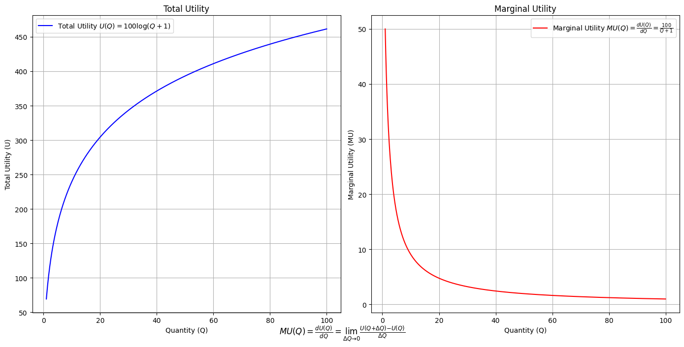
# Define the total utility function U(Q)
def total_utility(Q):
return 100 * np.log(Q + 1) # Logarithmic utility function for illustration
# Define the marginal utility function MU(Q)
def marginal_utility(Q):
return 100 / (Q + 1) # Derivative of the total utility function
# Generate data
Q = np.linspace(1, 100, 500) # Quantity range from 1 to 100
U = total_utility(Q)
MU = marginal_utility(Q)
# Plotting
plt.figure(figsize=(14, 7))
# Plot Total Utility
plt.subplot(1, 2, 1)
plt.plot(Q, U, label=r'Total Utility $U(Q) = 100 \log(Q + 1)$', color='blue')
plt.title('Total Utility')
plt.xlabel('Quantity (Q)')
plt.ylabel('Total Utility (U)')
plt.legend()
plt.grid(True)
# Plot Marginal Utility
plt.subplot(1, 2, 2)
plt.plot(Q, MU, label=r'Marginal Utility $MU(Q) = \frac{dU(Q)}{dQ} = \frac{100}{Q + 1}$', color='red')
plt.title('Marginal Utility')
plt.xlabel('Quantity (Q)')
plt.ylabel('Marginal Utility (MU)')
plt.legend()
plt.grid(True)
# Adding some calculus notation and Greek symbols
plt.figtext(0.5, 0.02, r"$MU(Q) = \frac{dU(Q)}{dQ} = \lim_{\Delta Q \to 0} \frac{U(Q + \Delta Q) - U(Q)}{\Delta Q}$", ha="center", fontsize=12)
plt.tight_layout()
plt.show()
Show code cell output
Show code cell source
import matplotlib.pyplot as plt
import numpy as np
from matplotlib.cm import ScalarMappable
from matplotlib.colors import LinearSegmentedColormap, PowerNorm

def gaussian(x, mean, std_dev, amplitude=1):
    return amplitude * np.exp(-0.9 * ((x - mean) / std_dev) ** 2)

def overlay_gaussian_on_line(ax, start, end, std_dev):
    x_line = np.linspace(start[0], end[0], 100)
    y_line = np.linspace(start[1], end[1], 100)
    mean = np.mean(x_line)
    y = gaussian(x_line, mean, std_dev, amplitude=std_dev)
    ax.plot(x_line + y / np.sqrt(2), y_line + y / np.sqrt(2), color='red', linewidth=2.5)

fig, ax = plt.subplots(figsize=(10, 10))

intervals = np.linspace(0, 100, 11)
custom_means = np.linspace(1, 23, 10)
custom_stds = np.linspace(.5, 10, 10)

# Change to 'viridis' colormap to get gradations like the older plot
cmap = plt.get_cmap('viridis')
norm = plt.Normalize(custom_stds.min(), custom_stds.max())
sm = ScalarMappable(cmap=cmap, norm=norm)
sm.set_array([])

median_points = []

for i in range(10):
    xi, xf = intervals[i], intervals[i+1]
    x_center, y_center = (xi + xf) / 2 - 20, 100 - (xi + xf) / 2 - 20
    x_curve = np.linspace(custom_means[i] - 3 * custom_stds[i], custom_means[i] + 3 * custom_stds[i], 200)
    y_curve = gaussian(x_curve, custom_means[i], custom_stds[i], amplitude=15)

    x_gauss = x_center + x_curve / np.sqrt(2)
    y_gauss = y_center + y_curve / np.sqrt(2) + x_curve / np.sqrt(2)

    ax.plot(x_gauss, y_gauss, color=cmap(norm(custom_stds[i])), linewidth=2.5)
    median_points.append((x_center + custom_means[i] / np.sqrt(2), y_center + custom_means[i] / np.sqrt(2)))

median_points = np.array(median_points)
ax.plot(median_points[:, 0], median_points[:, 1], '--', color='grey')
start_point = median_points[0, :]
end_point = median_points[-1, :]
overlay_gaussian_on_line(ax, start_point, end_point, 24)

ax.grid(True, linestyle='--', linewidth=0.5, color='grey')
ax.set_xlim(-30, 111)
ax.set_ylim(-20, 87)

# Create a new ScalarMappable with a reversed colormap just for the colorbar
cmap_reversed = plt.get_cmap('viridis').reversed()
sm_reversed = ScalarMappable(cmap=cmap_reversed, norm=norm)
sm_reversed.set_array([])

# Existing code for creating the colorbar
cbar = fig.colorbar(sm_reversed, ax=ax, shrink=1, aspect=90)

# Specify the tick positions you want to set
custom_tick_positions = [0.5, 5, 8, 10]  # example positions, you can change these
cbar.set_ticks(custom_tick_positions)

# Specify custom labels for those tick positions
custom_tick_labels = ['5', '3', '1', '0']  # example labels, you can change these
cbar.set_ticklabels(custom_tick_labels)

# Label for the colorbar
cbar.set_label(r'♭', rotation=0, labelpad=15, fontstyle='italic', fontsize=24)


# Label for the colorbar
cbar.set_label(r'♭', rotation=0, labelpad=15, fontstyle='italic', fontsize=24)


cbar.set_label(r'♭', rotation=0, labelpad=15, fontstyle='italic', fontsize=24)

# Add X and Y axis labels with custom font styles
ax.set_xlabel(r'Principal Component', fontstyle='italic')
ax.set_ylabel(r'Emotional State', rotation=0, fontstyle='italic', labelpad=15)

# Add musical modes as X-axis tick labels
# musical_modes = ["Ionian", "Dorian", "Phrygian", "Lydian", "Mixolydian", "Aeolian", "Locrian"]
greek_letters = ['α', 'β','γ', 'δ', 'ε', 'ζ', 'η'] # 'θ' , 'ι', 'κ'
mode_positions = np.linspace(ax.get_xlim()[0], ax.get_xlim()[1], len(greek_letters))
ax.set_xticks(mode_positions)
ax.set_xticklabels(greek_letters, rotation=0)

# Add moods as Y-axis tick labels
moods = ["flow", "control", "relaxed", "bored", "apathy","worry", "anxiety", "arousal"]
mood_positions = np.linspace(ax.get_ylim()[0], ax.get_ylim()[1], len(moods))
ax.set_yticks(mood_positions)
ax.set_yticklabels(moods)

# ... (rest of the code unchanged)


plt.tight_layout()
plt.show()
Show code cell output
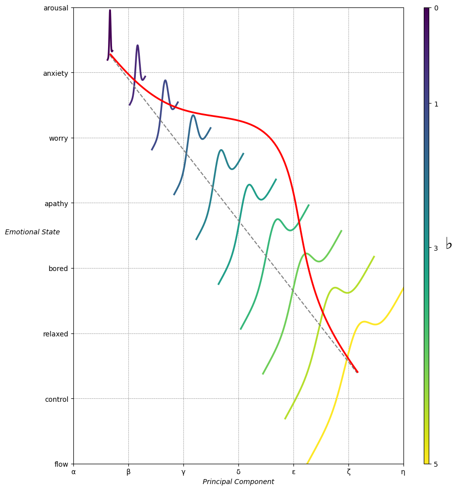
Emotion & Affect as Outcomes & Freewill. And the predictors \(\beta\) are MQ-TEA: Modes (ionian, dorian, phrygian, lydian, mixolydian, locrian), Qualities (major, minor, dominant, suspended, diminished, half-dimished, augmented), Tensions (7th), Extensions (9th, 11th, 13th), and Alterations (♯, ♭) 30#
                    1. f(t)
                           \
               2. S(t) ->  4. Nxb:t(X'X).X'Y -> 5. b -> 6. df
                           /
                           3. h(t)