Film#
Hasta Luego, Amigo!#
                    1. Pretext
                                  \
          2. Subtext ->  4. Context -> 5. Hypertext -> 6. Metatext
                                  /
                                 3. Text
Text: The straightforward narrative, dialogue, and events that unfold—what’s literally happening.
Subtext: The underlying themes, emotions, and tensions not explicitly stated. This includes what’s hinted at through silence, body language, or visuals.
Context: The socio-political, cultural, or historical backdrop that informs the film. This encompasses the external environment in which the film was made or set.
Pretext: The motivations and intentions behind the film’s creation. Why was this film made, and how does that impact its message or form? Think of the director’s intentions, the film’s ideological positioning, or the production circumstances.
Hypertext: The intertextual references or connections the film makes to other works, genres, or ideas—both within cinema and beyond. This includes homage, pastiche, and allusion.
Metatext: This involves the film’s self-awareness and commentary on its own creation or the medium of film itself. It’s when a movie steps outside of its narrative to reflect on filmmaking, storytelling, or its place in the cinematic world (like Adaptation or Deadpool).
From the point of view of form, the
archetypeof all the arts is the art of the musician.-Oscar Wilde 24
                   1. Phonetics
                               \
             2. Temperament -> 4. Modes -> 5. NexToken -> 6. Emotion
                               /
                               3. Scales

For a few dollars more. It is my belief that “Hasta luego, amigo!” from Sergio Leone’s film was misappropriated in David Cameron’s Terminator to get the non-idiomatic “Hasta lavista, baby!”. The timing, tone, & delivery is imitated within a very similar context#
\(\mu\) Lost-city#
\(f(t)\) Phonetics: This covers the basic sounds, the raw auditory elements that form the building blocks of music. It’s the point where vibration meets perception. Woody Allen’s kamikazi-archetype, with a much broader spectrum of “vibes”. Typically on lithium to keep bounds within pink zone below
Show code cell source
import numpy as np
import matplotlib.pyplot as plt

# Parameters
sample_rate = 44100  # Hz
duration = 20.0       # seconds
A4_freq = 440.0      # Hz

# Time array
t = np.linspace(0, duration, int(sample_rate * duration), endpoint=False)

# Fundamental frequency (A4)
signal = np.sin(2 * np.pi * A4_freq * t)

# Adding overtones (harmonics)
harmonics = [2, 3, 4, 5, 6, 7, 8, 9]  # First few harmonics
amplitudes = [0.5, 0.25, 0.15, 0.1, 0.05, 0.03, 0.01, 0.005]  # Amplitudes for each harmonic

for i, harmonic in enumerate(harmonics):
    signal += amplitudes[i] * np.sin(2 * np.pi * A4_freq * harmonic * t)

# Perform FFT (Fast Fourier Transform)
N = len(signal)
yf = np.fft.fft(signal)
xf = np.fft.fftfreq(N, 1 / sample_rate)

# Plot the frequency spectrum
plt.figure(figsize=(12, 6))
plt.plot(xf[:N//2], 2.0/N * np.abs(yf[:N//2]), color='navy', lw=1.5)

# Aesthetics improvements
plt.title('Simulated Frequency Spectrum of A440 on a Grand Piano', fontsize=16, weight='bold')
plt.xlabel('Frequency (Hz)', fontsize=14)
plt.ylabel('Amplitude', fontsize=14)
plt.xlim(0, 4186)  # Limit to the highest frequency on a piano (C8)
plt.ylim(0, None)

# Shading the region for normal speaking range (approximately 85 Hz to 255 Hz)
plt.axvspan(500, 2000, color='lightpink', alpha=0.5)

# Annotate the shaded region
plt.annotate('Normal Speaking Range (500 Hz - 2000 Hz)',
             xy=(2000, 0.7), xycoords='data',
             xytext=(2500, 0.5), textcoords='data',
             arrowprops=dict(facecolor='black', arrowstyle="->"),
             fontsize=12, color='black')

# Remove top and right spines
plt.gca().spines['top'].set_visible(False)
plt.gca().spines['right'].set_visible(False)

# Customize ticks
plt.xticks(fontsize=12)
plt.yticks(fontsize=12)

# Light grid
plt.grid(color='grey', linestyle=':', linewidth=0.5)

# Show the plot
plt.tight_layout()
plt.show()
Show code cell output
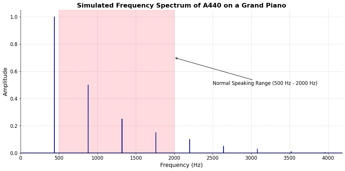
\(S(t)\) Temperament: This brings in the structure, the tuning systems that define the relationships between notes. It’s about how we decide to divide the sonic space, influencing everything that follows. Woody Allen’s nurturing-archetype, with precise “vibes”. Is typically already proven: divorced, has children
\(h(t)\) Scale: The specific selection of notes within the tempered system, which provides the framework for melody and harmony. Scales are the palette from which modes and emotions emerge. Woody Allen’s intellectual-archetype, Brandeis alum, highfalutin, no primeval attraction to her very highly curated mind
\(\sigma\) Archeological-dig#
\((X'X)^T \cdot X'Y\): Mode: These are the different ways to organize and emphasize notes within a scale, giving rise to distinct tonalities and moods. Modes are the bridge between structure (scales) and expression (emotion).
Categoricalimperative vs. moral-ambiguity, since the full range of human vices & redeeming qualities is included in the collective unconscious
Show code cell source
import matplotlib.pyplot as plt
import numpy as np
# Clock settings; f(t) random disturbances making "paradise lost"
clock_face_radius = 1.0
number_of_ticks = 7
tick_labels = [
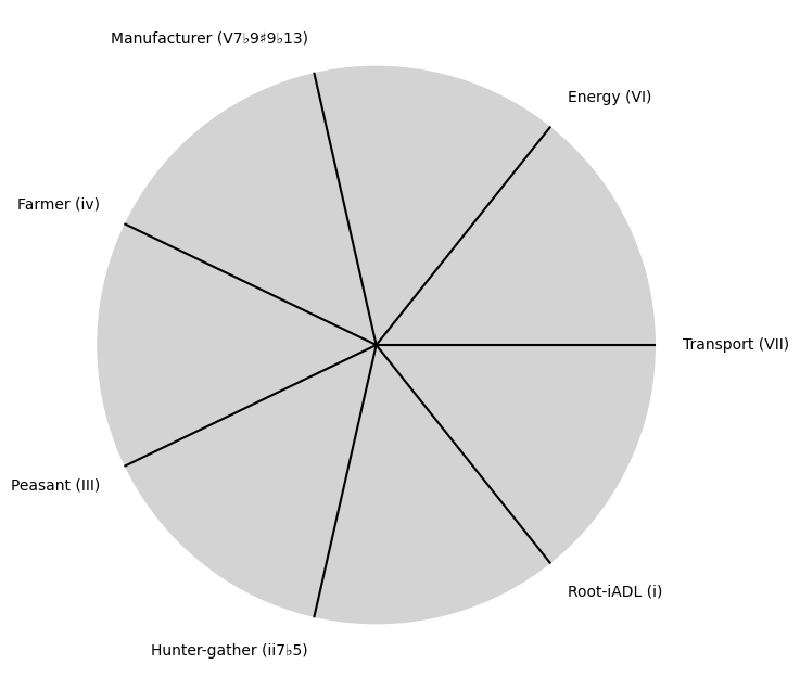
"Root-iADL (i)",
"Hunter-gather (ii7♭5)", "Peasant (III)", "Farmer (iv)", "Manufacturer (V7♭9♯9♭13)",
"Energy (VI)", "Transport (VII)"
]
# Calculate the angles for each tick (in radians)
angles = np.linspace(0, 2 * np.pi, number_of_ticks, endpoint=False)
# Inverting the order to make it counterclockwise
angles = angles[::-1]
# Create figure and axis
fig, ax = plt.subplots(figsize=(8, 8))
ax.set_xlim(-1.2, 1.2)
ax.set_ylim(-1.2, 1.2)
ax.set_aspect('equal')
# Draw the clock face
clock_face = plt.Circle((0, 0), clock_face_radius, color='lightgrey', fill=True)
ax.add_patch(clock_face)
# Draw the ticks and labels
for angle, label in zip(angles, tick_labels):
x = clock_face_radius * np.cos(angle)
y = clock_face_radius * np.sin(angle)
# Draw the tick
ax.plot([0, x], [0, y], color='black')
# Positioning the labels slightly outside the clock face
label_x = 1.1 * clock_face_radius * np.cos(angle)
label_y = 1.1 * clock_face_radius * np.sin(angle)
# Adjusting label alignment based on its position
ha = 'center'
va = 'center'
if np.cos(angle) > 0:
ha = 'left'
elif np.cos(angle) < 0:
ha = 'right'
if np.sin(angle) > 0:
va = 'bottom'
elif np.sin(angle) < 0:
va = 'top'
ax.text(label_x, label_y, label, horizontalalignment=ha, verticalalignment=va, fontsize=10)
# Remove axes
ax.axis('off')
# Show the plot
plt.show()
Show code cell output
\(\%\) Old-wisdom#
\(\beta\) NexToken: This concept, borrowing from predictive models, highlights the importance of progression and expectation in music. It’s about what comes next, how music unfolds, and the anticipation that drives emotional response.
Chords- minor (ii7, iii7, vi6), major (I, IV), dominant (V7) & half-dim (vii7b5) at time, \(t_{-1}\), are predictive of the next at time, \(t_{0}\) in increasing order of precision. Some chords may represent more ambiguity than others
Show code cell source
import matplotlib.pyplot as plt
import numpy as np
# Clock settings; f(t) random disturbances making "paradise lost"
clock_face_radius = 1.0
number_of_ticks = 9
tick_labels = [
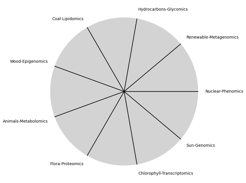
"Sun-Genomics", "Chlorophyll-Transcriptomics", "Flora-Proteomics", "Animals-Metabolomics",
"Wood-Epigenomics", "Coal-Lipidomics", "Hydrocarbons-Glycomics", "Renewable-Metagenomics", "Nuclear-Phenomics"
]
# Calculate the angles for each tick (in radians)
angles = np.linspace(0, 2 * np.pi, number_of_ticks, endpoint=False)
# Inverting the order to make it counterclockwise
angles = angles[::-1]
# Create figure and axis
fig, ax = plt.subplots(figsize=(8, 8))
ax.set_xlim(-1.2, 1.2)
ax.set_ylim(-1.2, 1.2)
ax.set_aspect('equal')
# Draw the clock face
clock_face = plt.Circle((0, 0), clock_face_radius, color='lightgrey', fill=True)
ax.add_patch(clock_face)
# Draw the ticks and labels
for angle, label in zip(angles, tick_labels):
x = clock_face_radius * np.cos(angle)
y = clock_face_radius * np.sin(angle)
# Draw the tick
ax.plot([0, x], [0, y], color='black')
# Positioning the labels slightly outside the clock face
label_x = 1.1 * clock_face_radius * np.cos(angle)
label_y = 1.1 * clock_face_radius * np.sin(angle)
# Adjusting label alignment based on its position
ha = 'center'
va = 'center'
if np.cos(angle) > 0:
ha = 'left'
elif np.cos(angle) < 0:
ha = 'right'
if np.sin(angle) > 0:
va = 'bottom'
elif np.sin(angle) < 0:
va = 'top'
ax.text(label_x, label_y, label, horizontalalignment=ha, verticalalignment=va, fontsize=10)
# Remove axes
ax.axis('off')
# Show the plot
plt.show()
Show code cell output
\(SV_t'\) Emotion: The ultimate goal of music, where all the previous elements converge. It’s the subjective experience that music evokes, the connection between the composer, performer, and listener.
Thusminor chords will evoke the mostuncertaintywhereas dom7 & half-dim will evoke the mostprecisesense of thenextoken
Show code cell source
import numpy as np
import matplotlib.pyplot as plt
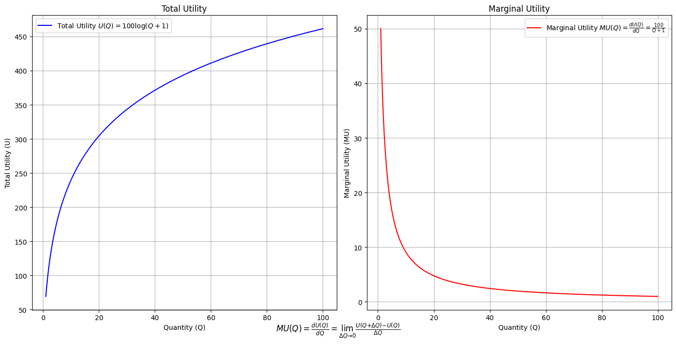
# Define the total utility function U(Q)
def total_utility(Q):
return 100 * np.log(Q + 1) # Logarithmic utility function for illustration
# Define the marginal utility function MU(Q)
def marginal_utility(Q):
return 100 / (Q + 1) # Derivative of the total utility function
# Generate data
Q = np.linspace(1, 100, 500) # Quantity range from 1 to 100
U = total_utility(Q)
MU = marginal_utility(Q)
# Plotting
plt.figure(figsize=(14, 7))
# Plot Total Utility
plt.subplot(1, 2, 1)
plt.plot(Q, U, label=r'Total Utility $U(Q) = 100 \log(Q + 1)$', color='blue')
plt.title('Total Utility')
plt.xlabel('Quantity (Q)')
plt.ylabel('Total Utility (U)')
plt.legend()
plt.grid(True)
# Plot Marginal Utility
plt.subplot(1, 2, 2)
plt.plot(Q, MU, label=r'Marginal Utility $MU(Q) = \frac{dU(Q)}{dQ} = \frac{100}{Q + 1}$', color='red')
plt.title('Marginal Utility')
plt.xlabel('Quantity (Q)')
plt.ylabel('Marginal Utility (MU)')
plt.legend()
plt.grid(True)
# Adding some calculus notation and Greek symbols
plt.figtext(0.5, 0.02, r"$MU(Q) = \frac{dU(Q)}{dQ} = \lim_{\Delta Q \to 0} \frac{U(Q + \Delta Q) - U(Q)}{\Delta Q}$", ha="center", fontsize=12)
plt.tight_layout()
plt.show()
Show code cell output
Show code cell source
import matplotlib.pyplot as plt
import numpy as np
from matplotlib.cm import ScalarMappable
from matplotlib.colors import LinearSegmentedColormap, PowerNorm

def gaussian(x, mean, std_dev, amplitude=1):
    return amplitude * np.exp(-0.9 * ((x - mean) / std_dev) ** 2)

def overlay_gaussian_on_line(ax, start, end, std_dev):
    x_line = np.linspace(start[0], end[0], 100)
    y_line = np.linspace(start[1], end[1], 100)
    mean = np.mean(x_line)
    y = gaussian(x_line, mean, std_dev, amplitude=std_dev)
    ax.plot(x_line + y / np.sqrt(2), y_line + y / np.sqrt(2), color='red', linewidth=2.5)

fig, ax = plt.subplots(figsize=(10, 10))

intervals = np.linspace(0, 100, 11)
custom_means = np.linspace(1, 23, 10)
custom_stds = np.linspace(.5, 10, 10)

# Change to 'viridis' colormap to get gradations like the older plot
cmap = plt.get_cmap('viridis')
norm = plt.Normalize(custom_stds.min(), custom_stds.max())
sm = ScalarMappable(cmap=cmap, norm=norm)
sm.set_array([])

median_points = []

for i in range(10):
    xi, xf = intervals[i], intervals[i+1]
    x_center, y_center = (xi + xf) / 2 - 20, 100 - (xi + xf) / 2 - 20
    x_curve = np.linspace(custom_means[i] - 3 * custom_stds[i], custom_means[i] + 3 * custom_stds[i], 200)
    y_curve = gaussian(x_curve, custom_means[i], custom_stds[i], amplitude=15)

    x_gauss = x_center + x_curve / np.sqrt(2)
    y_gauss = y_center + y_curve / np.sqrt(2) + x_curve / np.sqrt(2)

    ax.plot(x_gauss, y_gauss, color=cmap(norm(custom_stds[i])), linewidth=2.5)
    median_points.append((x_center + custom_means[i] / np.sqrt(2), y_center + custom_means[i] / np.sqrt(2)))

median_points = np.array(median_points)
ax.plot(median_points[:, 0], median_points[:, 1], '--', color='grey')
start_point = median_points[0, :]
end_point = median_points[-1, :]
overlay_gaussian_on_line(ax, start_point, end_point, 24)

ax.grid(True, linestyle='--', linewidth=0.5, color='grey')
ax.set_xlim(-30, 111)
ax.set_ylim(-20, 87)

# Create a new ScalarMappable with a reversed colormap just for the colorbar
cmap_reversed = plt.get_cmap('viridis').reversed()
sm_reversed = ScalarMappable(cmap=cmap_reversed, norm=norm)
sm_reversed.set_array([])

# Existing code for creating the colorbar
cbar = fig.colorbar(sm_reversed, ax=ax, shrink=1, aspect=90)

# Specify the tick positions you want to set
custom_tick_positions = [0.5, 5, 8, 10]  # example positions, you can change these
cbar.set_ticks(custom_tick_positions)

# Specify custom labels for those tick positions
custom_tick_labels = ['5', '3', '1', '0']  # example labels, you can change these
cbar.set_ticklabels(custom_tick_labels)

# Label for the colorbar
cbar.set_label(r'♭', rotation=0, labelpad=15, fontstyle='italic', fontsize=24)


# Label for the colorbar
cbar.set_label(r'♭', rotation=0, labelpad=15, fontstyle='italic', fontsize=24)


cbar.set_label(r'♭', rotation=0, labelpad=15, fontstyle='italic', fontsize=24)

# Add X and Y axis labels with custom font styles
ax.set_xlabel(r'Principal Component', fontstyle='italic')
ax.set_ylabel(r'Emotional State', rotation=0, fontstyle='italic', labelpad=15)

# Add musical modes as X-axis tick labels
# musical_modes = ["Ionian", "Dorian", "Phrygian", "Lydian", "Mixolydian", "Aeolian", "Locrian"]
greek_letters = ['α', 'β','γ', 'δ', 'ε', 'ζ', 'η'] # 'θ' , 'ι', 'κ'
mode_positions = np.linspace(ax.get_xlim()[0], ax.get_xlim()[1], len(greek_letters))
ax.set_xticks(mode_positions)
ax.set_xticklabels(greek_letters, rotation=0)

# Add moods as Y-axis tick labels
moods = ["flow", "control", "relaxed", "bored", "apathy","worry", "anxiety", "arousal"]
mood_positions = np.linspace(ax.get_ylim()[0], ax.get_ylim()[1], len(moods))
ax.set_yticks(mood_positions)
ax.set_yticklabels(moods)

# ... (rest of the code unchanged)


plt.tight_layout()
plt.show()
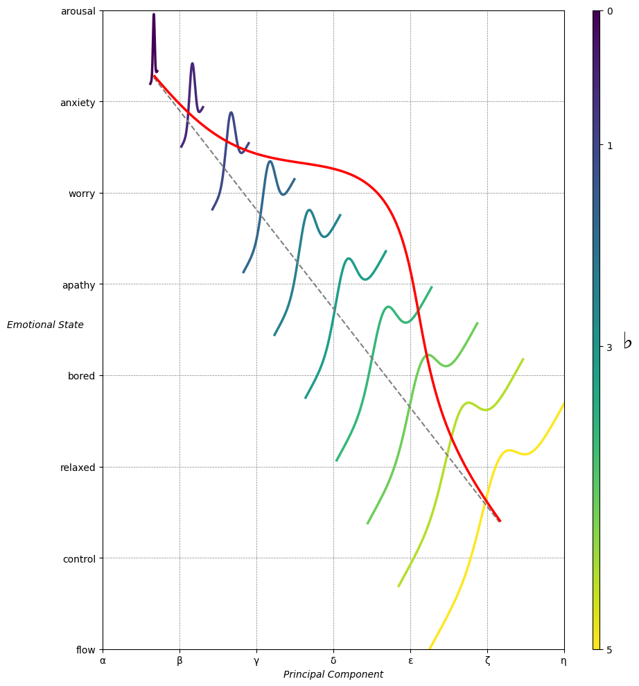
Emotion & Affect as Outcomes. And the predictors \(\beta\) are MQ-TEA: Modes (ionian, dorian, phrygian, lydian, mixolydian, locrian), Qualities (major, minor, dominant, suspended, diminished, half-dimished, augmented), Tensions (7th), Extensions (9th, 11th, 13th), and Alterations (♯, ♭) 29#
                1. Exposure
                           \
               2. Role ->  4. Categorical.Imperative -> 5. Determinism -> 6. Freewill
                           /
                           3. Impulse