History#
Uses & Abuses#
And now abideth faith, hope, charity, these three; but the greatest of these is charity. 1 Cor 13:13
                   1. Antiquarian
                                 \
                2. Monumental -> 4. History-Antiquarian -> 5. NexToken-Monumental -> 6. Emotion-Critical
                                 /
                                 3. Critical
Show code cell source
import networkx as nx
import matplotlib.pyplot as plt
import numpy as np

# Create a directed graph
G = nx.DiGraph()

# Add nodes representing different levels (subatomic, atomic, cosmic, financial, social)
levels = ['i: Critical\n Gulu\n Resentment\n Hope/Future\n AI', 'ii: Antiquarian\n Inferno\n Entitlement\n Faith/Past\n God', 'V7: Monumental\n Purgatorio\n Technology\n Love/Now\n Man']

# Add nodes to the graph
G.add_nodes_from(levels)

# Add edges to represent the flow of information (photons)
# Assuming the flow is directional from more fundamental levels to more complex ones
edges = [('ii: Antiquarian\n Inferno\n Entitlement\n Faith/Past\n God', 'V7: Monumental\n Purgatorio\n Technology\n Love/Now\n Man'),
         ('V7: Monumental\n Purgatorio\n Technology\n Love/Now\n Man', 'i: Critical\n Gulu\n Resentment\n Hope/Future\n AI'),]

# Add edges to the graph
G.add_edges_from(edges)

# Define positions for the nodes in a circular layout
pos = nx.circular_layout(G)

# Set the figure size (width, height)
plt.figure(figsize=(10, 10))  # Adjust the size as needed

# Draw the main nodes
nx.draw_networkx_nodes(G, pos, node_color='lightblue', node_size=30000)

# Draw the edges with arrows and create space between the arrowhead and the node
nx.draw_networkx_edges(G, pos, arrowstyle='->', arrowsize=20, edge_color='grey',
                       connectionstyle='arc3,rad=0.2')  # Adjust rad for more/less space

# Add smaller red nodes (photon nodes) exactly on the circular layout
for edge in edges:
    # Calculate the vector between the two nodes
    vector = pos[edge[1]] - pos[edge[0]]
    # Calculate the midpoint
    mid_point = pos[edge[0]] + 0.5 * vector
    # Normalize to ensure it's on the circle
    radius = np.linalg.norm(pos[edge[0]])
    mid_point_on_circle = mid_point / np.linalg.norm(mid_point) * radius
    # Draw the small red photon node at the midpoint on the circular layout
    plt.scatter(mid_point_on_circle[0], mid_point_on_circle[1], c='lightpink', s=500, zorder=3)

    # Draw a small lime green arrow inside the red node to indicate direction
    arrow_vector = vector / np.linalg.norm(vector) * 0.1  # Scale down arrow size
    plt.arrow(mid_point_on_circle[0] - 0.05 * arrow_vector[0],
              mid_point_on_circle[1] - 0.05 * arrow_vector[1],
              arrow_vector[0], arrow_vector[1],
              head_width=0.03, head_length=0.05, fc='limegreen', ec='limegreen', zorder=4)

# Draw the labels for the main nodes
nx.draw_networkx_labels(G, pos, font_size=18, font_weight='normal')

# Add a legend for "Photon/Info"
plt.scatter([], [], c='lightpink', s=100, label='Thoughtful Planting')  # Empty scatter for the legend
plt.legend(scatterpoints=1, frameon=True, labelspacing=1, loc='upper right')

# Set the title and display the plot
plt.title('Schools', fontsize=15)
plt.axis('off')
plt.show()
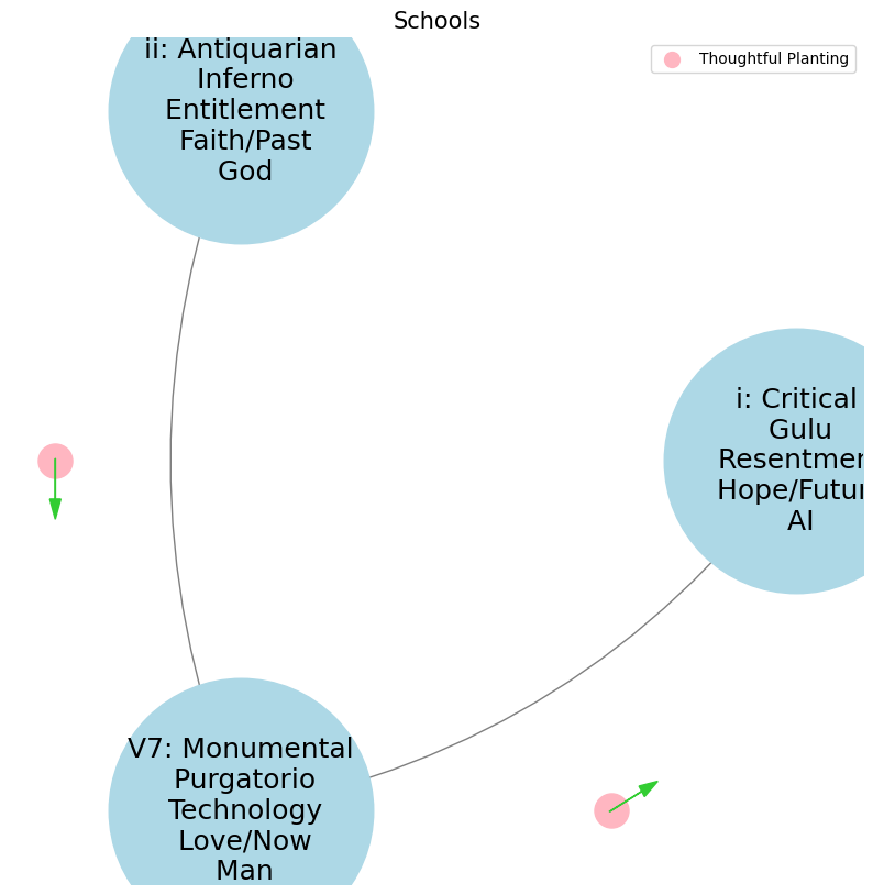

History is necessary to the living man in three ways. These three relations answer to the three kinds of history—so far as they can be distinguished—the antiquarian, the monumental, and the critical ii reverence: the man who can rest content with the traditional and venerable, uses the past as an “antiquarian historian” (in relation to his conservatism and reverence) \(f(t)\). V7 struggle: If the man who will produce something great, have need of the past, he makes himself its master by means of monumental history (his action and struggle) \(S(t)\). i and only he whose heart is oppressed by an instant need \(h(t)\), and who will cast the burden off at any price, feels the want of “critical history,” the history that judges and condemns (his suffering and his desire for deliverance).#
ii \(\mu\) Reverence#
ii\(f(t)\) Paradiso: 46 47Fractals\(440Hz \times 2^{\frac{N}{12}}\), \(S_0(t) \times e^{logHR}\), \(\frac{S N(d_1)}{K N(d_2)} \times e^{rT}\)
Show code cell source
import numpy as np
import matplotlib.pyplot as plt

# Parameters
sample_rate = 44100  # Hz
duration = 20.0       # seconds
A4_freq = 440.0      # Hz

# Time array
t = np.linspace(0, duration, int(sample_rate * duration), endpoint=False)

# Fundamental frequency (A4)
signal = np.sin(2 * np.pi * A4_freq * t)

# Adding overtones (harmonics)
harmonics = [2, 3, 4, 5, 6, 7, 8, 9]  # First few harmonics
amplitudes = [0.5, 0.25, 0.15, 0.1, 0.05, 0.03, 0.01, 0.005]  # Amplitudes for each harmonic

for i, harmonic in enumerate(harmonics):
    signal += amplitudes[i] * np.sin(2 * np.pi * A4_freq * harmonic * t)

# Perform FFT (Fast Fourier Transform)
N = len(signal)
yf = np.fft.fft(signal)
xf = np.fft.fftfreq(N, 1 / sample_rate)

# Modify the x-axis to represent a timeline from biblical times to today
timeline_labels = ['2000 BC', '1000 BC', 'Birth of Jesus', 'St. Paul', 'Middle Ages', 'Renaissance', 'Modern Era']
timeline_positions = np.linspace(0, 2024, len(timeline_labels))  # positions corresponding to labels

# Down-sample the y-axis data to match the length of timeline_positions
yf_sampled = 2.0 / N * np.abs(yf[:N // 2])
yf_downsampled = np.interp(timeline_positions, np.linspace(0, 2024, len(yf_sampled)), yf_sampled)

# Plot the frequency spectrum with modified x-axis
plt.figure(figsize=(12, 6))
plt.plot(timeline_positions, yf_downsampled, color='navy', lw=1.5)

# Aesthetics improvements
plt.title('Simulated Frequency Spectrum with Historical Timeline', fontsize=16, weight='bold')
plt.xlabel('Historical Timeline', fontsize=14)
plt.ylabel('Reverence', fontsize=14)
plt.xticks(timeline_positions, labels=timeline_labels, fontsize=12)
plt.ylim(0, None)

# Shading the period from Birth of Jesus to St. Paul
plt.axvspan(timeline_positions[2], timeline_positions[3], color='lightpink', alpha=0.5)

# Annotate the shaded region
plt.annotate('Birth of Jesus to St. Paul',
             xy=(timeline_positions[2], 0.7), xycoords='data',
             xytext=(timeline_positions[3] + 200, 0.5), textcoords='data',
             arrowprops=dict(facecolor='black', arrowstyle="->"),
             fontsize=12, color='black')

# Remove top and right spines
plt.gca().spines['top'].set_visible(False)
plt.gca().spines['right'].set_visible(False)

# Customize ticks
plt.xticks(timeline_positions, labels=timeline_labels, fontsize=12)
plt.yticks(fontsize=12)

# Light grid
plt.grid(color='grey', linestyle=':', linewidth=0.5)

# Show the plot
plt.tight_layout()


plt.show()
Show code cell output
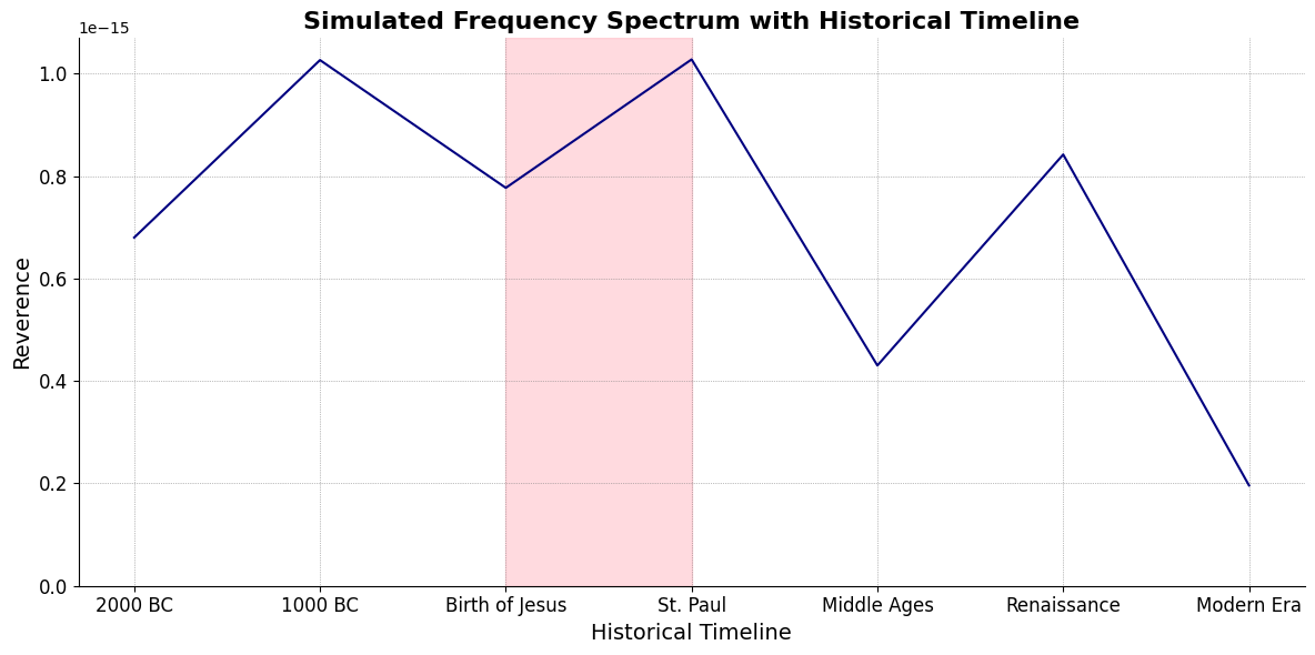
Inferno(Renaissance -> Modern Era)Purgatorio(St. Paul <- Middle Ages)
V7\(S(t)\) Struggle:ChainsEqual temperament, Proportional hazards, Homoskedastic volatility

i\(h(t)\) Deliverance:Equations9 Inherited (Antiquary), Added (Challenges), Overcome (Gracefully)

V7 \(\sigma\) Struggle#
\((X'X)^T \cdot X'Y\): Mode: \( \mathcal{F}(t) = \alpha \cdot \left( \prod_{i=1}^{n} \frac{\partial \psi_i(t)}{\partial t} \right) + \beta \cdot \int_{0}^{t} \left( \sum_{j=1}^{m} \frac{\partial \phi_j(\tau)}{\partial \tau} \right) d\tau\) .
Accidentsmezcal, mezclar, mezcaline. Just a reminder that accidents can mislead one to perceive patterns where there’re none. That said, \(\alpha\) & \(\beta\) are emerging as parameters representing the highest hierarchy in this multilevel dataset. They stand for determined (chains) & freewill (wiggle-room), which, with iteration, becomes substantive regardless of the degrees-of-freedom
Show code cell source
import matplotlib.pyplot as plt
import numpy as np
# Clock settings; f(t) random disturbances making "paradise lost"
clock_face_radius = 1.0
number_of_ticks = 7
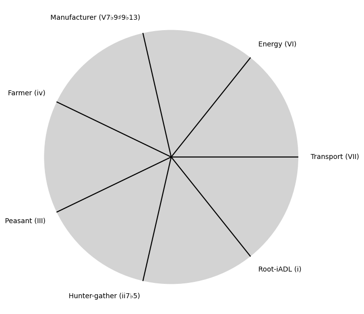
tick_labels = [
"Root-iADL (i)",
"Hunter-gather (ii7♭5)", "Peasant (III)", "Farmer (iv)", "Manufacturer (V7♭9♯9♭13)",
"Energy (VI)", "Transport (VII)"
]
# Calculate the angles for each tick (in radians)
angles = np.linspace(0, 2 * np.pi, number_of_ticks, endpoint=False)
# Inverting the order to make it counterclockwise
angles = angles[::-1]
# Create figure and axis
fig, ax = plt.subplots(figsize=(8, 8))
ax.set_xlim(-1.2, 1.2)
ax.set_ylim(-1.2, 1.2)
ax.set_aspect('equal')
# Draw the clock face
clock_face = plt.Circle((0, 0), clock_face_radius, color='lightgrey', fill=True)
ax.add_patch(clock_face)
# Draw the ticks and labels
for angle, label in zip(angles, tick_labels):
x = clock_face_radius * np.cos(angle)
y = clock_face_radius * np.sin(angle)
# Draw the tick
ax.plot([0, x], [0, y], color='black')
# Positioning the labels slightly outside the clock face
label_x = 1.1 * clock_face_radius * np.cos(angle)
label_y = 1.1 * clock_face_radius * np.sin(angle)
# Adjusting label alignment based on its position
ha = 'center'
va = 'center'
if np.cos(angle) > 0:
ha = 'left'
elif np.cos(angle) < 0:
ha = 'right'
if np.sin(angle) > 0:
va = 'bottom'
elif np.sin(angle) < 0:
va = 'top'
ax.text(label_x, label_y, label, horizontalalignment=ha, verticalalignment=va, fontsize=10)
# Remove axes
ax.axis('off')
# Show the plot
plt.show()
Show code cell output
i \(\%\) Deliverance#
\(\alpha, \beta, t\) NexToken:
Parametrizedthe processes that are responsible for human behavior as a moiety of “chains” with some “wiggle-room”
Show code cell source
import matplotlib.pyplot as plt
import numpy as np
# Clock settings; f(t) random disturbances making "paradise lost"
clock_face_radius = 1.0
number_of_ticks = 9
tick_labels = [
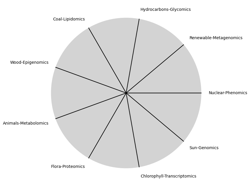
"Sun-Genomics", "Chlorophyll-Transcriptomics", "Flora-Proteomics", "Animals-Metabolomics",
"Wood-Epigenomics", "Coal-Lipidomics", "Hydrocarbons-Glycomics", "Renewable-Metagenomics", "Nuclear-Phenomics"
]
# Calculate the angles for each tick (in radians)
angles = np.linspace(0, 2 * np.pi, number_of_ticks, endpoint=False)
# Inverting the order to make it counterclockwise
angles = angles[::-1]
# Create figure and axis
fig, ax = plt.subplots(figsize=(8, 8))
ax.set_xlim(-1.2, 1.2)
ax.set_ylim(-1.2, 1.2)
ax.set_aspect('equal')
# Draw the clock face
clock_face = plt.Circle((0, 0), clock_face_radius, color='lightgrey', fill=True)
ax.add_patch(clock_face)
# Draw the ticks and labels
for angle, label in zip(angles, tick_labels):
x = clock_face_radius * np.cos(angle)
y = clock_face_radius * np.sin(angle)
# Draw the tick
ax.plot([0, x], [0, y], color='black')
# Positioning the labels slightly outside the clock face
label_x = 1.1 * clock_face_radius * np.cos(angle)
label_y = 1.1 * clock_face_radius * np.sin(angle)
# Adjusting label alignment based on its position
ha = 'center'
va = 'center'
if np.cos(angle) > 0:
ha = 'left'
elif np.cos(angle) < 0:
ha = 'right'
if np.sin(angle) > 0:
va = 'bottom'
elif np.sin(angle) < 0:
va = 'top'
ax.text(label_x, label_y, label, horizontalalignment=ha, verticalalignment=va, fontsize=10)
# Remove axes
ax.axis('off')
# Show the plot
plt.show()
Show code cell output
\(SV_t'\) Emotion:
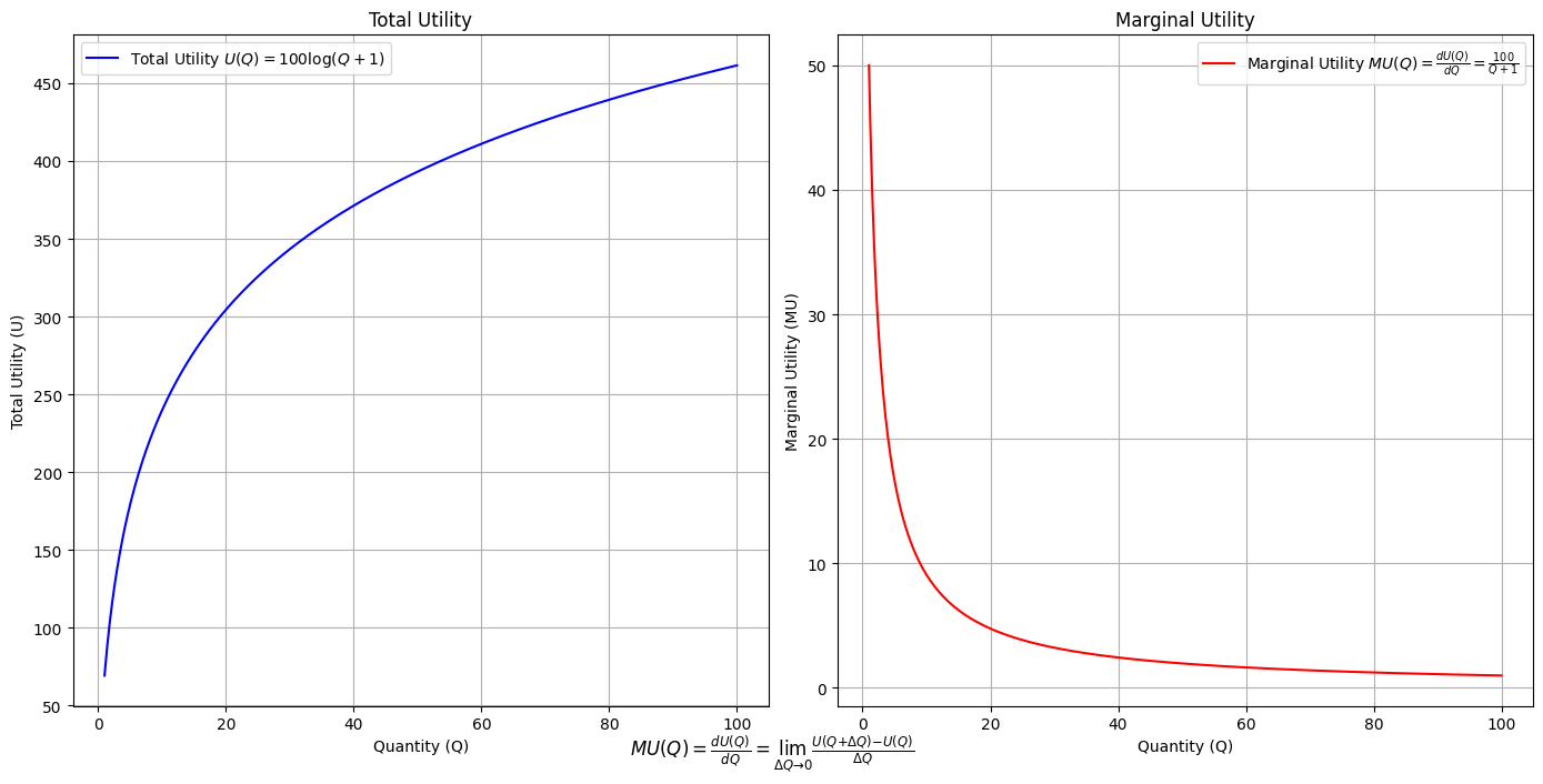
Ultimategoal of life, where all the outlined elements converge. It’s the subjective experience or illusion that life should evoke, the connection between god, neighbor, and self.Thusminor chords may represent “loose” chains whereas dom7 & half-dim are somewhat “tight” chains constraining us to our sense of the nextoken
Show code cell source
import numpy as np
import matplotlib.pyplot as plt

# Define the total utility function U(Q)
def total_utility(Q):
    return 100 * np.log(Q + 1)  # Logarithmic utility function for illustration

# Define the marginal utility function MU(Q)
def marginal_utility(Q):
    return 100 / (Q + 1)  # Derivative of the total utility function

# Generate data
Q = np.linspace(1, 100, 500)  # Quantity range from 1 to 100
U = total_utility(Q)
MU = marginal_utility(Q)

# Plotting
plt.figure(figsize=(14, 7))

# Plot Total Utility
plt.subplot(1, 2, 1)
plt.plot(Q, U, label=r'Total Utility $U(Q) = 100 \log(Q + 1)$', color='blue')
plt.title('Total Utility')
plt.xlabel('Quantity (Q)')
plt.ylabel('Total Utility (U)')
plt.legend()
plt.grid(True)

# Plot Marginal Utility
plt.subplot(1, 2, 2)
plt.plot(Q, MU, label=r'Marginal Utility $MU(Q) = \frac{dU(Q)}{dQ} = \frac{100}{Q + 1}$', color='red')
plt.title('Marginal Utility')
plt.xlabel('Quantity (Q)')
plt.ylabel('Marginal Utility (MU)')
plt.legend()
plt.grid(True)

# Adding some calculus notation and Greek symbols
plt.figtext(0.5, 0.02, r"$MU(Q) = \frac{dU(Q)}{dQ} = \lim_{\Delta Q \to 0} \frac{U(Q + \Delta Q) - U(Q)}{\Delta Q}$", ha="center", fontsize=12)

plt.tight_layout()
plt.show()
Show code cell output
Show code cell source
import matplotlib.pyplot as plt
import numpy as np
from matplotlib.cm import ScalarMappable
from matplotlib.colors import LinearSegmentedColormap, PowerNorm

def gaussian(x, mean, std_dev, amplitude=1):
    return amplitude * np.exp(-0.9 * ((x - mean) / std_dev) ** 2)

def overlay_gaussian_on_line(ax, start, end, std_dev):
    x_line = np.linspace(start[0], end[0], 100)
    y_line = np.linspace(start[1], end[1], 100)
    mean = np.mean(x_line)
    y = gaussian(x_line, mean, std_dev, amplitude=std_dev)
    ax.plot(x_line + y / np.sqrt(2), y_line + y / np.sqrt(2), color='red', linewidth=2.5)

fig, ax = plt.subplots(figsize=(10, 10))

intervals = np.linspace(0, 100, 11)
custom_means = np.linspace(1, 23, 10)
custom_stds = np.linspace(.5, 10, 10)

# Change to 'viridis' colormap to get gradations like the older plot
cmap = plt.get_cmap('viridis')
norm = plt.Normalize(custom_stds.min(), custom_stds.max())
sm = ScalarMappable(cmap=cmap, norm=norm)
sm.set_array([])

median_points = []

for i in range(10):
    xi, xf = intervals[i], intervals[i+1]
    x_center, y_center = (xi + xf) / 2 - 20, 100 - (xi + xf) / 2 - 20
    x_curve = np.linspace(custom_means[i] - 3 * custom_stds[i], custom_means[i] + 3 * custom_stds[i], 200)
    y_curve = gaussian(x_curve, custom_means[i], custom_stds[i], amplitude=15)

    x_gauss = x_center + x_curve / np.sqrt(2)
    y_gauss = y_center + y_curve / np.sqrt(2) + x_curve / np.sqrt(2)

    ax.plot(x_gauss, y_gauss, color=cmap(norm(custom_stds[i])), linewidth=2.5)
    median_points.append((x_center + custom_means[i] / np.sqrt(2), y_center + custom_means[i] / np.sqrt(2)))

median_points = np.array(median_points)
ax.plot(median_points[:, 0], median_points[:, 1], '--', color='grey')
start_point = median_points[0, :]
end_point = median_points[-1, :]
overlay_gaussian_on_line(ax, start_point, end_point, 24)

ax.grid(True, linestyle='--', linewidth=0.5, color='grey')
ax.set_xlim(-30, 111)
ax.set_ylim(-20, 87)

# Create a new ScalarMappable with a reversed colormap just for the colorbar
cmap_reversed = plt.get_cmap('viridis').reversed()
sm_reversed = ScalarMappable(cmap=cmap_reversed, norm=norm)
sm_reversed.set_array([])

# Existing code for creating the colorbar
cbar = fig.colorbar(sm_reversed, ax=ax, shrink=1, aspect=90)

# Specify the tick positions you want to set
custom_tick_positions = [0.5, 5, 8, 10]  # example positions, you can change these
cbar.set_ticks(custom_tick_positions)

# Specify custom labels for those tick positions
custom_tick_labels = ['5', '3', '1', '0']  # example labels, you can change these
cbar.set_ticklabels(custom_tick_labels)

# Label for the colorbar
cbar.set_label(r'♭', rotation=0, labelpad=15, fontstyle='italic', fontsize=24)


# Label for the colorbar
cbar.set_label(r'♭', rotation=0, labelpad=15, fontstyle='italic', fontsize=24)


cbar.set_label(r'♭', rotation=0, labelpad=15, fontstyle='italic', fontsize=24)

# Add X and Y axis labels with custom font styles
ax.set_xlabel(r'Principal Component', fontstyle='italic')
ax.set_ylabel(r'Emotional State', rotation=0, fontstyle='italic', labelpad=15)

# Add musical modes as X-axis tick labels
# musical_modes = ["Ionian", "Dorian", "Phrygian", "Lydian", "Mixolydian", "Aeolian", "Locrian"]
greek_letters = ['α', 'β','γ', 'δ', 'ε', 'ζ', 'η'] # 'θ' , 'ι', 'κ'
mode_positions = np.linspace(ax.get_xlim()[0], ax.get_xlim()[1], len(greek_letters))
ax.set_xticks(mode_positions)
ax.set_xticklabels(greek_letters, rotation=0)

# Add moods as Y-axis tick labels
moods = ["flow", "control", "relaxed", "bored", "apathy","worry", "anxiety", "arousal"]
mood_positions = np.linspace(ax.get_ylim()[0], ax.get_ylim()[1], len(moods))
ax.set_yticks(mood_positions)
ax.set_yticklabels(moods)

# ... (rest of the code unchanged)


plt.tight_layout()
plt.show()
Show code cell output
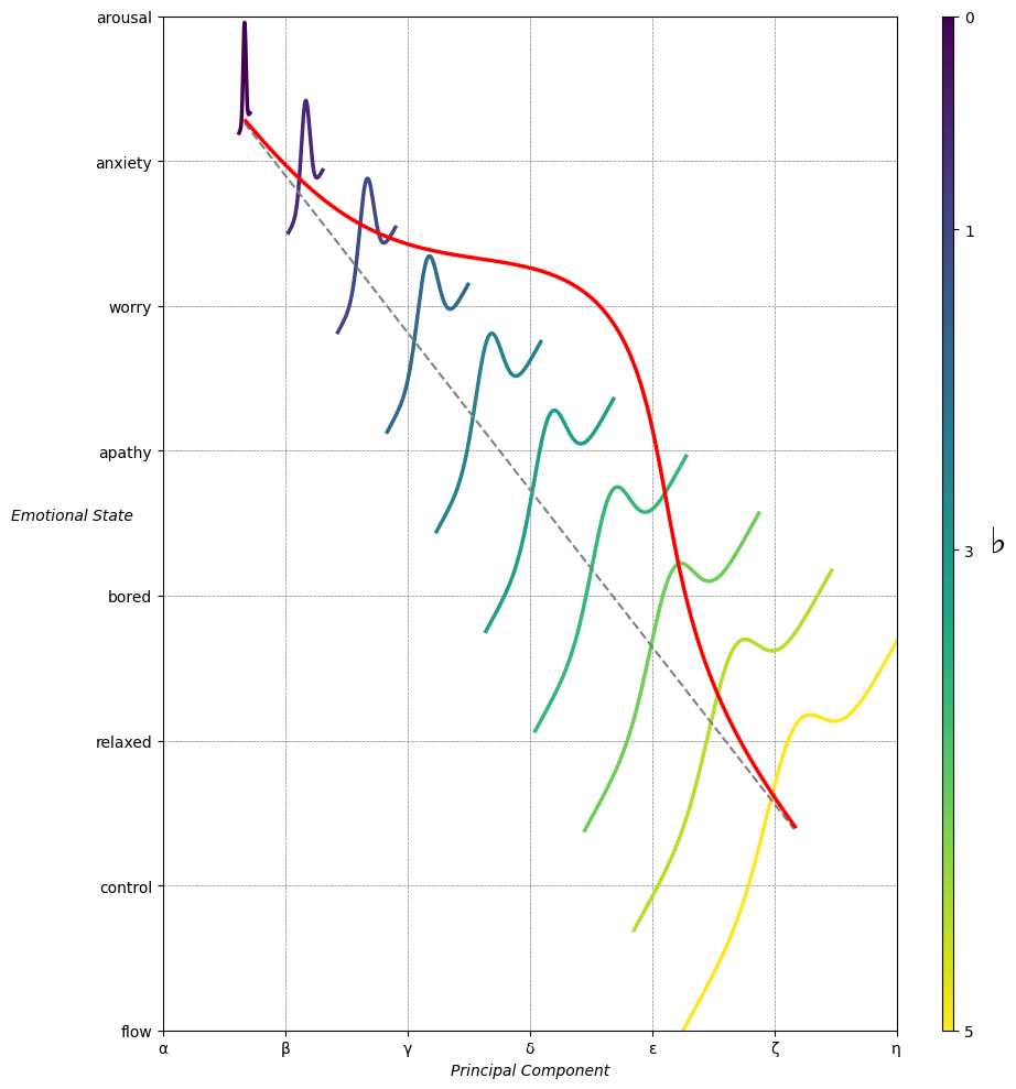
Emotion & Affect as Outcomes & Freewill. And the predictors \(\beta\) are MQ-TEA: Modes (ionian, dorian, phrygian, lydian, mixolydian, locrian), Qualities (major, minor, dominant, suspended, diminished, half-dimished, augmented), Tensions (7th), Extensions (9th, 11th, 13th), and Alterations (♯, ♭) 49#
                    1. f(t)
                           \
               2. S(t) ->  4. Nxb:t(X'X).X'Y -> 5. b -> 6. df
                           /
                           3. h(t)