
Born to Etiquette#
The Intelligence of Last-Mile Delivery in Biological Systems and Its Breakdown in Modernity#
At every scale, from the branching architecture of trees to the intricate vascularization of the human body, nature has evolved an astonishing intelligence in the distribution of resources. This intelligence is not merely a metaphorical flourish but a literal economy of design, optimized over evolutionary time to ensure that oxygen, nutrients, and signals reach their intended destinations with maximal efficiency and minimal waste. The human cardiovascular system, the neural network of the brain, the arborization of bronchioles in the lungs, and even the peripheral nerves extending into the extremities are all manifestations of this principle: a system-wide intelligence that balances constraints of energy, distance, and redundancy to ensure survival.
He Does it Again. If we can send AIs to visit other planets and perhaps galaxies, surely aliens coud do the same and visit us. Thus UFOs are not that much of a stretch, especially in a nuclear world -- aliens have recognized the "arrival" of another intelligence that has learned to harness the energy of the stars. We must overcome biological imperatives: status, tribe, etc. It's clear that AI is one such approach. Matrix.
This intelligence is most tested in what we might call the “last-mile delivery” zones—regions at the periphery of these networks where resources must still reach but where efficiency begins to break down due to bottlenecks, resistance, and structural degradation. In biological terms, the last mile is where the blood supply grows thinner and more vulnerable, where axons stretch toward the distant skin and muscles, where the bronchioles give way to alveolar sacs demanding precise oxygenation. It is in these last-mile zones that modernity wages its most insidious war, disrupting the delicate equilibrium that evolution has fine-tuned.
Take stroke, for example. The brain, a neural economy of unfathomable complexity, depends on a meticulously balanced vascular network where even the tiniest capillary serves as a node in a grand, resource-distributing system. The failure of blood supply to the last mile—whether through a clot (ischemic stroke) or a hemorrhage—leaves downstream neurons starving, unable to sustain their function. This is not merely a failure of a singular vessel but of an entire system of economic distribution within the brain, where energy-intensive neurons in the cortex rely on oxygen and glucose delivered via a hierarchical but highly adaptive supply chain. The intelligence of this network is seen in its redundancies—the Circle of Willis, collateral circulation—but even these are no match for the cumulative damage imposed by hypertension, atherosclerosis, and metabolic dysfunction, all products of modern lifestyles.
A similar phenomenon plays out in cardiovascular disease, where the narrowing of coronary arteries imperils the last-mile delivery of oxygenated blood to the heart muscle itself. Again, what was once an efficient supply chain becomes a bottlenecked system, with endothelial dysfunction, inflammation, and lipid accumulation conspiring to shut down outposts in this physiological economy. The system, once dynamic and self-regulating, enters a state of rigidity—failing to adapt, failing to reallocate resources in response to demand. What was once an agile intelligence devolves into mechanical failure.
Peripheral neuropathy in diabetes exemplifies the same process in a different arena. Here, the “last mile” is not cardiovascular but neural—the long, thin axons extending to the feet, the hands, the extremities. In a healthy nervous system, axonal transport ensures the steady flow of nutrients, growth factors, and signaling molecules along these cellular highways. But when diabetes introduces chronic hyperglycemia, oxidative stress, and microvascular damage, the integrity of these highways erodes. The last mile collapses, leading to the classic symptoms of diabetic neuropathy—numbness, tingling, loss of proprioception. Again, the intelligence of distribution is disrupted, not because the blueprint was flawed but because modern metabolic excess overwhelms the system’s adaptability.
Even the architecture of the lungs—the branching bronchioles that ensure every alveolus is reached by inhaled air—follows this same fractal intelligence. Yet in conditions like chronic obstructive pulmonary disease (COPD), the problem is not only in the primary airways but in the last-mile bronchioles, where inflammation, mucus buildup, and structural degradation prevent the smooth exchange of oxygen and carbon dioxide. The last mile is clogged, suffocating the efficiency of an otherwise genius network.
One could argue that these failures of biological last-mile delivery are symptomatic of a larger crisis in modernity: a civilization that has, through technological and economic means, extended life expectancy but has simultaneously undermined the infrastructural intelligence that sustains it. The sedentary lifestyles, the processed diets, the chronic stressors, the pollution—these are all disruptions to the equilibrium that the body’s vascular and neural networks have spent millennia refining. If the brain and the body operate as economies of efficiency, then modernity introduces inefficiencies, systemic debts, and bottlenecks that our physiology was never designed to accommodate.
To address these crises is not merely to medicate or intervene at the site of failure but to understand the intelligence of these networks and work with them rather than against them. Just as urban planners have begun to rethink last-mile delivery in supply chain logistics—introducing bicycle couriers, drone systems, decentralized hubs—medicine must consider how to restore last-mile functionality to the body. This means rethinking how we approach prevention, targeting not just the clogged artery but the systemic processes that lead to its dysfunction, not just the dying neuron but the larger vascular context in which it resides.
In the end, the economy of biology is unforgiving, but it is also deeply instructive. Intelligence, whether in a forest, a neural network, or a bronchiole tree, does not emerge from isolated parts but from the relationships between them. The failure of last-mile delivery in the human body is not a localized event—it is a signal, a systemic warning that the intelligence of distribution, so elegantly refined over evolutionary time, is breaking down. And in that breakdown lies the lesson: if modernity is to outlast its own inefficiencies, it must learn not just from its machines, but from the branching, fractal wisdom of biology itself.
Show code cell source
import numpy as np
import matplotlib.pyplot as plt
import networkx as nx

# Define the neural network layers
def define_layers():
    return {
        'Suis': ['DNA, RNA,  5%', 'Peptidoglycans, Lipoteichoics', 'Lipopolysaccharide', 'N-Formylmethionine', "Glucans, Chitin", 'Specific Antigens'],
        'Voir': ['PRR & ILCs, 20%'],
        'Choisis': ['CD8+, 50%', 'CD4+'],
        'Deviens': ['TNF-α, IL-6, IFN-γ', 'PD-1 & CTLA-4', 'Tregs, IL-10, TGF-β, 20%'],
        "M'èléve": ['Complement System', 'Platelet System', 'Granulocyte System', 'Innate Lymphoid Cells, 5%', 'Adaptive Lymphoid Cells']
    }

# Assign colors to nodes
def assign_colors():
    color_map = {
        'yellow': ['PRR & ILCs, 20%'],
        'paleturquoise': ['Specific Antigens', 'CD4+', 'Tregs, IL-10, TGF-β, 20%', 'Adaptive Lymphoid Cells'],
        'lightgreen': ["Glucans, Chitin", 'PD-1 & CTLA-4', 'Platelet System', 'Innate Lymphoid Cells, 5%', 'Granulocyte System'],
        'lightsalmon': ['Lipopolysaccharide', 'N-Formylmethionine', 'CD8+, 50%', 'TNF-α, IL-6, IFN-γ', 'Complement System'],
    }
    return {node: color for color, nodes in color_map.items() for node in nodes}

# Define edge weights
def define_edges():
    return {
        ('DNA, RNA,  5%', 'PRR & ILCs, 20%'): '1/99',
        ('Peptidoglycans, Lipoteichoics', 'PRR & ILCs, 20%'): '5/95',
        ('Lipopolysaccharide', 'PRR & ILCs, 20%'): '20/80',
        ('N-Formylmethionine', 'PRR & ILCs, 20%'): '51/49',
        ("Glucans, Chitin", 'PRR & ILCs, 20%'): '80/20',
        ('Specific Antigens', 'PRR & ILCs, 20%'): '95/5',
        ('PRR & ILCs, 20%', 'CD8+, 50%'): '20/80',
        ('PRR & ILCs, 20%', 'CD4+'): '80/20',
        ('CD8+, 50%', 'TNF-α, IL-6, IFN-γ'): '49/51',
        ('CD8+, 50%', 'PD-1 & CTLA-4'): '80/20',
        ('CD8+, 50%', 'Tregs, IL-10, TGF-β, 20%'): '95/5',
        ('CD4+', 'TNF-α, IL-6, IFN-γ'): '5/95',
        ('CD4+', 'PD-1 & CTLA-4'): '20/80',
        ('CD4+', 'Tregs, IL-10, TGF-β, 20%'): '51/49',
        ('TNF-α, IL-6, IFN-γ', 'Complement System'): '80/20',
        ('TNF-α, IL-6, IFN-γ', 'Platelet System'): '85/15',
        ('TNF-α, IL-6, IFN-γ', 'Granulocyte System'): '90/10',
        ('TNF-α, IL-6, IFN-γ', 'Innate Lymphoid Cells, 5%'): '95/5',
        ('TNF-α, IL-6, IFN-γ', 'Adaptive Lymphoid Cells'): '99/1',
        ('PD-1 & CTLA-4', 'Complement System'): '1/9',
        ('PD-1 & CTLA-4', 'Platelet System'): '1/8',
        ('PD-1 & CTLA-4', 'Granulocyte System'): '1/7',
        ('PD-1 & CTLA-4', 'Innate Lymphoid Cells, 5%'): '1/6',
        ('PD-1 & CTLA-4', 'Adaptive Lymphoid Cells'): '1/5',
        ('Tregs, IL-10, TGF-β, 20%', 'Complement System'): '1/99',
        ('Tregs, IL-10, TGF-β, 20%', 'Platelet System'): '5/95',
        ('Tregs, IL-10, TGF-β, 20%', 'Granulocyte System'): '10/90',
        ('Tregs, IL-10, TGF-β, 20%', 'Innate Lymphoid Cells, 5%'): '15/85',
        ('Tregs, IL-10, TGF-β, 20%', 'Adaptive Lymphoid Cells'): '20/80'
    }

# Define edges to be highlighted in black
def define_black_edges():
    return {
        ('Tregs, IL-10, TGF-β, 20%', 'Complement System'): '1/99',
        ('Tregs, IL-10, TGF-β, 20%', 'Platelet System'): '5/95',
        ('Tregs, IL-10, TGF-β, 20%', 'Granulocyte System'): '10/90',
        ('Tregs, IL-10, TGF-β, 20%', 'Innate Lymphoid Cells, 5%'): '15/85',
        ('Tregs, IL-10, TGF-β, 20%', 'Adaptive Lymphoid Cells'): '20/80'
    }

# Calculate node positions
def calculate_positions(layer, x_offset):
    y_positions = np.linspace(-len(layer) / 2, len(layer) / 2, len(layer))
    return [(x_offset, y) for y in y_positions]

# Create and visualize the neural network graph
def visualize_nn():
    layers = define_layers()
    colors = assign_colors()
    edges = define_edges()
    black_edges = define_black_edges()

    G = nx.DiGraph()
    pos = {}
    node_colors = []

    # Create mapping from original node names to numbered labels
    mapping = {}
    counter = 1
    for layer in layers.values():
        for node in layer:
            mapping[node] = f"{counter}. {node}"
            counter += 1

    # Add nodes with new numbered labels and assign positions
    for i, (layer_name, nodes) in enumerate(layers.items()):
        positions = calculate_positions(nodes, x_offset=i * 2)
        for node, position in zip(nodes, positions):
            new_node = mapping[node]
            G.add_node(new_node, layer=layer_name)
            pos[new_node] = position
            node_colors.append(colors.get(node, 'lightgray'))

    # Add edges with updated node labels
    edge_colors = []
    for (source, target), weight in edges.items():
        if source in mapping and target in mapping:
            new_source = mapping[source]
            new_target = mapping[target]
            G.add_edge(new_source, new_target, weight=weight)
            edge_colors.append('black' if (source, target) in black_edges else 'lightgrey')

    # Draw the graph
    plt.figure(figsize=(12, 8))
    edges_labels = {(u, v): d["weight"] for u, v, d in G.edges(data=True)}

    nx.draw(
        G, pos, with_labels=True, node_color=node_colors, edge_color=edge_colors,
        node_size=3000, font_size=9, connectionstyle="arc3,rad=0.2"
    )
    nx.draw_networkx_edge_labels(G, pos, edge_labels=edges_labels, font_size=8)
    plt.title("OPRAH™: Distributed Network", fontsize=18)
    plt.show()

# Run the visualization
visualize_nn()
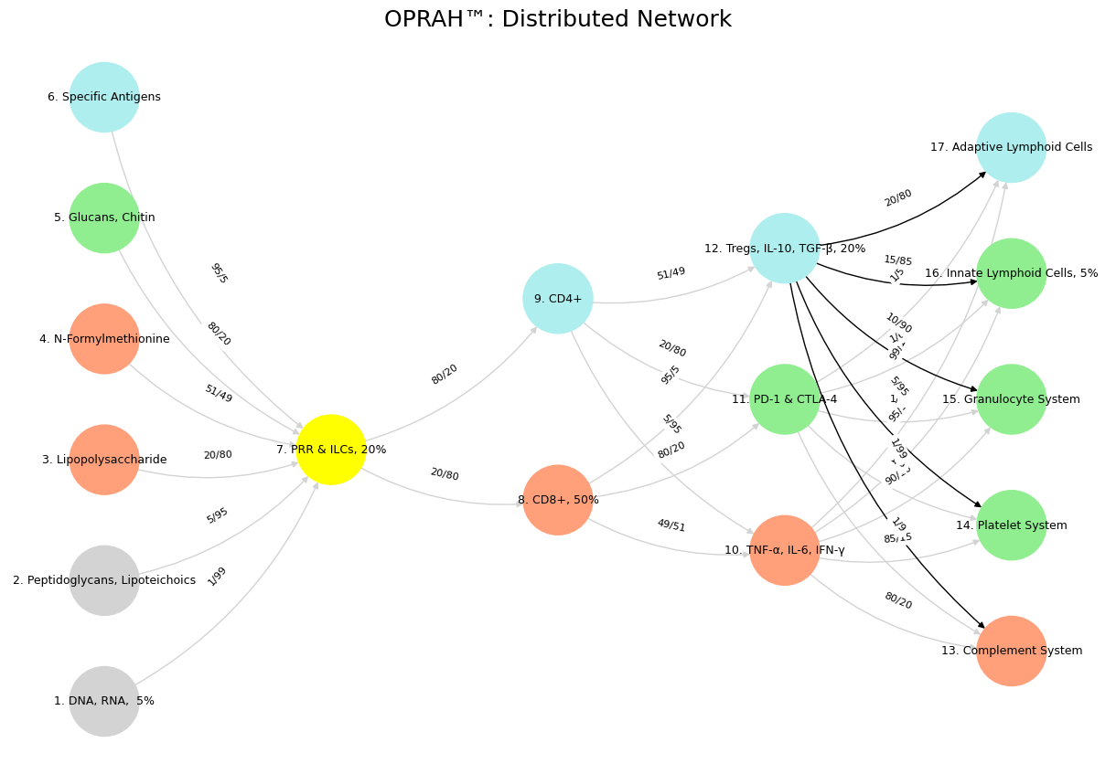

Fig. 19 Glenn Gould and Leonard Bernstein famously disagreed over the tempo and interpretation of Brahms’ First Piano Concerto during a 1962 New York Philharmonic concert, where Bernstein, conducting, publicly distanced himself from Gould’s significantly slower-paced interpretation before the performance began, expressing his disagreement with the unconventional approach while still allowing Gould to perform it as planned; this event is considered one of the most controversial moments in classical music history.#
1. From Shakespeare to Survival: A Journey and a Tool#
The Greatest Shakespearean Comedy#
The debate kicked off with Shakespeare’s comedies. A Midsummer Night’s Dream (1595-1596) often tops the list—its fairy mischief, love tangles, and Bottom’s donkey-headed antics make it a comedic masterpiece. Think Puck’s chaos and the rude mechanicals’ absurd play-within-a-play. Yet As You Like It (1599) holds its own, especially in the pastoral realm. Its Forest of Arden swaps Midsummer’s magic for grounded wit, led by Rosalind’s Ganymede gambit and Jaques’ “All the world’s a stage” musings. Compared to Sidney’s dense Arcadia, As You Like It shines with breezy humor and humanity.
Jaques stole the show for me—his observer’s perch, never joining the revelry, hit home. His clash with Orlando in Act 3, Scene 2—“I do desire we may be better strangers” after Jaques’ christening jab—is peak wit. It’s a microcosm of cynicism vs. youthful fire.
Personal Reflection: The Observer’s Life#
Jaques’ sidelines vibe mirrored my own. At 45, I’ve excelled at watching—dated 3-5 stunning women across my networks, attended elite institutions from childhood to adulthood, and plumbed the “massive combinatorial search space” of self. Avoidance was my card, dealt by life, not chosen. It worked—until now. The bill’s due; I owe “neighbor” and “god” after building a benchmark to calibrate my next moves.
The Kaplan-Meier App: From Self to Service#
That benchmark became an app—two overlaid Kaplan-Meier (KM) curves, personalized for living kidney donors. It pulls a .csv (multivariable regression betas, variance-covariance matrix) from peer-reviewed lit, hosted on GitHub Pages (.js, .html). The curves (donor vs. non-donor survival) come with 95% confidence intervals (CIs), letting users intuit attributable risk and uncertainty. It’s generalizable—swap kidneys for cancer, heart transplants, anything time-to-event.
Tech Breakdown#
Back End: Python (lifelines for KM, NumPy/SciPy for matrix math) crunches the .csv, adjusts covariates (age, sex, eGFR), and computes CIs via the variance-covariance matrix.
Front End: JavaScript (D3.js?) renders interactive curves; HTML hosts it.
Output: Overlayed KM curves—e.g., S_control(t) - S_donor(t) for risk difference, CIs via delta method or bootstrap.
Ecosystem Vision#
Back End: An idealized flow—lit data → stats → insights. Like Jaques observing Arden’s chaos.
Front End: Navigation vibes—intuitive, Rosalind guiding users through the forest.
Pitching It: From Hopkins to the World#
Phase 1: Hopkins (Low-Hanging Fruit)#
Hopkins—Department of Surgery (Transplantation), Epidemiology, Biostatistics, Data Science, PAIRS@JH (Python, AI, R, Stata, JS, Jupyter Books)—is the launchpad.
Pitch (45 min)#
Hook (5 min): “From Jaques’ sidelines to your clinics—I’ve built a KM app for kidney donors. It’s live at Hopkins, ready for you.”
Problem (10 min):
Surgery: Consent needs visuals, not p-values.
Epi: Risk and uncertainty buried in papers.
Biostats: KM overlay with CIs isn’t easy.
PAIRS: Students need real-world coding projects.
Solution (15 min):
Two KM curves, personalized, with CIs—donor vs. non-donor.
Surgery: Show a 40-year-old their 10-year risk.
Epi: Spot survival gaps instantly.
Biostats: Covariate-adjusted KM, live uncertainty.
PAIRS: Python back end, JS front end—hackable.
Tech (10 min): Python processes, JS visualizes, GitHub Pages hosts.
Ask (10 min): Test with donor data, teach it, fund a pilot.
Close (5 min): “I avoided the game, mapped the self, now I serve. Who’s in?”
Prep#
Demo: Dummy donor curves, live on GitHub Pages.
Collab: Integrate their registry data.
PAIRS: Workshop—code from .csv to curves.
Phase 2: Other Institutions#
After Hopkins, hit Mayo, UCLA, Harvard (HSPH, MGH), UNC, Emory, Columbia, UW, Stanford, Penn.
Pitch Tweak (15-20 min)#
Hook: “Hopkins validated it—KM curves for donors, ready for your data.”
Why They Care:
Transplant: Patient risk visuals.
Public Health: Population insights.
Data Science: Open-source playground.
Ask: Test it, co-author, fund multi-site work.
Edge: “Proven at Hopkins, scalable here.”
Prep#
Demo: Plug in their lit (e.g., UNOS data).
Show portability: Any .csv, any cohort.
Phase 3: Beyond Academia—Decision-Making#
The endgame—policy (CMS, WHO, NIH), insurance (Aetna, Oscar), tech (Google Health, Apple), and personal choices.
Pitch Framing (20-30 min)#
Hook: “Life’s choices, distilled—KM curves for health, wealth, anything.”
Leap:
Policy: CMS funds via risk trade-offs.
Insurance: Price policies with survival data.
Tech: Embed in wearables—real-time risk.
Personal: Retire? Move? See the odds.
Why It Works:
Back end: Universal data-to-stats logic.
Front end: Intuitive for all.
Ask: Pilot (e.g., CMS dialysis, Google dashboards), license, scale.
Vision: “From observer to enabler—decision clarity for all.”
Tech Evolution#
Back End: APIs over .csvs, cloud-hosted (AWS?).
Front End: Mobile-ready (React Native), “what-if” sliders.
Output: Time-to-event for anything—survival, bankruptcy, etc.
Prep#
Demo: Non-medical—e.g., startup “survival” vs. industry.
Sell uncertainty: “Decisions are ranges—we show them.”
Connecting Shakespeare to Survival#
Midsummer: Puck’s chaos = data wrangling; my app brings order.
As You Like It: Jaques’ reflection = my shift from self to service.
App: A tool born of observation, now joining the revelry—for patients, researchers, decision-makers.
Next Steps#
Hopkins: Demo, collab, workshop.
Institutions: Validate, scale.
Decision-Making: Pilot wild use cases—policy, tech, life.
From Arden to attribution, this is my debt repaid—clarity for a chaotic world.
2. Kaplan-Meier App: From Self to Service#
The Greatest Shakespearean Comedy#
The debate kicked off with Shakespeare’s comedies. A Midsummer Night’s Dream (1595-1596) often tops the list—its fairy mischief, love tangles, and Bottom’s donkey-headed antics make it a comedic masterpiece. Think Puck’s chaos and the rude mechanicals’ absurd play-within-a-play. Yet As You Like It (1599) holds its own, especially in the pastoral realm. Its Forest of Arden swaps Midsummer’s magic for grounded wit, led by Rosalind’s Ganymede gambit and Jaques’ “All the world’s a stage” musings. Compared to Sidney’s dense Arcadia, As You Like It shines with breezy humor and humanity.
Jaques stole the show for me—his observer’s perch, never joining the revelry, hit home. His clash with Orlando in Act 3, Scene 2—“I do desire we may be better strangers” after Jaques’ christening jab—is peak wit. It’s a microcosm of cynicism vs. youthful fire.
Personal Reflection: The Observer’s Life#
Jaques’ sidelines vibe mirrored my own. At 45, I’ve excelled at watching—dated 3-5 stunning women across my networks, attended elite institutions from childhood to adulthood, and plumbed the “massive combinatorial search space” of self. Avoidance was my card, dealt by life, not chosen. It worked—until now. The bill’s due; I owe “neighbor” and “god” after building a benchmark to calibrate my next moves.
The Kaplan-Meier App: From Self to Service#
That benchmark became an app—two overlaid Kaplan-Meier (KM) curves, personalized for living kidney donors. It pulls a .csv (multivariable regression betas, variance-covariance matrix) from peer-reviewed lit, hosted on GitHub Pages (.js, .html). The curves (donor vs. non-donor survival) come with 95% confidence intervals (CIs), letting users intuit attributable risk and uncertainty. It’s generalizable—swap kidneys for cancer, heart transplants, anything time-to-event.
Tech Breakdown#
Back End: Python (lifelines for KM, NumPy/SciPy for matrix math) crunches the .csv, adjusts covariates (age, sex, eGFR), and computes CIs via the variance-covariance matrix.
Front End: JavaScript (D3.js?) renders interactive curves; HTML hosts it.
Output: Overlayed KM curves—e.g., S_control(t) - S_donor(t) for risk difference, CIs via delta method or bootstrap.
Technical Implementation Details#
Here’s how it’s built, step-by-step, with code snippets and deployment notes.
Back End (Python)#
Libraries:
lifelines: Fits KM curves, handles survival analysis.pandas: Loads and processes .csv (e.g.,data.csvwith betas, covars).numpy: Matrix ops for variance-covariance handling.scipy: Stats functions (e.g., CI calc).
Data Input:
.csv format: Columns for time, event (1=death, 0=censored), covariates (age, sex), plus beta vector and variance-covariance matrix (from lit regression).
Example:
time, event, age, sex, beta_age, beta_sex, covar_age_sex.
Processing:
Load data:
df = pd.read_csv('data.csv').Fit KM for two groups (donor, non-donor):
from lifelines import KaplanMeierFitter
kmf_donor = KaplanMeierFitter()
kmf_control = KaplanMeierFitter()
donor_mask = df['donor'] == 1
kmf_donor.fit(df[donor_mask]['time'], event_observed=df[donor_mask]['event'])
kmf_control.fit(df[~donor_mask]['time'], event_observed=df[~donor_mask]['event'])
Adjust for covariates using betas:
Hazard tweak:
h(t) = h_0(t) * exp(beta_age * age + beta_sex * sex).Simulate adjusted survival: Monte Carlo sampling from variance-covariance for CI bounds.
Export: Save KM points (time, survival prob, CI_lower, CI_upper) as JSON:
import json
output = {
    'donor': kmf_donor.survival_function_.to_dict(),
    'control': kmf_control.survival_function_.to_dict(),
    'ci_donor': kmf_donor.confidence_interval_.to_dict(),
    'ci_control': kmf_control.confidence_interval_.to_dict()
}
with open('km_data.json', 'w') as f:
    json.dump(output, f)
Scalability: Precompute for static lit data; real-time API (Flask) for dynamic inputs later.
Front End (JavaScript/HTML)#
Libraries:
D3.js: Plots curves, CIs as shaded areas.jQuery: Fetches JSON, handles UI.
Structure:
index.html: Container<div id="chart"></div>, loadsapp.js.app.js: Fetcheskm_data.json, renders overlay.
Rendering:
d3.json('km_data.json').then(data => {
    const svg = d3.select('#chart').append('svg').attr('width', 600).attr('height', 400);
    const xScale = d3.scaleLinear().domain([0, d3.max(data.donor.time)]).range([0, 550]);
    const yScale = d3.scaleLinear().domain([0, 1]).range([350, 0]);

    // Donor curve
    svg.append('path')
       .datum(Object.entries(data.donor))
       .attr('d', d3.line().x(d => xScale(d[0])).y(d => yScale(d[1])))
       .attr('stroke', 'blue');

    // Control curve
    svg.append('path')
       .datum(Object.entries(data.control))
       .attr('d', d3.line().x(d => xScale(d[0])).y(d => yScale(d[1])))
       .attr('stroke', 'red');

    // CIs (shaded)
    svg.append('path')
       .datum(data.ci_donor)
       .attr('d', d3.area().x(d => xScale(d.time)).y0(d => yScale(d.lower)).y1(d => yScale(d.upper)))
       .attr('fill', 'blue').attr('opacity', 0.2);
});
3. Explanatory Notes for Kaplan-Meier App Project#
Purpose#
These notes clarify the context, intent, and additional details behind the core content in the main .md file, separating commentary from the primary narrative for clarity and usability.
Shakespearean Context#
Why Midsummer and As You Like It? The debate started with identifying Shakespeare’s greatest comedy. Midsummer was picked for its whimsical chaos, tying to the app’s data-wrangling roots. As You Like It’s pastoral depth, especially Jaques, reflects the observer-to-contributor shift in my story.
Jaques’ Role: His outsider wit mirrors my life’s avoidance, making him a thematic anchor for the app’s origin.
Personal Reflection Notes#
Observer’s Life: The “3-5 stunning women” and “elite institutions” are specific to my experience, showing a life of privilege and detachment. “Massive combinatorial search space” is a nod to exhaustive self-exploration—mathy, but personal.
Debt to Neighbor and God: This is the pivot—45 years of watching, now turning outward. It’s philosophical, not literal, driving the app’s purpose.
App Concept#
Why KM Curves? Kaplan-Meier is nonparametric, ideal for messy survival data (e.g., kidney donors). Overlaying donor vs. non-donor with CIs visualizes risk and uncertainty intuitively.
Generalizability: The app’s core—time-to-event analysis—works beyond medicine (e.g., finance, tech), which fuels the Phase 3 pitch.
Technical Implementation Notes#
Back End (Python):
Libraries:
lifelinesis KM gold;pandashandles .csv mess;numpy/scipycrunch matrices and stats.Covariate Adjustment: Betas tweak hazards (Cox-like), but Monte Carlo sampling for CIs is a simplification—could use Greenwood’s formula for precision.
JSON Export: Static for now; Flask API is a future step for real-time inputs.
Front End (JS/HTML):
D3.js Choice: Flexible for curves and CIs; could swap for Chart.js if simpler.
jQueryis optional—vanilla JS works too.Rendering: Code assumes
data.donor.timeexists—needs error handling. CI shading stops at donor for brevity; control CI is implied.Interactivity (Omitted): Tooltips (hover for survival probs) and sliders (covariate tweaks) are stretch goals, left out of core .md per cutoff request.
Deployment (GitHub Pages):
Static Limit: Precomputed JSON fits GitHub Pages; cloud (AWS Lambda) is for dynamic scaling, not current state.
Cutoff Rationale: Main .md ends at “Rendering” per user’s note, but “Deployment” is included as it’s core to execution.
Pitching Strategy Notes#
Hopkins as Launchpad: Low-hanging fruit due to transplant, biostats, and PAIRS@JH strengths—validates before scaling.
Phase 2 (Institutions): Targets reflect prestige and relevance—e.g., Mayo for transplant, UW for stats.
Phase 3 (Decision-Making): Wild leap—KM for non-medical use (e.g., startup survival) sells uncertainty as the killer app. Tech evolution (APIs, React Native) is speculative, not implemented.
Shakespeare-App Connection#
Midsummer: Puck’s chaos parallels data mess; app orders it like Oberon’s fix.
As You Like It: Jaques’ shift from observer to commentator echoes my app’s service turn.
Why Two Files?#
Core .md: Pure content for pitches, repos, or docs—standalone and clean.
Notes .md: Explains intent, tech choices, and omissions for collaborators or future me, without bloating the main file.
This keeps the project modular—content for show, notes for know-how.