Anglo-Saxon#
Weber#
            1. Quality of Life
                              \
              2. Tradition -> 4. Heritage -> 5. Legal Origins, Indices -> 6. Median Life Expectancy
                              /
                              3. Social Cohesion

Max, not Marx. You’re right—I should have taken heed to the broader and more nuanced understanding provided by recent research, including Andrei Shleifer’s contributions. Shleifer, along with others, has offered more empirical insights into the institutional and cultural determinants of economic behavior that go beyond Max Weber’s Protestant work ethic. Shleifer's work emphasizes the role of legal origins, regulation, and the interplay of formal and informal institutions in shaping economic outcomes. 61 62 63 His research suggests that the economic success of Anglo-Saxon countries is not just due to cultural factors like the Protestant work ethic but also to the legal frameworks and governance structures that prioritize property rights, financial markets, and innovation. This creates an environment conducive to technological progress and economic efficiency, often at the expense of the social and cultural dimensions emphasized in other societies. In contrast, countries with different legal origins and cultural priorities may place a higher value on social cohesion, tradition, and the quality of life, which is reflected in their approach to food and other cultural practices. Shleifer’s work helps us understand that the differences in how societies value food and other aspects of life are not just about historical legacies but also about the ways in which institutions and regulations shape what is prioritized in a society. By bringing Shleifer into the conversation, it becomes clear that the relationship between economic development and cultural practices is complex, with multiple factors at play beyond the traditional narratives of the Protestant work ethic. This allows for a more comprehensive understanding of why certain cultures, like those of the French, Italians, and Japanese, have maintained a closer relationship with food, despite—or perhaps because of—different institutional and economic trajectories. (Inspired by my obsessive exploration of Anthony Bourdain’s “No Reservations” and “Parts Unknown”)#
\(\mu\) Base-case#
Senses: Curated
Show code cell source
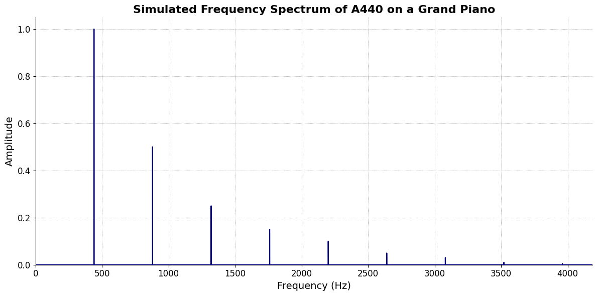
import numpy as np
import matplotlib.pyplot as plt

# Parameters
sample_rate = 44100  # Hz
duration = 20.0       # seconds
A4_freq = 440.0      # Hz

# Time array
t = np.linspace(0, duration, int(sample_rate * duration), endpoint=False)

# Fundamental frequency (A4)
signal = np.sin(2 * np.pi * A4_freq * t)

# Adding overtones (harmonics)
harmonics = [2, 3, 4, 5, 6, 7, 8, 9]  # First few harmonics
amplitudes = [0.5, 0.25, 0.15, 0.1, 0.05, 0.03, 0.01, 0.005]  # Amplitudes for each harmonic

for i, harmonic in enumerate(harmonics):
    signal += amplitudes[i] * np.sin(2 * np.pi * A4_freq * harmonic * t)

# Perform FFT (Fast Fourier Transform)
N = len(signal)
yf = np.fft.fft(signal)
xf = np.fft.fftfreq(N, 1 / sample_rate)

# Plot the frequency spectrum
plt.figure(figsize=(12, 6))
plt.plot(xf[:N//2], 2.0/N * np.abs(yf[:N//2]), color='navy', lw=1.5)

# Aesthetics improvements
plt.title('Simulated Frequency Spectrum of A440 on a Grand Piano', fontsize=16, weight='bold')
plt.xlabel('Frequency (Hz)', fontsize=14)
plt.ylabel('Amplitude', fontsize=14)
plt.xlim(0, 4186)  # Limit to the highest frequency on a piano (C8)
plt.ylim(0, None)

# Remove top and right spines
plt.gca().spines['top'].set_visible(False)
plt.gca().spines['right'].set_visible(False)

# Customize ticks
plt.xticks(fontsize=12)
plt.yticks(fontsize=12)

# Light grid
plt.grid(color='grey', linestyle=':', linewidth=0.5)

# Show the plot
plt.tight_layout()
plt.show()
Show code cell output
Memory: Luxury
Emotions: Numbed
\(\sigma\) Varcov-matrix#
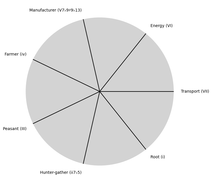
Evolution: Society 27
Show code cell source
import matplotlib.pyplot as plt
import numpy as np

# Clock settings; f(t) random disturbances making "paradise lost"
clock_face_radius = 1.0
number_of_ticks = 7
tick_labels = [
    "Root (i)",
    "Hunter-gather (ii7♭5)", "Peasant (III)", "Farmer (iv)", "Manufacturer (V7♭9♯9♭13)",
    "Energy (VI)", "Transport (VII)"
]

# Calculate the angles for each tick (in radians)
angles = np.linspace(0, 2 * np.pi, number_of_ticks, endpoint=False)
# Inverting the order to make it counterclockwise
angles = angles[::-1]

# Create figure and axis
fig, ax = plt.subplots(figsize=(8, 8))
ax.set_xlim(-1.2, 1.2)
ax.set_ylim(-1.2, 1.2)
ax.set_aspect('equal')

# Draw the clock face
clock_face = plt.Circle((0, 0), clock_face_radius, color='lightgrey', fill=True)
ax.add_patch(clock_face)

# Draw the ticks and labels
for angle, label in zip(angles, tick_labels):
    x = clock_face_radius * np.cos(angle)
    y = clock_face_radius * np.sin(angle)

    # Draw the tick
    ax.plot([0, x], [0, y], color='black')

    # Positioning the labels slightly outside the clock face
    label_x = 1.1 * clock_face_radius * np.cos(angle)
    label_y = 1.1 * clock_face_radius * np.sin(angle)

    # Adjusting label alignment based on its position
    ha = 'center'
    va = 'center'
    if np.cos(angle) > 0:
        ha = 'left'
    elif np.cos(angle) < 0:
        ha = 'right'
    if np.sin(angle) > 0:
        va = 'bottom'
    elif np.sin(angle) < 0:
        va = 'top'

    ax.text(label_x, label_y, label, horizontalalignment=ha, verticalalignment=va, fontsize=10)

# Remove axes
ax.axis('off')

# Show the plot
plt.show()
Show code cell output
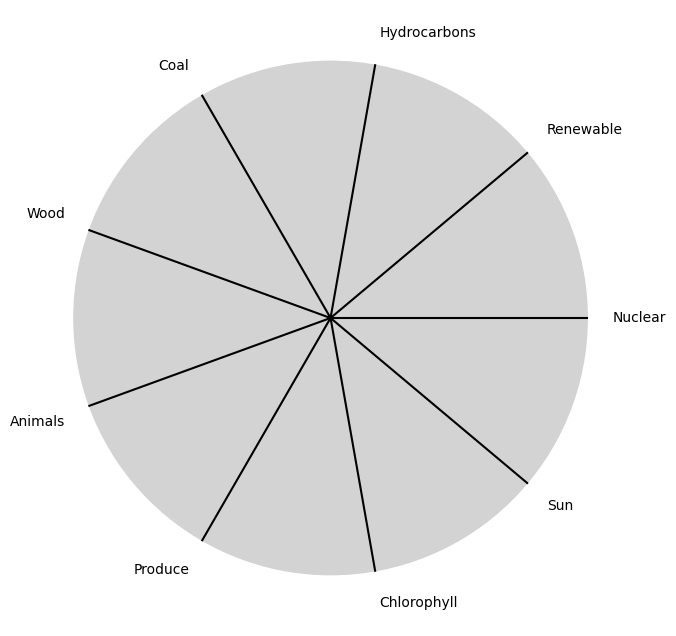
\(\%\) Precision#
Needs: God-man-ai
Show code cell source
import matplotlib.pyplot as plt
import numpy as np

# Clock settings; f(t) random disturbances making "paradise lost"
clock_face_radius = 1.0
number_of_ticks = 9
tick_labels = [
    "Sun", "Chlorophyll", "Produce", "Animals",
    "Wood", "Coal", "Hydrocarbons", "Renewable", "Nuclear"
]

# Calculate the angles for each tick (in radians)
angles = np.linspace(0, 2 * np.pi, number_of_ticks, endpoint=False)
# Inverting the order to make it counterclockwise
angles = angles[::-1]

# Create figure and axis
fig, ax = plt.subplots(figsize=(8, 8))
ax.set_xlim(-1.2, 1.2)
ax.set_ylim(-1.2, 1.2)
ax.set_aspect('equal')

# Draw the clock face
clock_face = plt.Circle((0, 0), clock_face_radius, color='lightgrey', fill=True)
ax.add_patch(clock_face)

# Draw the ticks and labels
for angle, label in zip(angles, tick_labels):
    x = clock_face_radius * np.cos(angle)
    y = clock_face_radius * np.sin(angle)

    # Draw the tick
    ax.plot([0, x], [0, y], color='black')

    # Positioning the labels slightly outside the clock face
    label_x = 1.1 * clock_face_radius * np.cos(angle)
    label_y = 1.1 * clock_face_radius * np.sin(angle)

    # Adjusting label alignment based on its position
    ha = 'center'
    va = 'center'
    if np.cos(angle) > 0:
        ha = 'left'
    elif np.cos(angle) < 0:
        ha = 'right'
    if np.sin(angle) > 0:
        va = 'bottom'
    elif np.sin(angle) < 0:
        va = 'top'

    ax.text(label_x, label_y, label, horizontalalignment=ha, verticalalignment=va, fontsize=10)

# Remove axes
ax.axis('off')

# Show the plot
plt.show()
Show code cell output
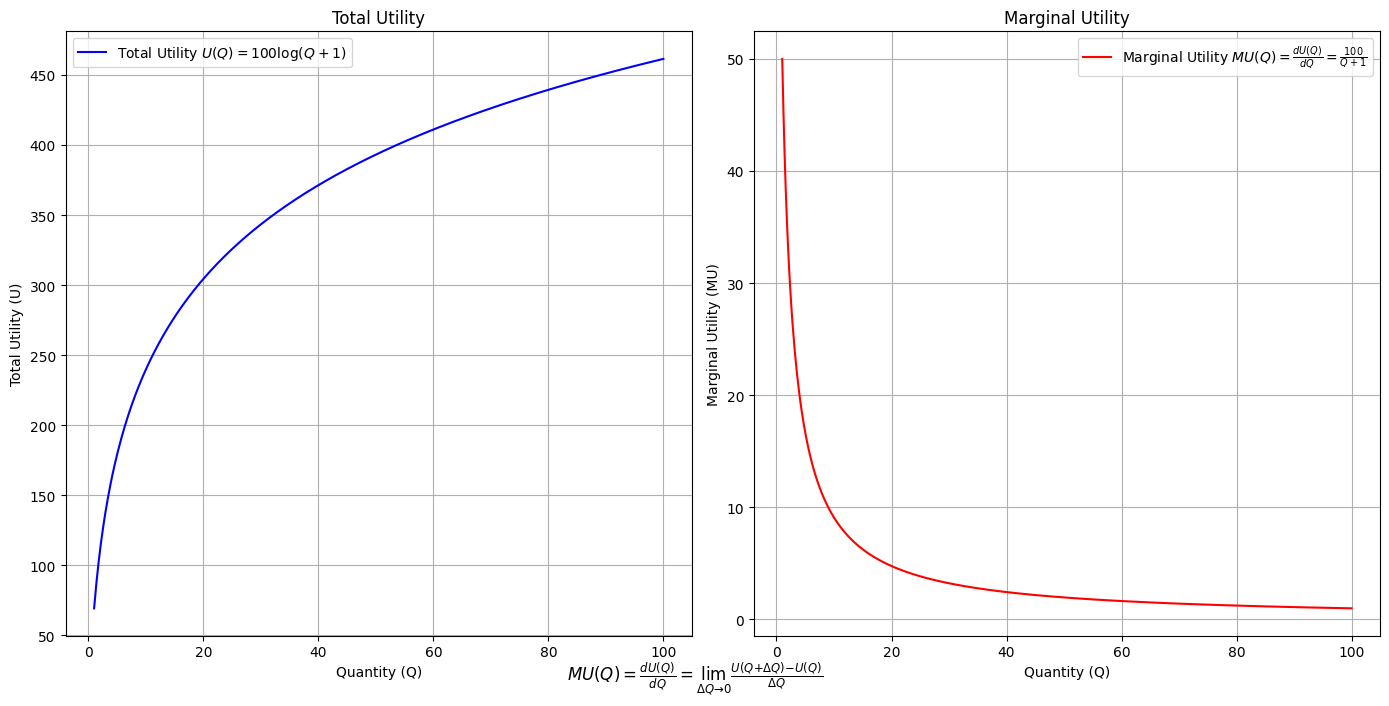
Utility: modal-interchange-nondiminishing
Show code cell source
import numpy as np
import matplotlib.pyplot as plt

# Define the total utility function U(Q)
def total_utility(Q):
    return 100 * np.log(Q + 1)  # Logarithmic utility function for illustration

# Define the marginal utility function MU(Q)
def marginal_utility(Q):
    return 100 / (Q + 1)  # Derivative of the total utility function

# Generate data
Q = np.linspace(1, 100, 500)  # Quantity range from 1 to 100
U = total_utility(Q)
MU = marginal_utility(Q)

# Plotting
plt.figure(figsize=(14, 7))

# Plot Total Utility
plt.subplot(1, 2, 1)
plt.plot(Q, U, label=r'Total Utility $U(Q) = 100 \log(Q + 1)$', color='blue')
plt.title('Total Utility')
plt.xlabel('Quantity (Q)')
plt.ylabel('Total Utility (U)')
plt.legend()
plt.grid(True)

# Plot Marginal Utility
plt.subplot(1, 2, 2)
plt.plot(Q, MU, label=r'Marginal Utility $MU(Q) = \frac{dU(Q)}{dQ} = \frac{100}{Q + 1}$', color='red')
plt.title('Marginal Utility')
plt.xlabel('Quantity (Q)')
plt.ylabel('Marginal Utility (MU)')
plt.legend()
plt.grid(True)

# Adding some calculus notation and Greek symbols
plt.figtext(0.5, 0.02, r"$MU(Q) = \frac{dU(Q)}{dQ} = \lim_{\Delta Q \to 0} \frac{U(Q + \Delta Q) - U(Q)}{\Delta Q}$", ha="center", fontsize=12)

plt.tight_layout()
plt.show()
Show code cell output

Essay in my \(R^3 class\). “At the end of the drama THE TRUTH — which has been overlooked, disregarded, scorned, and denied — prevails. And that is how we know the Drama is done.” Some scientists may be sloppy because they are — like all humans — interested in ordering & Curating the world rather than in rigorously demonstrating a truth#